On this page
- 01Key takeaways
- 02What should be in a homepage header?
- 03How many menu items should it have?
- 04Should the phone number go in the header?
- 05How should the header work on mobile?
- 06What should stay out of the header?
- 07When should the homepage header differ?
- 08What does this look like in practice?
- 09Homepage header checklist
- 10Next step
- 11Sources and further reading
- 12Frequently asked questions
Key takeaways
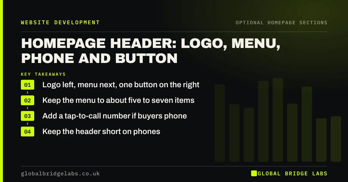
A homepage header needs four things: your logo, a short menu, a phone number if buyers call, and one primary button. Keep it short in height, so it does not eat the first screen on a phone. Anything more, such as social icons or several buttons, competes with the page's main job.
- Logo left, menu next, one button on the right.
- Keep the menu to about five to seven items.
- Add a tap-to-call number if buyers phone.
- Keep the header short on phones.
Want your header checked? Message us on WhatsApp.
Chat on WhatsApp →What should be in a homepage header?
A homepage header should contain your logo, linked to the homepage, a short menu, one primary action and a phone number if calls matter. Nielsen Norman Group research found logos placed on the left are remembered better. Conventional placement helps, because visitors already know where to look.
How many menu items should it have?
Five to seven top-level items is a good target for most SMEs. More makes the header harder to scan, and it crowds at smaller screen widths. Use labels that describe what people want. 'Services', 'Prices' and 'Contact' beat clever names that visitors have to work out for themselves.
Should the phone number go in the header?
Yes, for local and urgent services, where people want to call straight away. Make it a real tap-to-call link on phones, not an image. Leave it out, or make it smaller, if you do not want calls or cannot answer them, because an unanswered number is worse than none.
How should the header work on mobile?
On phones, reduce it to the logo, a menu icon and either a call button or the primary action. Keep the action visible outside the menu, if you can. Tall headers eat into the first screen, so aim for a compact height and check that it does not cover content when sticky.
What should stay out of the header?
Social icons, search boxes on small sites, long opening hours, multiple buttons and language selectors you do not need should all stay out. Each one competes for attention in a very small space. Put practical extras in the footer, where people expect to find them.
When should the homepage header differ?
It should rarely differ. Consistent headers across the site help people stay oriented. One exception is a landing page for a paid campaign, where you may remove navigation to keep the focus. Keep the homepage header standard, unless you have a clear reason to change it.
What does this look like in practice?
A pattern we see on trades sites: a header with a logo, ten menu items, three social icons, two phone numbers and a quote button, which collapses into a tall block on a phone. Reducing it to a logo, a menu and a call button can return a good share of the first screen to the actual message.
Homepage header checklist
- Place the logo at the left.
- Limit the menu to five to seven items.
- Keep one primary button.
- Make phone numbers tap-to-call.
- Keep the header compact on phones.
- Move extras to the footer.
Next step
Check your header on a phone and measure how much of the first screen it takes up. If it is more than about a fifth, shorten it.
Message us on WhatsApp for a header and menu review, with no pitch.
Chat on WhatsApp →Sources and further reading
- Website logo placement for maximum brand recall · Nielsen Norman Group
- Menu-design checklist: 17 UX guidelines · Nielsen Norman Group
- Sticky headers: 5 ways to make them better · Nielsen Norman Group
- Understanding WCAG 2.2 success criterion 2.4.11: Focus Not Obscured (Minimum) · W3C
Frequently asked questions
What should a website header include?
Your logo, linked to the homepage, a short menu, one primary action and, for call-led businesses, a phone number. Keep it uncluttered, because the header sits above every page and competes with the content below.
Should my phone number be at the top of my website?
Yes, if your customers prefer to call or need urgent help. Make it tap-to-call on phones. If you prefer forms or cannot answer the phone, a clear button is better than a number that nobody picks up.
How tall should a website header be?
Keep it compact. On phones, a very tall header eats into the first screen and hides your message. There is no fixed number, so check on real devices and make sure that nothing important is pushed out of view.
Written by

Global Bridge Labs (GBL) is a UK–Sri Lanka partner for social media, websites and BPO. Everything here comes from client delivery, not theory.