On this page
- 01Short answer
- 02What is website navigation?
- 03Why does poor navigation lose enquiries?
- 04How many menu items should a website have?
- 05What should mobile navigation look like?
- 06What belongs in the footer?
- 07When should you add more navigation, not less?
- 08What does this look like in practice?
- 09Navigation checklist
- 10Next step
- 11Sources and further reading
- 12Frequently asked questions
Short answer
Good website navigation uses five to seven top-level items, labelled in the words your buyers use, with services listed by name and one call to action button that stays visible. On mobile the menu should open quickly, be easy to tap and keep the phone or WhatsApp action outside the menu.
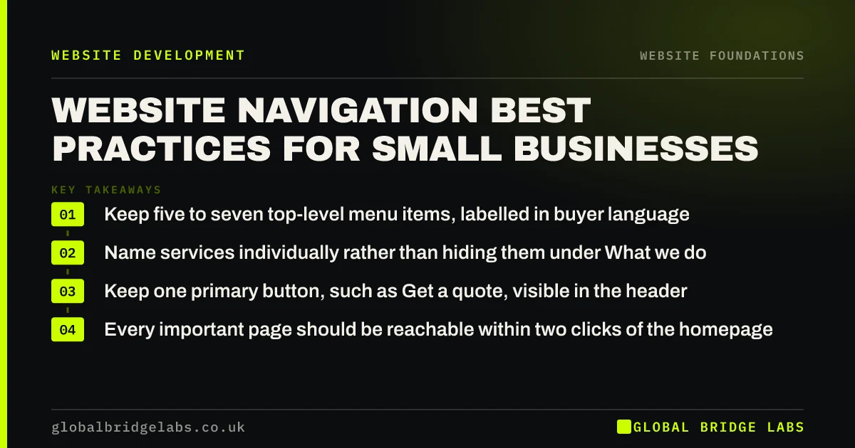
- Keep five to seven top-level menu items, labelled in buyer language.
- Name services individually rather than hiding them under What we do.
- Keep one primary button, such as Get a quote, visible in the header.
- Every important page should be reachable within two clicks of the homepage.
Want your menu reviewed? Send us your URL on WhatsApp and we will suggest a cleaner structure.
Chat on WhatsApp →What is website navigation?
Website navigation is the set of menus, links and buttons that let visitors and search engines move between the pages of a site, including the main header menu, the footer, breadcrumbs and in-page links.
It is also how Google and Bing understand which pages matter most. Pages linked from the main menu and from many other pages are treated as more important than pages buried four clicks deep, which is why site structure affects rankings as well as usability.
Why does poor navigation lose enquiries?
Poor navigation loses enquiries because visitors who cannot find the service they need assume you do not offer it. They do not search your site. They go back to Google.
The most common causes are internal labels (the names your team uses rather than the names customers search), too many items, and important pages hidden inside drop-downs that are hard to use on a phone.
- Labels such as Solutions, Offerings or What we do that say nothing specific.
- Twelve or more top-level items competing for attention.
- Service pages reachable only through a hover menu that fails on touch screens.
- No visible contact action in the header.
How many menu items should a website have?
Five to seven top-level items suits most small business sites. A typical set is Services, Industries or Who we help, Work or Reviews, Pricing, About, and Contact, with a button for the primary action.
If you have more services than fit, group them under a Services item with a drop-down that lists each one by name, and give the Services item its own overview page. That way a visitor who clicks rather than hovers still reaches something useful.
What should mobile navigation look like?
On mobile, keep the logo, a tap-to-call or WhatsApp button and a menu icon visible in the header. The menu itself should open instantly, use large tap targets and show services by name rather than nested three levels deep.
Google indexes the mobile version of your site first, so links that exist only in the desktop menu may carry less weight. Make sure the mobile menu contains the same important pages as the desktop menu.
What belongs in the footer?
The footer is where visitors look for practical detail. Include your full business name, address and phone number, opening hours, links to every service, privacy and cookie policies, and for limited companies the registered details required on business websites.
Consistent name, address and phone details in the footer also support local search, because Google compares them with your Google Business Profile and other directory listings.
Want a navigation and footer structure drafted for your services? Message us on WhatsApp.
Chat on WhatsApp →When should you add more navigation, not less?
Larger sites with many services, locations or products need more structure, not less. For them, breadcrumbs, category pages and a search box are worth the extra complexity because visitors genuinely need to filter.
The trade-off is maintenance. Every extra menu level is something to keep accurate as services change. For most SMEs the better investment is fewer, stronger pages linked clearly, rather than a mega-menu of thin pages.
What does this look like in practice?
A pattern in logistics and B2B service firms: a menu with Home, About, Solutions, Sectors, Resources, News, Careers and Contact, where Solutions is a hover-only drop-down with nine items that cannot be opened on a phone.
Renaming Solutions to Services, making it a clickable overview page, listing each service by its plain name and adding a Get a quote button in the header usually brings more visitors into service pages. News and Resources are merged into one item, and Home is dropped because the logo already does that job.
Navigation checklist
Test these on a phone as well as a desktop.
- Limit the top level to five to seven items.
- Replace internal jargon with the words buyers search.
- List every service by name.
- Make every drop-down parent a clickable page.
- Keep a primary action button visible in the header.
- Match mobile menu links to desktop menu links.
- Put full contact and legal details in the footer.
Next step
If visitors struggle to find your services, we will sketch a new navigation structure with you in 30 minutes, including the header, mobile menu and footer.
Message us on WhatsApp for a navigation review, or book a 30-minute consultation.
Chat on WhatsApp →Sources and further reading
- SEO Starter Guide · Google Search Central
- Mobile-first indexing best practices · Google Search Central
- Running a limited company: signs, stationery and promotional material · GOV.UK
Frequently asked questions
How many items should be in a website menu?
Five to seven top-level items works for most small business websites. Fewer items make each one easier to scan and understand. If you have more services than that, group them under one Services item that lists each service by name and links to a proper overview page.
Should my website have a drop-down menu?
A drop-down is fine for listing services, provided the parent item is also a clickable page and the menu works with a tap on mobile. Avoid hover-only menus and nested levels, which are hard to use on touch screens and can hide important pages from visitors.
Does website navigation affect SEO?
Yes. Navigation tells search engines which pages matter and how they relate. Pages linked from the main menu and from many other pages are easier to discover and are treated as more important. Clear labels that match search terms also help pages rank for those terms.
What should I put in my website footer?
Your business name, address, phone number and opening hours, links to each service, privacy and cookie policies, and for limited companies the registered name, number and office. Keeping these details consistent with your Google Business Profile also supports local search visibility.
Written by

Global Bridge Labs (GBL) is a UK–Sri Lanka partner for social media, websites and BPO. Everything here comes from client delivery, not theory.