On this page
- 01Short answer
- 02What does mobile friendly mean in 2026?
- 03Why does mobile matter so much?
- 04What are the most common mobile problems?
- 05What should a mobile page include at the top?
- 06How do you test your site on mobile?
- 07When should mobile and desktop differ?
- 08What does this look like in practice?
- 09Mobile checklist
- 10Next step
- 11Sources and further reading
- 12Frequently asked questions
Short answer
A mobile friendly website for a small business is one a visitor can use comfortably on a phone: readable text without zooming, buttons large enough to tap, one-tap calling and messaging, short forms and fast loading. Google indexes the mobile version first, so the mobile site is effectively your website as far as search is concerned.
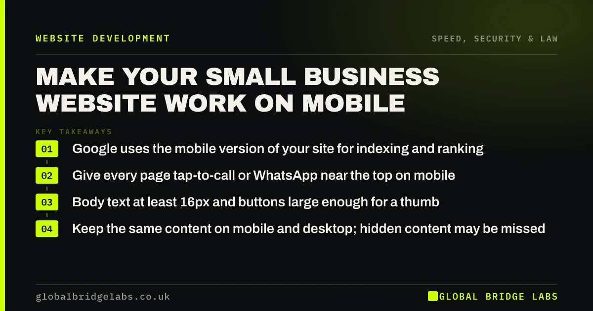
- Google uses the mobile version of your site for indexing and ranking.
- Give every page tap-to-call or WhatsApp near the top on mobile.
- Body text at least 16px and buttons large enough for a thumb.
- Keep the same content on mobile and desktop; hidden content may be missed.
Want your site checked on a real phone? Send us the URL on WhatsApp and we will list what gets in the way.
Chat on WhatsApp →What does mobile friendly mean in 2026?
A mobile friendly website is a site whose layout, text, navigation, forms and speed are designed to work well on small touch screens and mobile connections, not just shrunk to fit them.
Almost every site is technically responsive now. Mobile friendly is a higher bar: can someone standing in a shop, a car park or a kitchen find what they need and act on it with one thumb in under a minute?
Why does mobile matter so much?
Most visits to UK small business websites now come from phones, and Ofcom's Online Nation research consistently shows smartphones as the device UK adults use most to go online. For local services, the share is higher still, because people search when a problem happens.
Search also works mobile-first. Google's documentation confirms it uses the mobile version of a site's content for indexing and ranking. Content, links or structured data that exist only on desktop may not count.
What are the most common mobile problems?
These show up in almost every small business site audit, and most can be fixed without a redesign.
- Phone numbers that are not tappable links.
- Text too small to read without zooming.
- Buttons and links too close together to tap accurately.
- Pop-ups that cover the page and are hard to close.
- Long forms with tiny fields and the wrong keyboard.
- Menus that hide services or fail to open.
- Heavy pages that take many seconds to become usable.
What should a mobile page include at the top?
The first screen on a phone is small, so every element must earn its place. Include the logo, the headline, one primary button, and a tap-to-call or WhatsApp action. Push secondary information further down.
A sticky bottom bar with Call and WhatsApp buttons works well for local services, because it keeps the action available as visitors scroll without covering content. Keep it slim and make sure it does not overlap cookie banners or forms.
Want a mobile layout plan for your homepage and top service page? Message us on WhatsApp.
Chat on WhatsApp →How do you test your site on mobile?
Use your own phone and a cheaper Android device if you can, over mobile data. Try the four tasks customers most often attempt: find a service, find a price, call or message, and submit the form. Note every moment of friction.
Then check Google Search Console for mobile usability and Core Web Vitals issues, and run key pages through PageSpeed Insights on mobile. Ask someone who has never seen the site to try the same tasks while you watch.
When should mobile and desktop differ?
Layout should differ; content should not. It is right to stack columns, simplify menus and shorten image galleries on mobile. It is risky to hide whole sections of text, because Google indexes the mobile version and may never see what you hid.
Some tasks genuinely suit desktop, such as uploading technical drawings. Make those possible on mobile too, but offer a way to continue later, such as emailing a link.
What does this look like in practice?
A pattern in trades and home services: a site designed on a large monitor, with the phone number as an image in the header, which cannot be tapped on a phone. Visitors must memorise the number or give up.
Making the number a tap-to-call link, adding a sticky Call and WhatsApp bar and enlarging the form fields are small changes. They directly affect the visitors most likely to enquire: people on phones who need help now.
Mobile checklist
Test these on a real phone.
- Make phone numbers tappable.
- Add a Call or WhatsApp action near the top.
- Use body text of at least 16px.
- Space buttons for thumbs.
- Remove or delay pop-ups on mobile.
- Keep forms short with correct input types.
- Match mobile content to desktop content.
- Check Search Console and PageSpeed Insights on mobile.
Next step
If you mostly look at your site on a computer, it is worth seeing it as customers do. We will review it on a phone with you in 30 minutes and list the fixes in order.
Message us on WhatsApp for a mobile website review, or book a 30-minute consultation.
Chat on WhatsApp →Sources and further reading
- Mobile-first indexing best practices · Google Search Central
- Online Nation: how the UK uses online services · Ofcom
- Understanding Core Web Vitals and Google search results · Google Search Central
Frequently asked questions
How do I know if my website is mobile friendly?
Try it on a real phone over mobile data. Check that text is readable without zooming, buttons are easy to tap, phone numbers are tappable, forms are easy to complete and pages load quickly. Then check Google Search Console and PageSpeed Insights for mobile issues.
What is mobile-first indexing?
Mobile-first indexing means Google uses the mobile version of a website's content for indexing and ranking. If content, links or structured data appear only on the desktop version, Google may not take them into account, so the mobile version needs the same important content as desktop.
Is a responsive website the same as mobile friendly?
Not quite. A responsive site adjusts its layout to the screen size, which is the starting point. A mobile friendly site also has readable text, thumb-sized buttons, tap-to-call, short forms and fast loading on mobile connections. Many responsive sites still fail on those details.
Should my mobile site have less content than desktop?
The layout can be simpler, but the content should be the same. Google indexes the mobile version, so hiding sections of text on mobile can mean they are not counted. Use accordions or shorter layouts carefully, keeping important information visible and indexable on mobile.
Written by

Global Bridge Labs (GBL) is a UK–Sri Lanka partner for social media, websites and BPO. Everything here comes from client delivery, not theory.