On this page
- 01Key takeaways
- 02What is a visual direction?
- 03Where should you look for homepage inspiration?
- 04How do you choose the three words?
- 05Why does looking like your sector matter?
- 06What should you put in the 'avoid' list?
- 07When can you skip this step?
- 08What does this look like in practice?
- 09Homepage visual direction checklist
- 10Next step
- 11Sources and further reading
- 12Frequently asked questions
Key takeaways
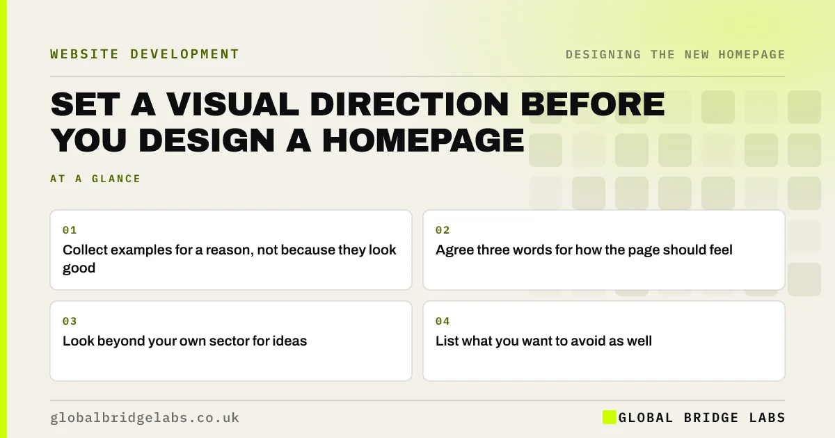
Homepage design inspiration is only useful with a purpose. Before designing, gather five to eight examples, note what each does well and agree three words that describe how the page should feel. This short visual direction stops the project becoming a matter of personal taste, and it gives a designer something firm to work from.
- Collect examples for a reason, not because they look good.
- Agree three words for how the page should feel.
- Look beyond your own sector for ideas.
- List what you want to avoid as well.
Want help setting a visual direction? Message us on WhatsApp.
Chat on WhatsApp →What is a visual direction?
A visual direction is a short agreement on how a homepage should look and feel, made before design begins. It usually covers tone words, examples, colours, type and image style. It takes about an hour, and it replaces vague requests such as 'modern but friendly' with shared references everyone can point to.
Where should you look for homepage inspiration?
Look at businesses your buyers already trust, firms in other sectors with a similar buying journey and competitors whose pages you think fail. Note specific things you like, such as how one uses photos or how another shows proof. A list of reasons is far more useful than a folder of screenshots.
How do you choose the three words?
Pick words buyers would use, then test them against a clear opposite. 'Calm, not clinical.' 'Practical, not rough.' 'Premium, not cold.' The contrast stops words such as 'professional' from meaning everything. Run them past someone who deals with customers, as they know how the business is actually perceived.
Why does looking like your sector matter?
Google research by Tuch and others found that pages with low visual complexity and high prototypicality were judged most attractive in a fraction of a second. People expect a type of business to look a certain way. Standing out is fine, as long as visitors can still tell what kind of business you are.
What should you put in the 'avoid' list?
Add anything that has caused trouble before: stock handshakes, autoplay video, dark backgrounds that your buyers dislike, or a competitor's signature style. Add trends that do not suit you. An avoid list is often more useful than an inspiration list, because it settles arguments before any design work starts.
When can you skip this step?
Skip it when you have strong brand guidelines, or when you are using a template with few visual choices. Then the direction has already been set, and your effort is better spent on words and images. Keep the avoid list, though, as it takes only a few minutes and prevents common mistakes.
What does this look like in practice?
A pattern worth noticing: a client sends a designer ten websites they love, all very different, and the first concept pleases nobody. Asking what they liked about each one usually shows that they care about clarity and photo quality, not about any one style.
Homepage visual direction checklist
- Gather five to eight examples.
- Write why each one works.
- Include examples from other sectors.
- Agree three words with their opposites.
- Write an avoid list.
- Share it before design begins.
Next step
Choose three websites you admire and write one sentence on what each does for its buyer. If you can only say 'it looks nice', keep looking.
Message us on WhatsApp to talk through your homepage direction, with no pitch.
Chat on WhatsApp →Sources and further reading
- The role of visual complexity and prototypicality regarding first impression of websites · Google Research (Tuch et al., 2012)
- First impressions matter: how designers can support automatic cognitive processing · Nielsen Norman Group
- Jakob's law of internet user experience · Nielsen Norman Group
Frequently asked questions
Where can I find homepage design inspiration?
Start with businesses your buyers already use, then look at firms in other sectors with similar buying decisions. Gallery sites can help, but they often favour visually striking work. Always note what each example does for its buyer.
What is a mood board for a website?
It is a collection of images, colours, type and examples showing the intended look and feel. It helps a team agree direction before design begins. A short mood board is useful, as long as each item is there for a stated reason.
Should my homepage look like my competitors?
It should look like the right kind of business, so that visitors feel on familiar ground, but it should differ in message and proof. Copying a competitor's layout or wording will not help you stand out, and it may raise copyright issues.
Written by

Global Bridge Labs (GBL) is a UK–Sri Lanka partner for social media, websites and BPO. Everything here comes from client delivery, not theory.