On this page
- 01Key takeaways
- 02What do high-converting websites have in common?
- 03Example 1: What makes a trades website convert?
- 04Example 2: What makes a clinic website convert?
- 05Example 3: What makes a B2B services website convert?
- 06Example 4: What makes an e-commerce website convert?
- 07Example 5: What makes a professional services website convert?
- 08What should you not copy from examples?
- 09What does this look like in practice?
- 10Borrow-from-examples checklist
- 11Next step
- 12Sources and further reading
- 13Frequently asked questions
Key takeaways
High-converting website examples look different from one another but share the same bones: a headline that names the offer and audience, proof beside claims, price guidance, one clear action and fast mobile pages. The examples below are anonymised patterns from UK SMEs we have audited or worked with, each showing the feature that made the difference.
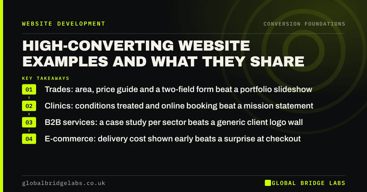
- Trades: area, price guide and a two-field form beat a portfolio slideshow.
- Clinics: conditions treated and online booking beat a mission statement.
- B2B services: a case study per sector beats a generic client logo wall.
- E-commerce: delivery cost shown early beats a surprise at checkout.
Want to see which pattern fits your business? Ask us on WhatsApp.
Chat on WhatsApp →What do high-converting websites have in common?
High-converting websites share five features regardless of sector: clarity, proof, low friction, one clear action and tracked follow-up. Colour, layout and platform vary widely. When we compare the best and worst converting sites in the same sector, the difference almost always sits in those five, not in the visual style.
Example 1: What makes a trades website convert?
A roofing firm in the Midlands converts well because its homepage headline reads like a search result: the service, the county and 'free survey within 48 hours'. Beneath it, a row of recent jobs shows town, job type and price band. The form asks for postcode and phone number only.
The lesson: tradespeople's buyers want to know you cover their area, roughly what it costs and how fast you can come. Answer those three and the form does the rest.
Example 2: What makes a clinic website convert?
A private physiotherapy clinic converts well because each treatment page starts with the condition in the patient's words ('knee pain after running'), then the likely number of sessions, the price per session and a 'book an assessment' button linked to live availability. Reviews mentioning that condition sit beside the button.
Example 3: What makes a B2B services website convert?
A payroll bureau converts well because it has one case study per sector it targets, each with a before-and-after figure (hours saved, errors reduced) and a named role quote. Service pages give a per-employee price range. The main call to action is a 20-minute call, with a downloadable checklist as a softer option.
For B2B, the buyer often has to persuade someone else. Pages that give them the numbers to do that convert better than pages that only persuade them.
Example 4: What makes an e-commerce website convert?
An independent homeware retailer converts well because delivery cost and delivery date appear on every product page, above the add-to-basket button, and guest checkout is the default. Baymard Institute's research lists extra costs such as shipping as the top reason shoppers abandon, cited by about 40%. Showing them early removes the surprise.
Want a page from your site compared with the pattern for your sector? Send it to us on WhatsApp.
Chat on WhatsApp →Example 5: What makes a professional services website convert?
A small employment law practice converts well because its pages are organised by the client's situation ('I have been dismissed', 'I need a settlement agreement reviewed') rather than by legal area. Each page gives a fixed-fee range where the rules allow, meets SRA transparency requirements and offers a short callback request.
What should you not copy from examples?
Do not copy the look. Visual style is the least transferable part of any example, and copying a competitor's layout makes you harder to tell apart. Do not copy tactics built for different buyers either: a flash-sale banner that works for fashion retail will cheapen a surveyor's site. Copy the principle behind the feature, then write it for your own buyers.
What does this look like in practice?
Across these examples, the changes that moved results were rarely expensive. Rewriting headlines, adding price guidance, moving proof and shortening forms are mostly copy and configuration work. Across GBL website clients we have seen a 2.4x enquiry rate from this kind of work. The public examples on our projects page show how those features look in finished sites.
Borrow-from-examples checklist
- Find two high-converting sites in your sector, not just attractive ones.
- List how each answers offer, area, price, proof and next step.
- Mark which of those answers your site is missing.
- Write your own version for your buyers; do not copy wording.
- Change one area at a time and measure the effect.
Next step
Examples help most when they are matched to your sector and your buyers. We can show you the patterns that work in your market and where your pages differ.
Message us on WhatsApp for sector-matched examples, or book a 30-minute consultation.
Chat on WhatsApp →Sources and further reading
- Cart abandonment rate statistics · Baymard Institute
- Transparency rules · Solicitors Regulation Authority
- Creating helpful, reliable, people-first content · Google Search Central
Frequently asked questions
What does a high-converting website look like?
It varies by sector, but it always has a headline naming the offer and audience, proof next to claims, price guidance, one obvious next step and fast mobile pages. The visual style can be plain or premium. The structure of answers is what converts.
Should I copy a competitor's website?
No. Copying the look makes you harder to tell apart and may copy their weaknesses too. Study how they answer the buyer's questions about area, price, proof and next step, then answer those questions better and in your own words for your own buyers.
Where can I find examples of high-converting websites?
Look at businesses in your sector that grow steadily and advertise heavily, because they tend to invest in conversion. Note how their pages answer buyer questions rather than how they look. Public case studies from agencies, including our projects page, also show before-and-after structures.
Do high-converting websites use a lot of text?
They use as much as the buyer needs, arranged so the essentials come first. Simple, low-cost offers can convert with little text. High-value services usually need more explanation, proof and pricing guidance, with a call to action repeated after each major section.
Written by

Global Bridge Labs (GBL) is a UK–Sri Lanka partner for social media, websites and BPO. Everything here comes from client delivery, not theory.