On this page
- 01Key takeaways
- 02Is there an ideal homepage length?
- 03Do people actually scroll on a homepage?
- 04What should change the length of your page?
- 05How do you make a long page feel shorter?
- 06How can you tell your homepage is too long?
- 07What does this look like in practice?
- 08Homepage length checklist
- 09Next step
- 10Sources and further reading
- 11Frequently asked questions
Key takeaways
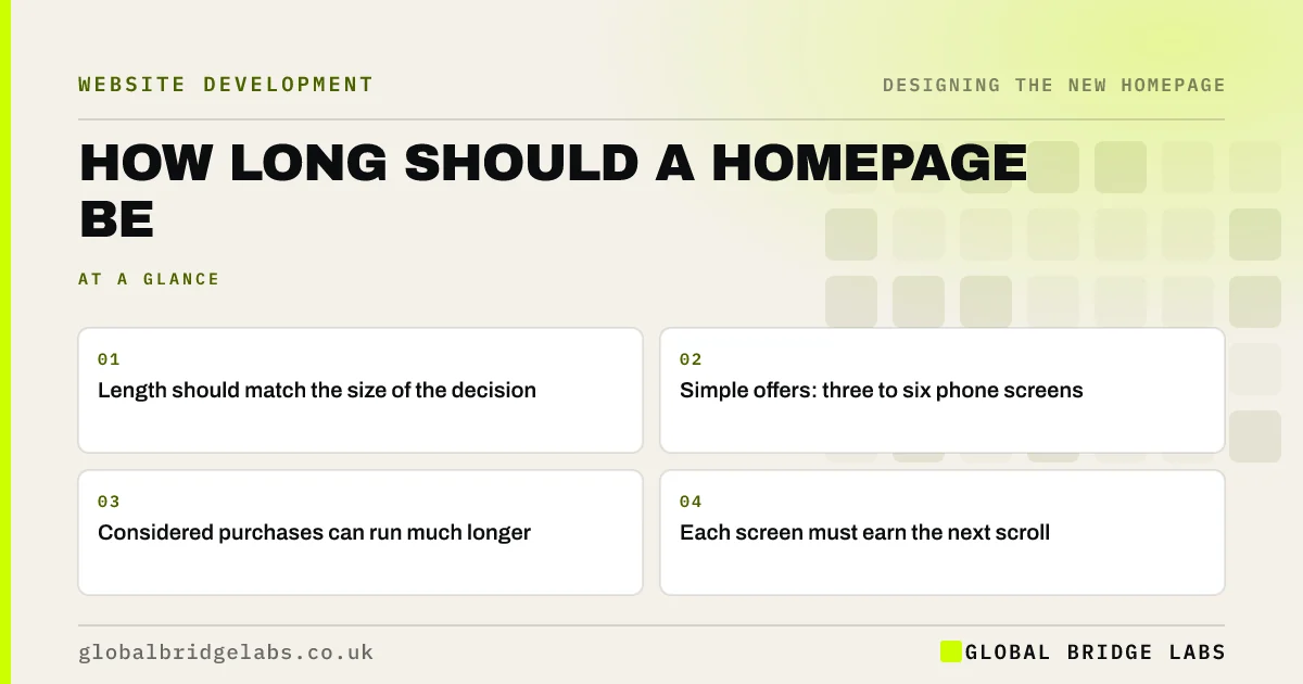
How long a homepage should be depends on the decision it supports. A simple, low-risk purchase may need only three or four phone screens, while a considered B2B service may need ten or more. People will scroll if the page stays useful. The real measure is whether each screen helps a buyer decide.
- Length should match the size of the decision.
- Simple offers: three to six phone screens.
- Considered purchases can run much longer.
- Each screen must earn the next scroll.
Unsure if your homepage is the right length? Message us on WhatsApp.
Chat on WhatsApp →Is there an ideal homepage length?
No single length is right. Page length follows buyer need, and the only universal rule is that each section should give a reason to continue. As a Global Bridge Labs (GBL) rule of thumb, simple local services work in three to six phone screens, and complex services may run to ten or more.
Do people actually scroll on a homepage?
Yes, but attention falls away. Nielsen Norman Group's eyetracking found 57% of viewing time above the fold and 74% within the first two screenfuls. People scroll when the page signals that there is more worth seeing. They will not read everything, so the most important content must come early.
What should change the length of your page?
Price, risk, familiarity and buyer knowledge all change it. A £40 repair needs little persuasion, whereas a £40,000 contract needs a lot. An unfamiliar service needs more explanation. Visitors who arrive via referral need less than those who arrive from search. Know which of these is your main audience.
- Higher price: more proof.
- Higher risk: more reassurance.
- Unfamiliar service: more explanation.
- Warm referrals: less persuasion.
- Urgent need: shorter, faster page.
How do you make a long page feel shorter?
Use clear headings, short paragraphs, visual variety and repeated actions. Every section should be able to stand alone. Keep the button visible at intervals, as a GBL rule of thumb about every two screens. A long page is fine when visitors can always tell where they are and what they can do next.
How can you tell your homepage is too long?
Your homepage is too long if sections repeat each other, if scroll data shows a sharp fall before your proof or if the page is slow on phones. Move detail to service pages. If visitors never reach your best evidence, the answer is often to move that evidence up, not to cut it.
What does this look like in practice?
A pattern we see: a business cuts its homepage to look cleaner and removes the proof and FAQs that were answering objections. It looks better and enquiries drop. Moving the answers higher up tends to work better than removing them.
Homepage length checklist
- Rate your purchase by price and risk.
- Count your phone screens.
- Remove repeated sections.
- Check how far visitors scroll.
- Repeat your action about every two screens.
- Move deep detail to inner pages.
Next step
Scroll your homepage on a phone and count the screens. Then ask, for each one, what a buyer would lose if it were gone.
Message us on WhatsApp for a homepage length review, with no pitch.
Chat on WhatsApp →Sources and further reading
- Scrolling and attention · Nielsen Norman Group
- How long do users stay on web pages? · Nielsen Norman Group
- Creating helpful, reliable, people-first content · Google Search Central
Frequently asked questions
How long should a homepage be?
Long enough to answer a buyer's main questions and no longer. Simple offers often fit in three to six phone screens, and considered purchases may need more. Judge by whether each section helps a decision, not by a fixed word count.
Is a long homepage bad for SEO?
No, a long page is not a problem if it is useful and well organised. Length is not a ranking factor by itself. A slow or repetitive page is a problem for both users and search engines.
Should everything be above the fold?
No. The fold should carry the core message and the main action, but people do scroll. Trying to squeeze everything in creates clutter. Make the first screen clear, and signal that there is more below.
Written by

Global Bridge Labs (GBL) is a UK–Sri Lanka partner for social media, websites and BPO. Everything here comes from client delivery, not theory.