On this page
- 01Key takeaways
- 02What did the Google study find?
- 03What is visual complexity?
- 04What is prototypicality?
- 05How do you apply this without looking generic?
- 06When does unusual design make sense?
- 07What does this look like in practice?
- 08Complexity and prototypicality checklist
- 09Next step
- 10Sources and further reading
- 11Frequently asked questions
Key takeaways
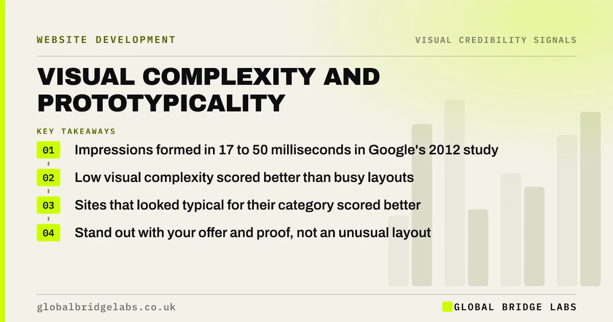
A 2012 Google study found that websites with low visual complexity and high prototypicality, meaning they look like a typical site of their kind, were judged most appealing within 17 to 50 milliseconds. For a business, the lesson is to look simple and familiar for your category, then stand out through content and proof.
- Impressions formed in 17 to 50 milliseconds in Google's 2012 study.
- Low visual complexity scored better than busy layouts.
- Sites that looked typical for their category scored better.
- Stand out with your offer and proof, not an unusual layout.
Want to know how complex your site looks at a glance? Message us on WhatsApp.
Chat on WhatsApp →What did the Google study find?
Researchers at Google and the University of Basel, led by Alexandre Tuch, showed people website screenshots for as little as 17 milliseconds. Sites with low visual complexity and high prototypicality were rated most appealing. Highly complex sites and sites that looked unusual for their category were rated least appealing, and the effect appeared even at the shortest exposures.
What is visual complexity?
Visual complexity is how busy a page looks: the number of elements, colours, images, text blocks and alignments competing for attention. A page with one headline, one image and one button has low complexity. A page with a slider, six boxes, three colours of button and a sidebar has high complexity, and visitors read it as harder work.
What is prototypicality?
Prototypicality is how closely a site matches the visitor's mental picture of a typical site in that category. People expect a law firm site to look different from a fashion shop. A site that matches the expected pattern, such as logo top left, menu top, contact button top right, is processed faster and judged more favourably.
Want your homepage simplified without losing what makes you different? Message us on WhatsApp and we will discuss your requirements.
Chat on WhatsApp →How do you apply this without looking generic?
Keep the structure familiar and make the substance specific. Use the layout conventions of your sector, then differentiate with your own photography, a precise statement of what you do and for whom, and named proof. Familiar structure lowers effort; specific content gives visitors a reason to choose you.
When does unusual design make sense?
Unusual design can work for creative businesses, such as design studios or architects, where the site itself is the portfolio and visitors expect originality. Even then, the navigation and contact route should follow convention. For most service businesses, being unusual costs more in effort than it gains in memorability.
What does this look like in practice?
A pattern we see: a homepage carries a rotating slider, a video, four service boxes, a news feed and a partner logo strip, all above the second screen. Reducing it to one headline, one real photo, one action and three services makes the business look more established, not less.
Complexity and prototypicality checklist
- Count the distinct elements on your first screen; aim for five or fewer.
- Use your sector's familiar layout pattern.
- Limit colours to a primary, a neutral and one accent.
- Remove sliders and auto-rotating content.
- Differentiate through words and photos, not structure.
Next step
Compare your homepage with the top three competitors in your sector. If yours is the busiest, simplify first.
Message us on WhatsApp for a first-screen review, or book a 30-minute consultation.
Chat on WhatsApp →Sources and further reading
- The role of visual complexity and prototypicality regarding first impression of websites · Google Research (Tuch et al., 2012)
- Attention web designers: you have 50 milliseconds to make a good first impression · Behaviour & Information Technology (Lindgaard et al., 2006)
- First impressions matter: how designers can support automatic cognitive processing · Nielsen Norman Group
Frequently asked questions
What is prototypicality in web design?
Prototypicality is how closely a website matches what people expect a site of that type to look like. Sites that follow familiar patterns for their category are processed more easily and, in Google's 2012 research, were judged more appealing at first sight.
Does a simple website look less professional?
No. Research suggests the opposite: low visual complexity was rated more appealing in first impressions. Simple is different from empty, though. A simple site still needs clear content, real images and proof to be credible.
How fast do people judge a website's look?
In the Google study, people formed impressions from screenshots shown for 17 to 50 milliseconds. Earlier research by Lindgaard and colleagues found consistent judgements of visual appeal within about 50 milliseconds.
Written by

Global Bridge Labs (GBL) is a UK–Sri Lanka partner for social media, websites and BPO. Everything here comes from client delivery, not theory.