On this page
- 01Key takeaways
- 02Why change backgrounds between sections?
- 03How many background colours should you use?
- 04Where should the strongest colour go?
- 05What about contrast?
- 06When are coloured bands unnecessary?
- 07What does this look like in practice?
- 08Homepage backgrounds checklist
- 09Next step
- 10Sources and further reading
- 11Frequently asked questions
Key takeaways
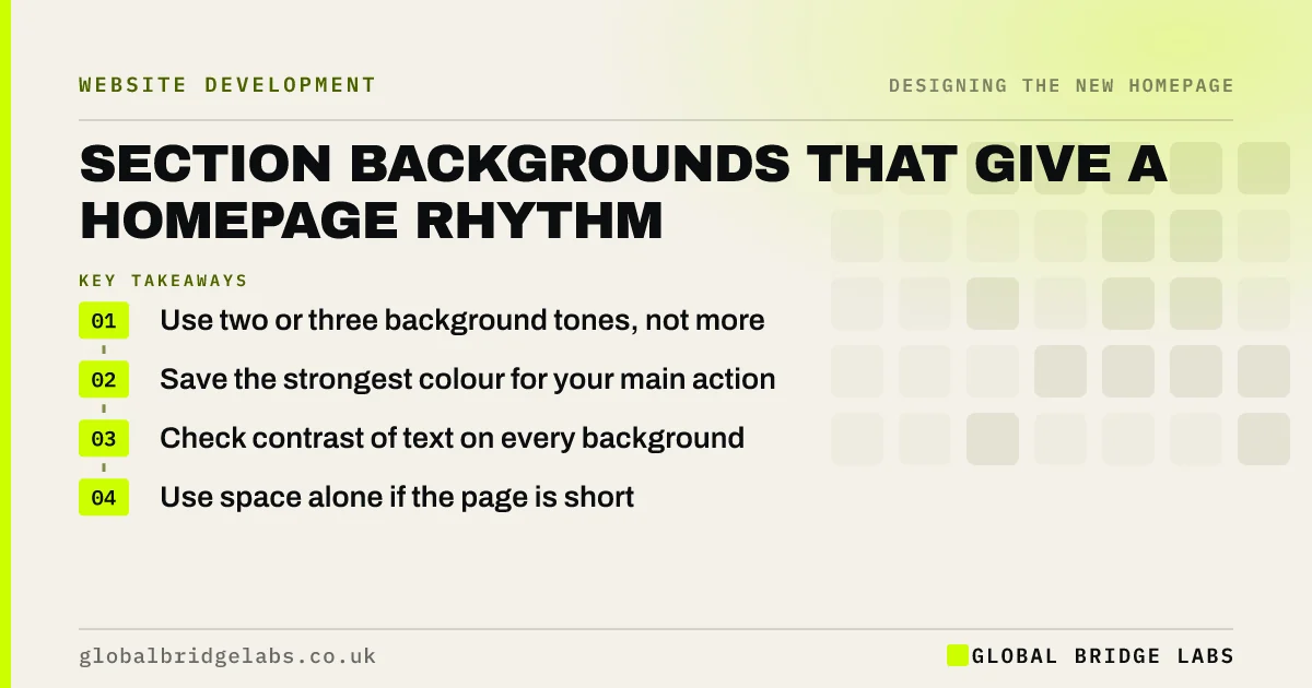
A homepage section background shows visitors where one idea ends and the next begins. Alternate between two or three calm tones, save your strongest colour for the section that matters most, and always check contrast. Done well, this rhythm makes a long page easier to scan, without adding any extra words.
- Use two or three background tones, not more.
- Save the strongest colour for your main action.
- Check contrast of text on every background.
- Use space alone if the page is short.
Want your page rhythm reviewed? Message us on WhatsApp.
Chat on WhatsApp →Why change backgrounds between sections?
Changing backgrounds groups content visually, so a scanning visitor can see the page's structure without reading it. It also gives the eye small resting points on long pages. On a phone, where sections stack in one column, these changes can be the clearest sign that a new topic has started.
How many background colours should you use?
Two or three is usually enough: white or off-white, one soft tint and one strong brand colour. More than that starts to look like a patchwork. Nielsen Norman Group advises using colour deliberately and sparingly, since it loses its power to direct attention when everything is colourful.
Where should the strongest colour go?
Save it for the section with the most commercial value, usually your closing action or a key proof point. If every section is loud, none of them stands out. Using one strong band near the end of the page gives visitors a clear visual signal that this is where to act.
What about contrast?
Check text on each background against WCAG 2.2, which requires 4.5:1 for normal text and 3:1 for large text. Pay attention to tinted backgrounds, muted greys and text on brand colours. WebAIM's annual analysis repeatedly finds low-contrast text to be among the most common accessibility failures on home pages.
When are coloured bands unnecessary?
They are unnecessary on short pages, where plenty of white space does the same job. They may also feel heavy on a premium or minimal brand. If your page already has strong images or a clear heading rhythm, try using spacing alone, and add colour only if the structure seems unclear.
What does this look like in practice?
A pattern we see on template sites: each section has a different colour taken from the theme's demo, none of them meaningful. Reducing this to white, one tint and one strong band usually makes the page feel more considered, and it makes the closing call to action far easier to spot.
Homepage backgrounds checklist
- Choose two or three tones.
- Alternate them with purpose.
- Reserve the strongest for your key section.
- Check text contrast on each background.
- Check that links and buttons stay visible.
- Avoid text over busy images.
Next step
Zoom your browser out to 25% and look at your page. You should be able to see where the sections begin and which one matters most.
Message us on WhatsApp for a homepage design review, with no pitch.
Chat on WhatsApp →Sources and further reading
- Using color to enhance your design · Nielsen Norman Group
- Understanding SC 1.4.3: Contrast (Minimum) · W3C
- The WebAIM Million: accessibility of the top 1,000,000 home pages · WebAIM
Frequently asked questions
Should website sections have different background colours?
Alternating subtle tones often helps on long pages, because it separates topics and makes scanning easier. On short pages, white space may be enough. Keep to a small palette so that the page does not look like a patchwork.
What background colour is best for a website?
White or a soft off-white usually reads best for long text. Strong colours work well in short sections with a clear purpose. Whatever you pick, confirm that text meets WCAG contrast ratios of at least 4.5:1.
Is a dark background bad for a homepage?
Not automatically, but it needs care with contrast, image choices and long-text reading. Some brands suit it well. It is safest used in a few sections, or when you have tested it with your actual buyers.
Written by

Global Bridge Labs (GBL) is a UK–Sri Lanka partner for social media, websites and BPO. Everything here comes from client delivery, not theory.