On this page
- 01Key takeaways
- 02Does minimalist design look more professional?
- 03What should a minimalist site keep?
- 04What makes minimalist design backfire?
- 05When is a fuller design better?
- 06What does this look like in practice?
- 07Minimalist design checklist
- 08Next step
- 09Sources and further reading
- 10Frequently asked questions
Key takeaways
Minimalist design looks credible when it removes noise and keeps substance: a clear offer, real proof, prices or ranges and contact. It looks empty when it removes the substance too. The goal is low visual complexity, not low information. A minimal homepage with no proof or detail feels like a placeholder, not a confident brand.
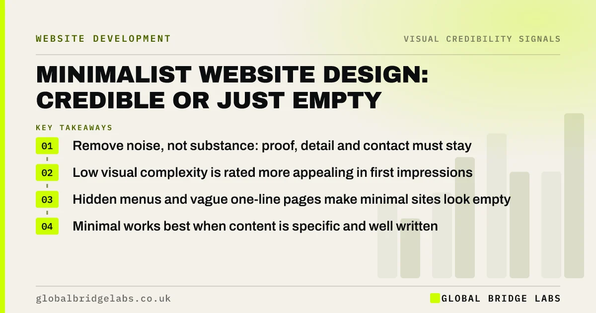
- Remove noise, not substance: proof, detail and contact must stay.
- Low visual complexity is rated more appealing in first impressions.
- Hidden menus and vague one-line pages make minimal sites look empty.
- Minimal works best when content is specific and well written.
Want to know whether your site is minimal or just thin? Message us on WhatsApp.
Chat on WhatsApp →Does minimalist design look more professional?
Minimalist design often looks more professional because it signals control and confidence. Google's 2012 research found low visual complexity was rated more appealing at first sight. But minimalism is a method of presentation, not a content strategy. A site that is minimal because it has little to say looks unfinished, not confident.
What should a minimalist site keep?
Keep everything a buyer needs to decide, presented calmly. Remove decoration, repetition and filler, not information.
- A specific statement of what you do and for whom.
- Real photos of people and work.
- Named proof: reviews, clients, results.
- Prices or typical ranges, or how pricing works.
- A visible menu and contact route.
What makes minimalist design backfire?
Minimalism backfires when it hides navigation behind an icon on desktop, uses faint grey text for elegance, replaces descriptions with single words or removes proof to keep pages clean. Nielsen Norman Group's research on flat design found that stripping visual cues, such as button shapes, makes interfaces harder to use. Calm is good; vague is not.
- Colour contrast on websites: why grey text loses readers
- The most common business website design mistakes
Want a review that keeps your clean look and adds back the substance? Message us on WhatsApp and we will discuss your requirements.
Chat on WhatsApp →When is a fuller design better?
A fuller design is better when buyers compare many options in detail, such as e-commerce with large ranges, or when the audience expects to see lots of information up front. In those cases, use clear structure rather than empty space to keep things calm: grouping, headings and filters.
What does this look like in practice?
A pattern we see: a consultancy homepage has a large photo, a three-word slogan and a 'Learn more' button. It looks elegant and says nothing. Adding one sentence on who they help, three named client results and a contact button keeps the calm look and gives visitors a reason to stay.
Minimalist design checklist
- Check each page answers what, who, proof, price and contact.
- Remove decoration and repetition first.
- Keep text dark enough to read easily.
- Keep buttons looking like buttons.
- Keep the menu visible on desktop.
Next step
Read your homepage first screen to a stranger. If they cannot say what you do, the page is too empty, not too busy.
Message us on WhatsApp for a homepage review, or book a 30-minute consultation.
Chat on WhatsApp →Sources and further reading
- The role of visual complexity and prototypicality regarding first impression of websites · Google Research (Tuch et al., 2012)
- Flat design: its origins, its problems, and why flat 2.0 is better for users · Nielsen Norman Group
- Visual hierarchy in UX: definition · Nielsen Norman Group
Frequently asked questions
Is a minimalist website good for business?
It can be, if it keeps the substance buyers need: a clear offer, proof, prices and contact. Minimal presentation lowers effort and looks confident. Minimal content looks empty and unfinished. Aim for calm design with specific content.
Can a website be too minimal?
Yes. When it hides navigation, uses vague one-line descriptions, removes proof or makes buttons look like plain text, visitors struggle to understand and trust it. Minimalism should remove noise, not information.
What is the difference between minimalist and simple design?
Simple design means easy to understand and use. Minimalist design is a visual style with few elements and much empty space. A minimalist site can still be hard to use if it hides things; the aim is simplicity, using minimalism where it helps.
Written by

Global Bridge Labs (GBL) is a UK–Sri Lanka partner for social media, websites and BPO. Everything here comes from client delivery, not theory.