On this page
- 01Key takeaways
- 02Why does a homepage need a closing section?
- 03What should a closing section say?
- 04Which worry should it answer?
- 05How should it look?
- 06When should you use a form here?
- 07What does this look like in practice?
- 08Homepage closing section checklist
- 09Next step
- 10Sources and further reading
- 11Frequently asked questions
Key takeaways
A homepage closing section gives visitors who have scrolled the whole page one clear reason and one clear way to act. Restate the offer in a line, answer the last likely worry and repeat your primary button. Most homepages just stop at the footer, leaving their most interested visitors with nothing to do next.
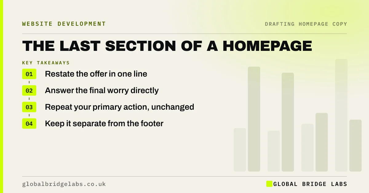
- Restate the offer in one line.
- Answer the final worry directly.
- Repeat your primary action, unchanged.
- Keep it separate from the footer.
Want your closing section written? Message us on WhatsApp.
Chat on WhatsApp →Why does a homepage need a closing section?
People who reach the bottom are often your most interested visitors, because they have read everything. If the page simply ends, they must scroll back or hunt in the menu. A closing section catches them at that moment and makes the next step obvious, which costs you nothing and helps your best prospects.
What should a closing section say?
It should combine a short restated promise, a reassurance and a button. For example: 'Need your boiler fixed this week? Tell us the problem and we will reply within 2 hours. No call-out charge for quotes.' Use a plain sentence, not a phrase such as 'Ready to get started?' on its own.
- One line restating the outcome.
- One line removing the final worry.
- The primary button, with the same wording.
- An alternative for people who prefer to call.
Which worry should it answer?
Answer the doubt that most often stops people at the last moment, such as cost, commitment or being pestered by sales calls. Your sales team will know it. Short statements such as 'No obligation' or 'We will not call unless you ask' work when they are true and specific.
How should it look?
Make it visually distinct, with a contrasting background, so that it reads as a final section and not as part of the footer. Keep the button large, and give the text room. On phones, make sure that the button sits fully above any floating chat or cookie banner.
When should you use a form here?
A short form works in this spot when contacting you is the page's main goal, and when the form needs only a few fields. It saves the visitor a click. For more complex enquiries, a button to a dedicated page usually works better, as it allows room for reassurance and detail.
What does this look like in practice?
A pattern worth checking: a homepage with a strong opening and good proof that finishes in a list of footer links. Adding one line and a button at the bottom is among the smallest changes a page can have, and it gives your most engaged readers a clear place to go.
Homepage closing section checklist
- Restate the outcome.
- Answer the biggest final worry.
- Repeat the primary button text.
- Offer an alternative contact route.
- Separate it from the footer visually.
- Check it on a phone with banners open.
Next step
Scroll to the bottom of your homepage and ask what a keen visitor should do now. If the answer is not on the screen, add it this week.
Message us on WhatsApp and we will draft your closing section, with no pitch.
Chat on WhatsApp →Sources and further reading
- Scrolling and attention · Nielsen Norman Group
- Web page footers 101: design patterns and when to use each · Nielsen Norman Group
- Understanding WCAG 2.2 success criterion 2.4.11: Focus Not Obscured (Minimum) · W3C
Frequently asked questions
What should go at the bottom of a homepage?
A closing section with a short restatement of the offer, a reassurance and your primary button, followed by the footer. The footer holds practical links and business details, while the closing section serves people who are ready to act.
Should a homepage end with a call to action?
Yes. Visitors who reach the end are usually interested, so give them a clear next step. Use the same action as the rest of the page, so that the message stays consistent, and add a simple alternative for those who prefer to call.
Is the footer enough as a closing section?
No. A footer is a reference area with links and legal details, and most visitors do not treat it as a prompt to act. A separate section above it gives your final message room to work.
Written by

Global Bridge Labs (GBL) is a UK–Sri Lanka partner for social media, websites and BPO. Everything here comes from client delivery, not theory.