On this page
- 01Key takeaways
- 02What is visual hierarchy?
- 03Why does visual hierarchy affect conversion?
- 04What should the hierarchy be on a service page?
- 05How do you check visual hierarchy in five minutes?
- 06What are the common hierarchy mistakes?
- 07When should hierarchy be subtle?
- 08What does this look like in practice?
- 09Visual hierarchy checklist
- 10Next step
- 11Sources and further reading
- 12Frequently asked questions
Key takeaways
Visual hierarchy is the order in which a page tells the eye what matters, using size, contrast, colour, spacing and position. On a high-converting website that order runs: offer, proof, next step. On many good-looking websites the loudest element is decoration, so visitors see the photo and miss the offer.
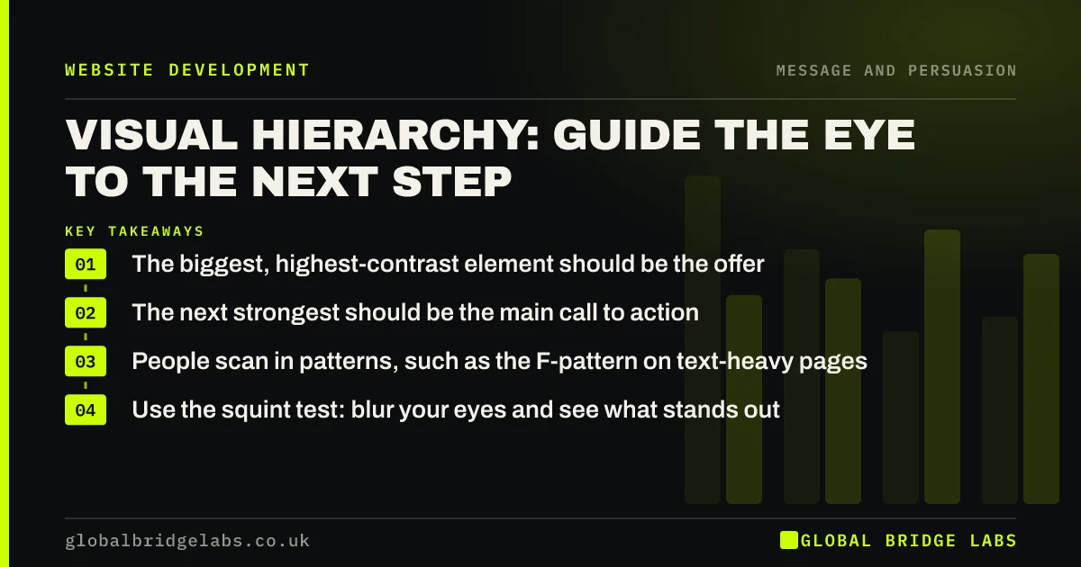
- The biggest, highest-contrast element should be the offer.
- The next strongest should be the main call to action.
- People scan in patterns, such as the F-pattern on text-heavy pages.
- Use the squint test: blur your eyes and see what stands out.
Want the visual hierarchy of your homepage reviewed? Message us on WhatsApp.
Chat on WhatsApp →What is visual hierarchy?
Visual hierarchy is the arrangement of elements on a page so that their importance is clear from how they look. Nielsen Norman Group defines it as the order in which the eye perceives what it sees, shaped by size, colour and contrast, spacing, alignment and position. Good hierarchy lets visitors understand a page before reading it.
Why does visual hierarchy affect conversion?
Visitors do not read pages top to bottom. They scan. Nielsen Norman Group's eye-tracking research describes patterns such as the F-shaped scan on text-heavy pages. If the offer and next step are not visually dominant, scanning visitors miss them and leave, even when the information is on the page.
What should the hierarchy be on a service page?
For most service pages, the order of visual weight should follow the order of the buyer's questions.
- 1. Headline: the offer, audience and area. Largest text on the page.
- 2. Primary call to action: the strongest colour contrast on the screen.
- 3. Key proof: a rating, result or short review close to the button.
- 4. Supporting detail: price guidance, process, what is included.
- 5. Secondary links and navigation: quiet, but findable.
Want a hierarchy plan for your main service page? Ask us on WhatsApp.
Chat on WhatsApp →How do you check visual hierarchy in five minutes?
Use three quick tests. The squint test: blur your eyes at the page and note the first three things you see. The five-second test: show it to someone new and ask what they remember. The mobile test: check what fills the first screen on a phone. If the offer and next step are not in the top three, the hierarchy needs work.
What are the common hierarchy mistakes?
The usual mistakes come from giving decoration or everything the same weight.
- A large photo with a small, low-contrast headline over it.
- Several buttons in the same bold colour.
- Brand colour used everywhere, so nothing stands out.
- Long paragraphs with no headings to scan.
- The call to action placed only at the bottom.
When should hierarchy be subtle?
Premium and professional brands sometimes need restraint, and an oversized neon button can cheapen them. Hierarchy can still be clear with quieter tools: space around the call to action, position and contrast within a restrained palette. Subtle is fine. Invisible is not. Contrast must still meet WCAG 2.2 for accessibility.
What does this look like in practice?
A UK architecture practice's homepage had a striking full-width image, a small grey headline and a thin outline button. In a squint test, people saw only the photo. We kept the image, placed the headline on a solid panel at twice the size and made the consultation button solid. Consultation requests from the homepage rose over the following quarter.
Visual hierarchy checklist
- Make the offer the largest text on the page.
- Give the primary button the strongest contrast.
- Use one accent colour for actions only.
- Break text with scannable headings.
- Place proof close to the button.
- Run the squint, five-second and mobile tests.
Next step
Visual hierarchy is where design and conversion meet. Small changes in size, contrast and space can bring the offer and next step forward without a redesign. We can show you where yours needs adjusting.
Message us on WhatsApp for a visual hierarchy review, or book a 30-minute consultation.
Chat on WhatsApp →Sources and further reading
- Visual hierarchy in UX: definition · Nielsen Norman Group
- F-shaped pattern of reading: misunderstood, but still relevant · Nielsen Norman Group
- Web Content Accessibility Guidelines (WCAG) 2.2 · W3C
Frequently asked questions
What is visual hierarchy in web design?
Visual hierarchy is arranging page elements so their importance is clear from how they look, using size, contrast, colour, spacing and position. It tells visitors what to look at first, second and third before they read a word. Good hierarchy makes the offer and next step obvious.
How does visual hierarchy improve conversion?
It makes the offer and next step stand out for visitors who scan rather than read. When the most important elements are also the most visually prominent, more visitors understand the page quickly and find the call to action. The squint test shows it quickly.
What is the F-pattern in web design?
The F-pattern is a scanning pattern observed in eye-tracking studies, where people read across the top, then a shorter line further down, then scan down the left side. It is common on text-heavy pages and shows why headings and front-loaded sentences matter.
How do I test my website's visual hierarchy?
Squint at the page and note the first three things you see, show it to someone new for five seconds and ask what they remember, and check the first screen on a phone. The offer and next step should appear in those tests.
Written by

Global Bridge Labs (GBL) is a UK–Sri Lanka partner for social media, websites and BPO. Everything here comes from client delivery, not theory.