On this page
- 01Key takeaways
- 02Why start with principles rather than tactics?
- 03Principle 1: Why must clarity come before cleverness?
- 04Principle 2: Why does proof beat promises?
- 05Principle 3: Why does less effort convert more?
- 06Principle 4: Why offer one next step per page?
- 07Principle 5: Why reduce the risk of enquiring?
- 08Principle 6: Why measure before you change anything?
- 09When do these principles pull against each other?
- 10What does this look like in practice?
- 11Conversion principles checklist
- 12Next step
- 13Sources and further reading
- 14Frequently asked questions
Key takeaways
Website conversion principles that hold up are the ones rooted in how people decide, not in design fashion: be clear before clever, prove every claim, reduce effort, offer one next step, reduce risk, and measure. Tactics such as button colours and pop-ups come and go. These principles apply to a plumber's site and a law firm's site alike.
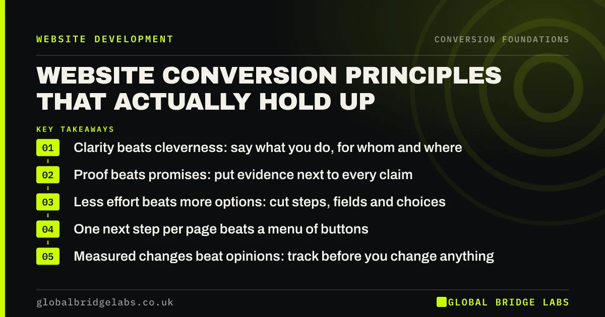
- Clarity beats cleverness: say what you do, for whom and where.
- Proof beats promises: put evidence next to every claim.
- Less effort beats more options: cut steps, fields and choices.
- One next step per page beats a menu of buttons.
- Measured changes beat opinions: track before you change anything.
Want your site checked against these principles? Send us the URL on WhatsApp.
Chat on WhatsApp →Why start with principles rather than tactics?
Tactics are copied from other sites without the context that made them work. A green button, an exit pop-up or a countdown timer may have lifted results for a large retailer and do nothing, or harm, for a UK accountancy firm. Principles explain why something works, so you can judge whether it fits your buyers.
Principle 1: Why must clarity come before cleverness?
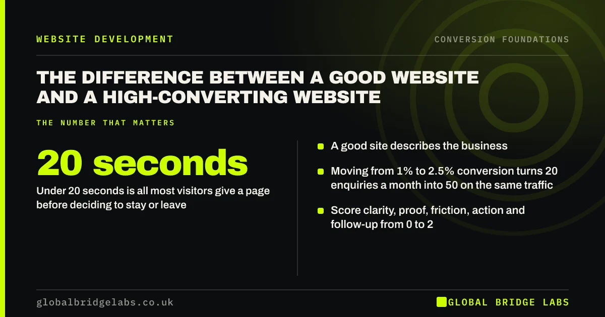
Clarity comes first because visitors decide within seconds whether to stay. Nielsen Norman Group found users often leave pages in 10 to 20 seconds unless a clear value proposition holds them. A clever slogan makes visitors work out what you do. A plain statement of offer, audience and area lets them decide immediately.
Principle 2: Why does proof beat promises?
Every business claims quality, reliability and great service, so buyers discount the claims. Specific proof is harder to fake: a named project, a before-and-after number, a review that mentions the problem solved. Proof placed beside the claim it supports does more than a testimonials page nobody visits.
Principle 3: Why does less effort convert more?
Every extra step, field or decision is a chance to leave. Baymard Institute's checkout research found nearly one in five online shoppers had abandoned an order because the process was too long or complicated. Service enquiries follow the same logic: ask only what you need to reply, and make the form work on a phone.
Principle 4: Why offer one next step per page?
When a page offers four equal buttons, visitors hesitate. Hick's Law, as summarised by Nielsen Norman Group, describes how decision time grows with the number of choices. Pick the one action that suits the visitor's stage on that page and make it dominant. Secondary options can exist, but quieter.
Principle 5: Why reduce the risk of enquiring?
Buyers hold back when enquiring feels risky: a sales call they cannot escape, a hidden price, a commitment they do not understand. Say what happens after they enquire, how quickly you reply, and that there is no obligation. Guarantees and clear cancellation terms reduce risk further where you can honestly offer them.
Principle 6: Why measure before you change anything?
Without a baseline you cannot tell whether a change helped. Track forms, calls, WhatsApp chats and bookings as key events in Google Analytics 4, record at least a month of data, then change one area at a time. Most small sites cannot run statistically clean A/B tests, so compare periods carefully and watch qualified enquiries, not just clicks.
Want a baseline set up before you change anything? Ask us on WhatsApp.
Chat on WhatsApp →When do these principles pull against each other?
Clarity and brevity can clash with proof: adding evidence adds length. The answer is order, not omission. Lead with the offer and one strong proof point, then expand below for visitors who want detail. Similarly, reducing friction can lower lead quality. A slightly longer form that asks budget or timescale can be worth it for high-value services.
What does this look like in practice?
A UK physiotherapy clinic applied the principles in order over one quarter: tracking first, then a headline naming the conditions treated and the town, then reviews beside each treatment, then a two-field booking request, then a line explaining that the first call is with a physiotherapist, not a receptionist. No design changes were made.
Bookings from the website rose steadily across the quarter. Across GBL website clients we have seen a 2.4x enquiry rate from work like this, where the lift comes from principles applied in order rather than from a single tactic.
Conversion principles checklist
- State offer, audience and area in every key headline.
- Place specific proof beside each main claim.
- Remove any form field you do not need to reply.
- Make one next step dominant on each page.
- Explain what happens after someone enquires.
- Track every enquiry route before changing pages.
- Change one area at a time and measure for 8 weeks.
Next step
Principles are easy to agree with and harder to apply to your own pages. We can walk through your top pages with you and show where each principle is missing.
Message us on WhatsApp for a principles review of your site, or book a 30-minute consultation.
Chat on WhatsApp →Sources and further reading
- How long do users stay on web pages? · Nielsen Norman Group
- Hick's Law: designing long menu lists · Nielsen Norman Group
- E-commerce checkout usability: research and benchmark · Baymard Institute
- About key events · Google Analytics Help
Frequently asked questions
What are the basic principles of website conversion?
Be clear about what you offer and for whom, back claims with specific proof, reduce the effort needed to act, offer one obvious next step per page, reduce the perceived risk of enquiring, and measure every enquiry route so you know what works.
Do conversion best practices work for every business?
The principles do, but specific tactics often do not. A countdown timer or pop-up that works for a retailer can damage trust for a professional services firm. Apply the principle, then choose a tactic that suits your buyers and measure whether it helps.
What is the most important conversion principle?
Clarity. If visitors cannot tell within a few seconds what you do, who it is for and where you work, nothing else on the page gets a chance. Most sites we audit gain more from a clearer headline than from any design or button change.
How do I apply conversion principles on a small budget?
Start with tracking, then rewrite headlines on your top five landing pages, add proof beside claims, shorten your enquiry form and make one button dominant. These are mostly copy and settings changes that cost little and can be done on your existing platform.
Written by

Global Bridge Labs (GBL) is a UK–Sri Lanka partner for social media, websites and BPO. Everything here comes from client delivery, not theory.