On this page
- 01Key takeaways
- 02Why repeat the call to action?
- 03How many CTAs should a homepage have?
- 04Should each repeat be identical?
- 05What about mobile?
- 06When is repeating too much?
- 07What does this look like in practice?
- 08CTA repetition checklist
- 09Next step
- 10Sources and further reading
- 11Frequently asked questions
Key takeaways
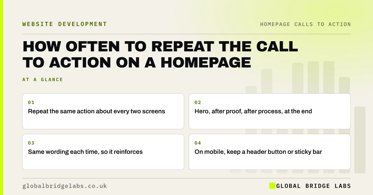
On a typical small business homepage, repeat the call to action on the page three or four times: in the hero, after the main proof, after the process or services section, and at the end. Visitors decide at different points, and each repeat should be the same action with the same wording, so it reinforces rather than competes.
- Repeat the same action about every two screens.
- Hero, after proof, after process, at the end.
- Same wording each time, so it reinforces.
- On mobile, keep a header button or sticky bar.
Want your call to action placed where visitors decide? Message us on WhatsApp.
Chat on WhatsApp →Why repeat the call to action?
Repeat the call to action because visitors make up their minds at different moments. Some act from the hero, others after reading reviews or the process. If the only button is at the top, those who decide halfway down must scroll back to find it, and many do not.
How many CTAs should a homepage have?
As a GBL working rule of thumb, repeat the primary action about every two screens, which is three or four times on most small business homepages. Place it after sections that build confidence: proof, process and services. More than that starts to feel pushy; fewer leaves gaps.
Should each repeat be identical?
Keep the action and core wording identical so visitors learn what the button means. You can add context around it, such as 'Seen enough? Get your fixed quote' after reviews, but the button itself should say the same thing. Different wording for the same action looks like different actions.
What about mobile?
On a phone, the homepage is long, so a header button or a sticky bar at the bottom keeps the action within reach. Sticky bars work best when slim and when they do not cover content or the cookie banner. Test them on small screens.
When is repeating too much?
Repetition becomes too much when a button follows every paragraph, when pop-ups add more asks or when the closing section is just a row of buttons. Each repeat should come after something that earns it. If the page is short, two placements may be enough.
What does this look like in practice?
A pattern we see: one button in the hero and a contact form at the very bottom, with ten screens of content between. Scroll data shows most visitors never reach the form. Adding the same button after the reviews and the process sections usually lifts clicks without changing anything else.
CTA repetition checklist
- Count the screens on your homepage on a phone.
- Place the action about every two screens.
- Put a repeat after proof and after process.
- Use the same button wording every time.
- Keep a header button or slim sticky bar on mobile.
Next step
Scroll your homepage on a phone and note every screen with no route to your main action. Add the button after the nearest proof section.
Message us on WhatsApp for a placement plan, or book a 30-minute consultation.
Chat on WhatsApp →Sources and further reading
- Scrolling and attention · Nielsen Norman Group
- Sticky headers: 5 ways to make them better · Nielsen Norman Group
Frequently asked questions
How many times should a call to action appear on a homepage?
Usually three or four times on a typical small business homepage: in the hero, after the main proof, after the process or services section and at the end. As a rule of thumb, visitors should never be more than about two screens from the main action.
Is it pushy to repeat the same button?
Not if each repeat follows a section that builds confidence and the wording stays calm and consistent. It feels pushy when buttons follow every paragraph or pop-ups add extra asks. Visitors who are ready simply appreciate not having to scroll back.
Should the repeated buttons say the same thing?
Yes. Use the same action and core wording each time so visitors recognise it. You can add a short lead-in line that fits the section, but changing the button text makes it look like a different action.
Written by

Global Bridge Labs (GBL) is a UK–Sri Lanka partner for social media, websites and BPO. Everything here comes from client delivery, not theory.