On this page
- 01Key takeaways
- 02Does above the fold still matter?
- 03What should go above the fold?
- 04How is the fold different on mobile?
- 05What should move below the fold?
- 06When is cramming the fold a mistake?
- 07What does this look like in practice?
- 08Above the fold checklist
- 09Next step
- 10Sources and further reading
- 11Frequently asked questions
Key takeaways
Above the fold is the part of a page visible before scrolling. It still matters because visitors spend most of their viewing time there and decide whether to scroll based on it. For a business website, it should hold four things: the offer, who and where it is for, one piece of proof and the main call to action.
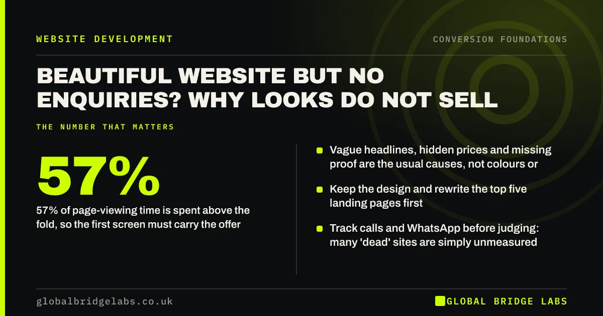
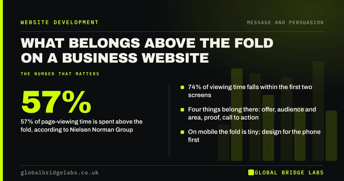
- 57% of page-viewing time is spent above the fold, according to Nielsen Norman Group.
- 74% of viewing time falls within the first two screens.
- Four things belong there: offer, audience and area, proof, call to action.
- On mobile the fold is tiny; design for the phone first.
Want your first screen reviewed on a phone? Send us the URL on WhatsApp.
Chat on WhatsApp →Does above the fold still matter?
Yes. People scroll more than they used to, but they decide whether scrolling is worthwhile based on the first screen. Nielsen Norman Group's eye-tracking found about 57% of page-viewing time was spent above the fold and 74% within the first two screens. The first screen sets the visitor's decision to stay.
What should go above the fold?
Four elements belong above the fold on almost every business landing page. Anything else competes with them.
- The offer: what you do, in plain words.
- Audience and area: who it is for and where you work.
- One piece of proof: a rating, a result or an accreditation.
- One primary call to action, with a line on what happens next.
How is the fold different on mobile?
On a phone the first screen might show only 60 to 80 words and a button. That rules out large images with text beneath them and headers that take half the screen. Design the mobile first screen deliberately: short headline, one proof line and a thumb-reachable button, with the image smaller or lower.
Want a mobile first-screen mock-up for your homepage? Ask us on WhatsApp.
Chat on WhatsApp →What should move below the fold?
Move anything that does not help a first-time visitor decide to stay. That usually includes company history, mission statements, long lists of services, sliders, newsletter sign-ups, social media feeds and cookie-cutter 'welcome to our website' text.
When is cramming the fold a mistake?
Trying to fit everything above the fold backfires. A first screen packed with text, three buttons and badges becomes unreadable. The goal is not to answer every question on the first screen but to answer the first question and give a reason to scroll. Clear, well-spaced content below the fold still gets read by interested visitors.
What does this look like in practice?
A UK wedding photographer's homepage opened with a full-screen photo and the word 'Moments'. On mobile, nothing else showed. We added a line over the photo: 'Relaxed wedding photography across Yorkshire, from £1,400', a rating line and a 'Check my date' button. Date enquiries from mobile increased over the next season.
Above the fold checklist
- Check the first screen on a phone and a laptop.
- State the offer in plain words.
- Name the audience and area.
- Show one piece of proof.
- Include one primary call to action.
- Move history, feeds and sliders lower.
Next step
Your first screen decides whether visitors give the rest of your site a chance. We can help you get it right on the devices your buyers use.
Message us on WhatsApp for a first-screen review, or book a 30-minute consultation.
Chat on WhatsApp →Sources and further reading
- Scrolling and attention · Nielsen Norman Group
- How long do users stay on web pages? · Nielsen Norman Group
- Mobile-first indexing best practices · Google Search Central
Frequently asked questions
What does above the fold mean on a website?
Above the fold is the part of a web page visible without scrolling. The term comes from newspapers, where the top half of the front page was visible on the stand. On websites the fold varies by device, and is much smaller on phones.
Does above the fold matter anymore?
Yes. People scroll, but they decide whether to scroll based on the first screen. Nielsen Norman Group found about 57% of page-viewing time is spent above the fold. The first screen must give visitors a reason to stay. On mobile the first screen is small, so design it deliberately.
Should my call to action be above the fold?
Yes for most landing pages, so ready visitors can act immediately. Repeat it after each major section for visitors who need more information first. On long pages about high-value services, the lower repetitions often get as many clicks as the top one.
Should I use a slider above the fold?
Usually not. Sliders rotate the key message away before many visitors read it, add load time and compete for attention. A single clear image with a fixed headline and call to action usually performs better. If you keep one, never rotate the headline or call to action away, and check its effect on mobile load time.
Written by

Global Bridge Labs (GBL) is a UK–Sri Lanka partner for social media, websites and BPO. Everything here comes from client delivery, not theory.