On this page
- 01Key takeaways
- 02What size should homepage headings be?
- 03How do you build a simple type scale?
- 04Why can a very large headline backfire?
- 05Should size match the heading tag?
- 06What makes text accessible at any size?
- 07When should you break these guidelines?
- 08What does this look like in practice?
- 09Homepage heading sizes checklist
- 10Next step
- 11Sources and further reading
- 12Frequently asked questions
Key takeaways
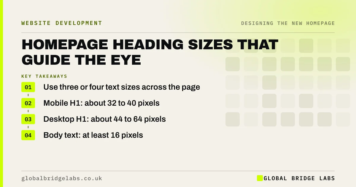
Homepage heading size tells visitors what to read first. Use a simple scale of three or four sizes, make the main heading clearly the largest and keep it readable on a phone. As a working guide, 32 to 40 pixels suits a mobile H1 and 44 to 64 pixels suits desktop, with 16 pixels or more for body text.
- Use three or four text sizes across the page.
- Mobile H1: about 32 to 40 pixels.
- Desktop H1: about 44 to 64 pixels.
- Body text: at least 16 pixels.
Want your type hierarchy reviewed? Message us on WhatsApp.
Chat on WhatsApp →What size should homepage headings be?
As a working guide, use about 32 to 40 pixels for the main heading on phones and 44 to 64 on desktop. Section headings often sit around 24 to 32 on phones and 30 to 40 on desktop. These are design conventions rather than standards, so test them with your longest headline.
How do you build a simple type scale?
Choose a body size, then multiply by a set ratio to get each step, for instance 16, 20, 25, 31 and 39 pixels at a ratio of 1.25. Use only those sizes. A consistent scale looks intentional, and it stops the page from filling up with near-identical sizes that create no clear order.
Why can a very large headline backfire?
Oversized headlines look striking in demos but wrap onto many lines with real wording, especially on phones. A 12-word headline at 64 pixels can fill the screen and push the button out of view. Check your longest real headline at the narrowest phone width before you settle on a size.
Should size match the heading tag?
The visual size should broadly follow the HTML heading order, so that sighted and screen reader users get the same structure. Do not choose an H3 only because you like how small it looks. Style the correct tag with CSS, and keep the structure logical.
What makes text accessible at any size?
Use relative units such as rem, so that text respects browser settings, and make sure it can be enlarged to 200% without breaking, as WCAG requires. Contrast and line height matter as much as size. Thin, pale fonts can be hard to read, even when they are large.
When should you break these guidelines?
Break them when your headline is unusually long or short, or when a strong brand style calls for it. Short, poster-like statements can go larger, and longer headlines should go smaller. Readability on a real phone is the test that matters, whatever a type scale suggests.
What does this look like in practice?
A pattern we see: a template demo with a two-word headline at 72 pixels, filled with a real twelve-word headline that takes up the whole phone screen. Reducing the size a step or two usually brings the button and first proof back into view, with no loss of impact.
Homepage heading sizes checklist
- Choose a body size of at least 16 pixels.
- Set three or four steps in a scale.
- Test your longest headline on a phone.
- Match sizes to heading tags.
- Use relative units.
- Test browser zoom at 200%.
Next step
Open your homepage at the narrowest phone width and count the lines your headline takes. If it is more than three or four, reduce the size or shorten the words.
Message us on WhatsApp for a design review, with no pitch.
Chat on WhatsApp →Sources and further reading
- Understanding SC 1.4.4: Resize Text · W3C Web Accessibility Initiative
- Visual hierarchy in UX: definition · Nielsen Norman Group
- Understanding WCAG 2.2 success criterion 2.4.6: Headings and Labels · W3C
Frequently asked questions
What font size should an H1 be?
There is no fixed rule. As a working guide, 32 to 40 pixels suits phones and 44 to 64 suits desktop. Choose a size that keeps your real headline to a few lines and leaves the main button in view.
What is a good body text size for a website?
Use at least 16 pixels for body text on all devices, which is the browser default. Some sites go slightly larger for comfort. Use relative units so that people can adjust size through their browser settings.
How many font sizes should a homepage use?
Three or four sizes is usually enough: main heading, section heading, body and small text. Using too many creates visual noise and weakens hierarchy, so stick to a small scale and apply it consistently.
Written by

Global Bridge Labs (GBL) is a UK–Sri Lanka partner for social media, websites and BPO. Everything here comes from client delivery, not theory.