On this page
- 01Key takeaways
- 02Why do speed and design seem to conflict?
- 03Which design choices cost the most speed?
- 04How do you keep a site fast and distinctive?
- 05When is a heavier design worth it?
- 06What does this look like in practice?
- 07Speed and design checklist
- 08Next step
- 09Sources and further reading
- 10Frequently asked questions
Key takeaways
You rarely have to choose between website speed and design. The conflict comes from a handful of specific choices: full-screen video, sliders, heavy animation, many font weights and oversized images. Good design decides what the visitor needs to see first and delivers that quickly. A site can look distinctive and load fast if the first screen is treated as a budget.
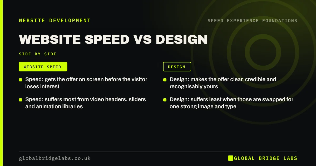
- Speed: gets the offer on screen before the visitor loses interest.
- Design: makes the offer clear, credible and recognisably yours.
- Speed: suffers most from video headers, sliders and animation libraries.
- Design: suffers least when those are swapped for one strong image and type.
Want both? Send us a page you like the look of and we will tell you what it costs in speed.
Chat on WhatsApp →Why do speed and design seem to conflict?
They seem to conflict because the most eye-catching effects are the heaviest. A background video, a parallax scroll or a carousel of large photographs impresses in a design review on a fast laptop. On a phone, the same effects delay the first screen and compete with the content they were meant to frame.
The real conflict is between decoration and priority. Design that serves the visitor and speed that serves the visitor point the same way.
Which design choices cost the most speed?
A few choices account for most of the cost. Each has a lighter alternative that keeps the intent.
- Video headers: replace with a still image, or load video only on wide screens.
- Sliders: replace with one image and one message.
- Animation libraries: use a few simple transitions built into the browser.
- Custom fonts in many weights: use two weights and let text show at once.
- Full-size photographs: resize to the space and use modern formats.
How do you keep a site fast and distinctive?
Set a budget for the first screen and design within it. Typography, colour, spacing and one well-chosen image cost almost nothing in speed and carry most of a brand's character. Richer elements can sit lower on the page, where they load after the visitor has what they came for.
- 1. Decide what must appear first: headline, proof point, main action.
- 2. Give that screen a weight limit and keep to it.
- 3. Reserve space for every image so nothing shifts.
- 4. Review each design on a mid-range phone before sign-off.
- Performance budgets: stop your website slowing down again
- What belongs above the fold on a business website
Planning a redesign? Ask us on WhatsApp how to brief speed into it.
Chat on WhatsApp →When is a heavier design worth it?
A heavier design is worth it when the visuals are the product. A photographer, a venue, a kitchen showroom or a fashion brand sells on imagery, and stripping it out would cost more enquiries than the extra load time. The answer there is to deliver the imagery well: correctly sized, in modern formats, with the first image prioritised and the rest loading as the visitor scrolls.
It is not worth it when the effect exists because it looked good in the pitch.
What does this look like in practice?
A pattern we see after a redesign: the new site won approval on a large monitor, with a video header and animated sections. Enquiries from phones fall, because the first screen now takes several seconds to show anything and the call button arrives last.
Keeping the video for wide screens and showing a still on mobile, with the headline and button as text, preserves the look where it works and restores the speed where it matters. Across client work at Global Bridge Labs (GBL), we have seen a 2.4x enquiry rate from conversion changes like these.
Speed and design checklist
- List the first-screen elements and what each one weighs.
- Replace sliders and video headers on mobile.
- Limit fonts to two weights.
- Resize and convert every image.
- Approve designs on a phone, not a monitor.
- Add speed targets to the design brief.
Next step
A good-looking site that nobody waits for is not good design. We can review a current page or a proposed design and show where it will be slow before it is built.
Message us on WhatsApp for a speed review of your design, or book a 30-minute consultation.
Chat on WhatsApp →Sources and further reading
- Optimise Largest Contentful Paint · web.dev (Google)
- Performance budgets 101 · web.dev (Google)
- Understanding Core Web Vitals and Google search results · Google Search Central
Frequently asked questions
Does good design slow a website down?
Not by itself. Layout, colour, typography and a well-chosen image cost very little. Speed suffers from specific choices such as video headers, sliders, heavy animation and many font weights. Replace those and a site can be both distinctive and quick.
Should I choose a fast website or a beautiful one?
You should not need to choose. Decide what the visitor must see first and make that screen light. Put richer visuals lower down, where they load after the essentials. Only image-led businesses face a real trade-off, and it is solved by delivering images properly.
Are sliders bad for website speed?
Usually. A slider loads several large images and a script to display one message at a time, most of which visitors never see. One image with one clear message is faster and tends to communicate better.
How do I brief a designer for speed?
Give targets in the brief: main content within 2.5 seconds on mobile, no layout shift and a limit on first-screen weight. Ask for designs to be reviewed on a mid-range phone and for alternatives to video headers and sliders on small screens.
Written by

Global Bridge Labs (GBL) is a UK–Sri Lanka partner for social media, websites and BPO. Everything here comes from client delivery, not theory.