On this page
- 01Key takeaways
- 02How do web fonts slow a page down?
- 03What do visitors actually experience?
- 04How do you keep brand fonts and stay fast?
- 05Should you use system fonts instead?
- 06When are custom fonts worth the cost?
- 07What does this look like in practice?
- 08Web font speed checklist
- 09Next step
- 10Sources and further reading
- 11Frequently asked questions
Key takeaways
Web fonts slow a site when too many are loaded, from another company's servers, in a way that hides text until they arrive. A visitor on a phone can be left looking at a page with images and no words. You do not have to give up brand typography. Use two weights, host the files yourself, and let text show immediately in a fallback font.
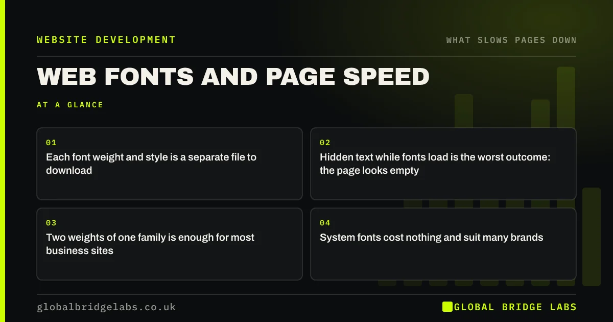
- Each font weight and style is a separate file to download.
- Hidden text while fonts load is the worst outcome: the page looks empty.
- Two weights of one family is enough for most business sites.
- System fonts cost nothing and suit many brands.
Want to know how many font files your site loads? Send us the URL on WhatsApp.
Chat on WhatsApp →How do web fonts slow a page down?
A web font is a file the browser must download before it can draw text in that typeface. Every weight, such as regular, medium and bold, and every italic is another file. A design using two families in four weights each can ask for eight or more.
Until a font arrives, the browser has to choose: hide the text, or show it in a fallback font and swap later. The first makes the page look empty. The second can make the text jump when the swap happens.
What do visitors actually experience?
Visitors experience one of two faults. With hidden text, the layout and images appear and the words are missing for a second or more, which on a slow connection looks like a broken page. With a late swap, they start reading and the lines reflow, sometimes moving a button as they reach for it.
Both are worse on mobile data, and both happen on every first visit.
How do you keep brand fonts and stay fast?
Load fewer fonts, from your own site, and never block text on them.
- 1. Cut to one family and two weights where the design allows.
- 2. Use the WOFF2 format, which is the smallest widely supported.
- 3. Host the font files on your own domain instead of a third party.
- 4. Set fonts to swap, so text shows at once in a fallback.
- 5. Choose a fallback with similar proportions to limit movement.
- 6. Preload only the one or two files used on the first screen.
Want your font loading checked and tidied? Ask us on WhatsApp.
Chat on WhatsApp →Should you use system fonts instead?
System fonts are the typefaces already installed on a phone or computer. They load instantly because there is nothing to download, and modern ones are well designed. Many large sites use them for body text and reserve a brand typeface for headings.
The trade-off is control. Text will look slightly different on an iPhone, an Android phone and a Windows laptop. For most service businesses that matters far less than a page that reads immediately.
When are custom fonts worth the cost?
Custom fonts are worth it when typography carries the brand: fashion, design studios, publishing and premium products. In those cases, load them well. What is rarely worth it is a third or fourth weight used for one line, or an icon font loaded in full to show five icons.
What does this look like in practice?
A pattern we see on template-built sites: the theme loads two font families in every available weight from an external service, plus an icon font. The design uses two weights. On a phone, headings appear a second after the images, and the page shifts as they do.
Cutting to the weights in use, hosting them on the site and showing fallback text first makes the page readable sooner with no visible change to the brand. Global Bridge Labs (GBL) includes font loading in every speed review.
Web font speed checklist
- Count the font files each page loads.
- Remove weights and styles the design does not use.
- Convert to WOFF2 and host the files yourself.
- Make text show immediately in a fallback font.
- Replace icon fonts with individual icons.
- Check on a phone that text appears with the layout.
Next step
Words are what visitors came for. They should never be the last thing to arrive. We will check how your fonts load and what can go.
Message us on WhatsApp for a font loading review.
Chat on WhatsApp →Sources and further reading
- Best practices for fonts · web.dev (Google)
- Optimise Cumulative Layout Shift · web.dev (Google)
- Understanding Core Web Vitals and Google search results · Google Search Central
Frequently asked questions
Do custom fonts slow down a website?
They can. Each weight and style is a separate download, and text may be hidden or shift while fonts load. Using two weights, hosting the files yourself and letting text show in a fallback font keeps custom typography with very little cost.
Why is text invisible while my website loads?
The browser is waiting for a web font before drawing the text. On slow connections that can last a second or more. Setting fonts to swap makes text appear immediately in a fallback typeface and switch when the custom font arrives.
Are system fonts better for speed?
Yes. System fonts are already on the visitor's device, so nothing is downloaded and text appears instantly. They look slightly different across devices. Many sites use them for body text and keep a brand font for headings.
How many fonts should a website use?
One family in two weights is enough for most business sites, with a second family only if the brand requires it. Every additional weight is another file for the visitor's phone to fetch before the page looks finished.
Written by

Global Bridge Labs (GBL) is a UK–Sri Lanka partner for social media, websites and BPO. Everything here comes from client delivery, not theory.