On this page
- 01Key takeaways
- 02What is website friction?
- 03What are the most common friction points?
- 04How much does friction cost?
- 05How do you find friction on your own site?
- 06How do you remove friction without losing information?
- 07When is friction useful?
- 08What does this look like in practice?
- 09Friction removal checklist
- 10Next step
- 11Sources and further reading
- 12Frequently asked questions
Key takeaways
Website friction is anything that makes the next step harder than it needs to be: extra fields, slow pages, unclear buttons, forced accounts, surprise costs or dead ends. Each obstacle is small on its own. Together they are often the difference between a good website and one that converts.
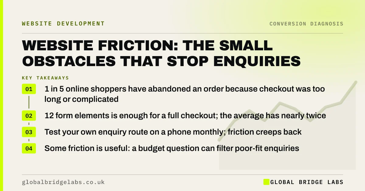
- 1 in 5 online shoppers have abandoned an order because checkout was too long or complicated.
- 12 form elements is enough for a full checkout; the average has nearly twice that.
- Test your own enquiry route on a phone monthly; friction creeps back.
- Some friction is useful: a budget question can filter poor-fit enquiries.
Want your enquiry route tested for friction? Message us on WhatsApp.
Chat on WhatsApp →What is website friction?
Website friction is any effort, delay, confusion or doubt a visitor meets between wanting to act and completing the action. It includes physical effort (typing, tapping, scrolling), waiting (slow pages), thinking (unclear choices) and worry (unexpected costs or commitments).
Friction is the most fixable part of the gap between a good website and a high-converting one, because it can be found by testing and removed without changing the brand.
What are the most common friction points?
The same obstacles appear on most small business sites we test. None look serious in a design review. All of them cost enquiries.
- Forms asking for more than you need to reply, such as full address on first contact.
- Phone numbers that are not clickable on mobile.
- Buttons that say 'Submit' with no hint of what happens next.
- Error messages that clear the whole form.
- Pages that take several seconds to show text on mobile data.
- Pop-ups that block the page before visitors have read anything.
- Required account creation before buying or booking.
- Delivery costs or fees revealed only at the last step.
How much does friction cost?
Baymard Institute's checkout research found nearly one in five shoppers had abandoned an order because the process was too long or complicated, and that an ideal checkout needs only 12 form elements while the average shows around 23. Speed is friction too: the BBC found it lost an additional 10% of users for every extra second its site took to load, as reported by web.dev.
How do you find friction on your own site?
Use the site as a buyer would. On a phone, over mobile data, go from a Google result to a completed enquiry or purchase and note every moment of hesitation or annoyance. Then watch recordings in a free tool such as Microsoft Clarity for rage clicks, repeated form errors and abandoned forms.
- Time the route from landing page to confirmation.
- Count taps and fields.
- Try deliberate mistakes to test error handling.
- Ask someone outside the business to do the same and watch silently.
Want someone outside the business to test your route? Ask us on WhatsApp.
Chat on WhatsApp →How do you remove friction without losing information?
Ask only for what you need to reply, and collect the rest later. A name, phone or email and one line about the job are enough for most service enquiries. Make every phone number and email tappable, show costs early, allow guest checkout, and write buttons that say what happens next. GOV.UK's guidance on structuring forms is a strong, free reference.
When is friction useful?
Friction is useful when it filters out enquiries you cannot serve. A question about budget, postcode or project start date adds a few seconds but can save hours of calls with poor-fit buyers. The test is whether the extra step improves qualified enquiries, not just total enquiries.
What does this look like in practice?
A UK electrical contractor's quote form had 11 fields, including full address and a mandatory file upload. On mobile, the upload failed for many phones. We cut the form to four fields, made the upload optional and moved it to the follow-up email. Form completions rose substantially the following month with no change in lead quality.
Friction removal checklist
- Remove every form field you do not need to reply.
- Make phone numbers and emails tappable.
- Replace 'Submit' with words describing the next step.
- Keep entered data when an error appears.
- Show all costs before the last step.
- Allow guest checkout or booking.
- Test the route on a phone every month.
Next step
Friction is invisible to the people who built the site and obvious to the people trying to use it. We will walk your enquiry route with you and list every obstacle worth removing.
Message us on WhatsApp for a friction review, or book a 30-minute consultation.
Chat on WhatsApp →Sources and further reading
- E-commerce checkout usability: research and benchmark · Baymard Institute
- Why does speed matter? · web.dev
- Structuring forms · GOV.UK Service Manual
- About Microsoft Clarity (heatmaps and session recordings) · Microsoft
Frequently asked questions
What is friction on a website?
Friction is anything that makes the next step harder than necessary: extra form fields, slow pages, unclear buttons, forced account creation, surprise costs, pop-ups or dead ends. Each obstacle is small, but together they stop a significant share of visitors from enquiring or buying.
How do I reduce friction on my website?
Ask only for the information you need to reply, make phone numbers tappable, show costs early, allow guest checkout, write buttons that describe the next step, keep data when errors occur, and test the full route on a phone over mobile data every month.
How many fields should a contact form have?
For most service enquiries, three to five: name, phone or email, and a short description, plus one qualifying question if poor-fit enquiries are a problem. Collect addresses, files and detailed requirements in the follow-up rather than on first contact. Fewer fields on first contact usually means more enquiries sent.
Is all friction bad for conversion?
No. A qualifying question about budget, location or timescale adds friction but can improve lead quality and save sales time. Judge friction by its effect on qualified enquiries, not total enquiries. If a question removes poor-fit enquiries and qualified enquiries hold steady or rise, the friction is earning its place on the form.
Written by

Global Bridge Labs (GBL) is a UK–Sri Lanka partner for social media, websites and BPO. Everything here comes from client delivery, not theory.