On this page
- 01Short answer
- 02What is a call to action on a website?
- 03Why do calls to action get ignored?
- 04Which call to action examples work for service businesses?
- 05Where should calls to action go on a page?
- 06What difference can better calls to action make?
- 07When should you offer more than one action?
- 08What does this look like in practice?
- 09Call to action checklist
- 10Next step
- 11Sources and further reading
- 12Frequently asked questions
Short answer
The website calls to action that get clicked name the outcome rather than the action, match how buyers prefer to get in touch, and appear where the reader has just been persuaded. "Get my fixed-price quote" beats "Submit", and one clear primary action beats five competing ones.
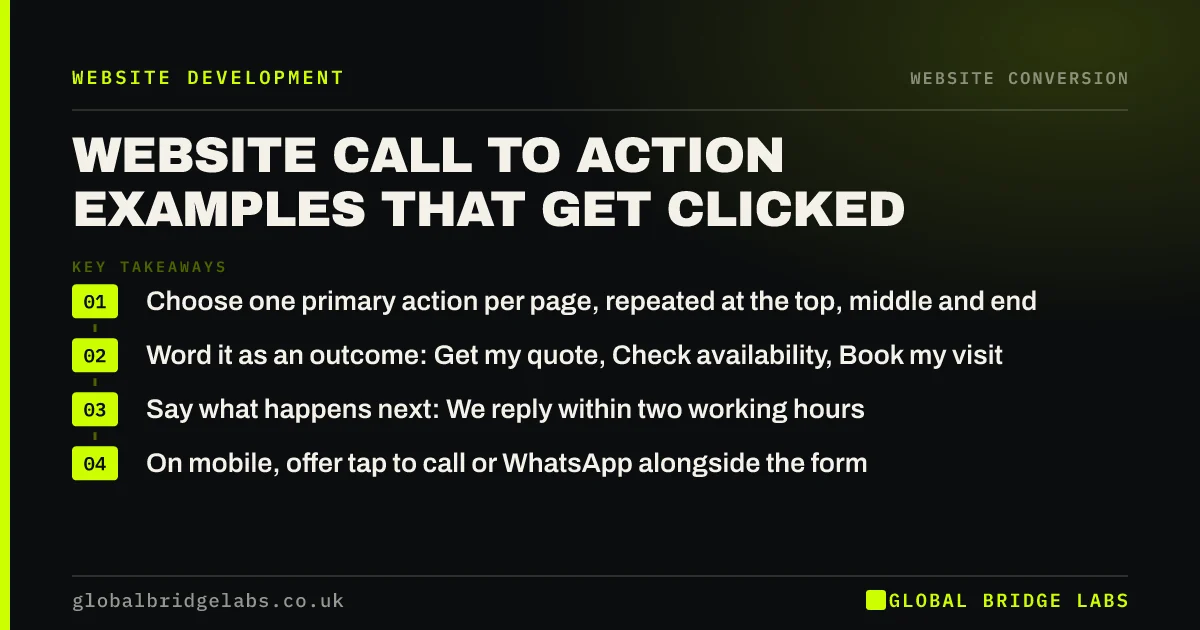
- Choose one primary action per page, repeated at the top, middle and end.
- Word it as an outcome: Get my quote, Check availability, Book my visit.
- Say what happens next: We reply within two working hours.
- On mobile, offer tap to call or WhatsApp alongside the form.
Want your buttons rewritten for your service? Send us the page link on WhatsApp.
Chat on WhatsApp →What is a call to action on a website?
A call to action (CTA) is a button, link or short prompt on a web page that asks the visitor to take a specific next step, such as requesting a quote, booking an appointment, calling or buying.
It is the point where the page stops informing and starts asking. Everything above it should be building the case for that one step, which is why the choice of action matters as much as the wording.
Why do calls to action get ignored?
Calls to action get ignored when they are vague, when there are too many of them, or when the visitor is not yet convinced. "Contact us" asks for effort without promising anything. Five buttons of equal weight force a decision the page should have made.
They are also ignored when they appear only at the bottom of a long page, or only at the top. Readers who are persuaded halfway down need a way to act at that point.
- Generic labels: Submit, Click here, Learn more, Contact us.
- Competing actions: quote, call, brochure, newsletter and social icons together.
- No reassurance about what happens after clicking.
- Buttons that look like plain text or disappear on mobile.
Which call to action examples work for service businesses?
Choose the wording that fits the buyer's urgency and the size of the decision. These examples are grouped by the action they ask for.
- Urgent local service: Call now, engineer within 90 minutes. Or: WhatsApp us a photo of the problem.
- Quoted work: Get my fixed-price quote. Or: Send your plans for a quote in 48 hours.
- Appointments: Check availability this week. Or: Book my free assessment.
- Professional services: Book a 30-minute call. Or: Get a fee estimate.
- E-commerce: Add to basket. Or: Buy now, free UK delivery over £50.
- B2B: Get a costed proposal. Or: See pricing for your team size.
Where should calls to action go on a page?
Place the primary call to action in three positions: in the first screen, immediately after the strongest piece of proof or pricing, and at the end of the page. On mobile, a sticky bar with call and WhatsApp buttons keeps the action one tap away without covering content.
Pair each button with a line of reassurance, such as no obligation, reply within two working hours or fixed price before we start. Those few words answer the question that stops people clicking: what am I committing to?
Want a call to action plan for your homepage and top service page? Message us on WhatsApp.
Chat on WhatsApp →What difference can better calls to action make?
The effect is usually modest per change but compounds. Reducing competing actions, rewording buttons and adding reassurance lines are small edits, and on a page with steady traffic they can visibly lift the share of visitors who act.
Measure it properly. Track clicks on each button as a GA4 event, and compare completed enquiries rather than clicks alone, because a button that attracts more clicks from less serious visitors is not an improvement.
When should you offer more than one action?
Offer a secondary action when your buyers genuinely split. Some prefer to call, some prefer to write. A primary button plus a quieter phone link or WhatsApp option serves both without creating a tie.
Avoid equal-weight choices. If the quote form and the brochure download look identical, many visitors will take the easier, lower-value option, or neither.
What does this look like in practice?
A pattern in logistics and B2B services: a header with Contact us, a hero with Learn more, a footer newsletter sign-up and a Download brochure button in the middle of the page. None of them tells the visitor how to get a price.
Replacing all four with one primary action, Get a quote in 24 hours, plus a phone number for urgent jobs, gives the page a single purpose. The brochure moves to the resources page, where the few people who want it can still find it.
Call to action checklist
Check each page against these.
- Choose one primary action per page.
- Word the button as an outcome, in the first person where it reads well.
- Add a reassurance line next to the button.
- Place it at the top, after proof and at the end.
- Add a sticky call and WhatsApp bar on mobile.
- Track clicks and completed enquiries separately.
Next step
If your pages end with Contact us, we will rewrite the calls to action on your three most visited pages with you in 30 minutes.
Message us on WhatsApp for call to action rewrites, or book a 30-minute consultation.
Chat on WhatsApp →Sources and further reading
- About key events · Google Analytics Help
- Writing to GOV.UK standards: writing guidelines · GOV.UK
- How to use click to chat · WhatsApp Help Center
Frequently asked questions
What is a good call to action for a website?
A good call to action names the outcome the visitor gets, such as Get my fixed-price quote or Check availability this week, rather than a generic action like Submit. It appears where the visitor has just been persuaded and is paired with a short line explaining what happens next.
How many calls to action should a page have?
One primary action, repeated in several places on the page, plus at most one quieter secondary option such as a phone number. Several different actions with equal visual weight make visitors hesitate, and hesitation usually ends with them leaving without doing anything.
Should my call to action say Contact us?
Usually not. Contact us asks for effort without promising anything specific. Replace it with the outcome, such as Get my quote, Book a call or WhatsApp us a photo, and add a line about what happens next, for example a reply within two working hours.
Where is the best place for a call to action?
In the first screen, directly after your strongest proof or pricing section, and at the end of the page. On mobile, a sticky bar with call and WhatsApp buttons keeps the action one tap away. This way visitors can act whenever they are convinced, not only at the bottom.
Written by

Global Bridge Labs (GBL) is a UK–Sri Lanka partner for social media, websites and BPO. Everything here comes from client delivery, not theory.