On this page
- 01Key takeaways
- 02Why do too many choices stop visitors acting?
- 03Where does choice overload appear on small business sites?
- 04How do you reduce choices without losing content?
- 05How many options is too many?
- 06When do more choices help?
- 07What does this look like in practice?
- 08Choice reduction checklist
- 09Next step
- 10Sources and further reading
- 11Frequently asked questions
Key takeaways
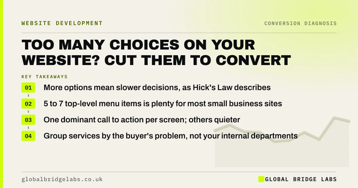
Too many choices on a website slow visitors down and make them less likely to act. Hick's Law describes how decision time rises with the number of options. For a small business site, the fix is to reduce competing choices at each decision point, not to delete content: fewer menu items, one dominant button and grouped services.
- More options mean slower decisions, as Hick's Law describes.
- 5 to 7 top-level menu items is plenty for most small business sites.
- One dominant call to action per screen; others quieter.
- Group services by the buyer's problem, not your internal departments.
Want your menu and buttons reviewed for overload? Message us on WhatsApp.
Chat on WhatsApp →Why do too many choices stop visitors acting?
Every option on a page asks the visitor to make a decision. When a homepage offers eight menu items, four buttons and a carousel, visitors spend their limited attention choosing where to click rather than deciding to enquire. Many leave instead. Nielsen Norman Group summarises this as Hick's Law: the more choices, the longer the decision.
Where does choice overload appear on small business sites?
Overload rarely comes from one big mistake. It builds up as each department, service or idea gets its own link or button.
- Menus with 8 or more top-level items and deep drop-downs.
- Homepages with several equally loud buttons.
- Service lists of 15 items with no grouping.
- Contact pages offering phone, form, email, WhatsApp, chat and booking with equal weight.
- Product pages with many variants shown as a wall of options.
How do you reduce choices without losing content?
Keep the content, change the choices. Group related pages under clear headings, move secondary links to the footer, and make one action dominant on each page. Visitors should see a short set of obvious paths, with detail one step away for those who want it.
- Cut the main menu to 5 to 7 items named in the buyer's words.
- Group services into 3 to 5 problem-based categories.
- Make one button dominant per screen; style the rest as text links.
- Offer one primary contact route per page, with others secondary.
- Move policies, careers and news to the footer.
Want a proposed simpler menu for your site? Send us the URL on WhatsApp.
Chat on WhatsApp →How many options is too many?
There is no magic number, but practical limits help. Most small business sites need 5 to 7 top-level menu items, one primary and at most one secondary call to action per screen, and service groupings of 3 to 5. If you cannot explain in one sentence why an option is at that level, move it down.
When do more choices help?
More choices help when visitors already know exactly what they want and need to find it fast, such as a parts supplier or a large shop. There, strong search, filters and clear categories matter more than a short menu. For service businesses, where visitors are working out what they need, fewer and clearer choices almost always convert better.
What does this look like in practice?
A UK facilities management firm had 11 top-level menu items, including every division name. We regrouped them into four buyer-facing categories (offices, schools, healthcare, retail), moved corporate pages to the footer and made 'Request a site survey' the single dominant button. Visitors reached service pages faster and survey requests rose over the following quarter.
Choice reduction checklist
- Count top-level menu items; aim for 5 to 7.
- Rename menu items in the buyer's language.
- Group services into 3 to 5 problem-based categories.
- Make one button dominant per screen.
- Choose one primary contact route per page.
- Move low-use links to the footer.
Next step
Cutting choices feels risky because every option was added for a reason. We can help you decide what stays at the top and what moves one click down.
Message us on WhatsApp for a choice overload review, or book a 30-minute consultation.
Chat on WhatsApp →Sources and further reading
- Hick's Law: designing long menu lists · Nielsen Norman Group
- Visual hierarchy in UX: definition · Nielsen Norman Group
- SEO Starter Guide · Google Search Central
Frequently asked questions
What is Hick's Law in web design?
Hick's Law states that the more choices you present, the longer people take to decide. In web design it means menus, buttons and options should be limited and grouped so visitors can quickly see the path that suits them, rather than weighing many equal alternatives.
How many items should be in a website menu?
Most small business websites work well with 5 to 7 top-level menu items, named in the buyer's language. Larger sites can use grouped drop-downs, but the top level should still be short enough to scan in a couple of seconds.
Should I offer multiple ways to contact me?
Offer several, but make one primary on each page. Buyers prefer different channels, so phone, form and WhatsApp can all exist. Give the one that suits most visitors on that page visual priority, and keep the others quieter. One clear default speeds the decision.
Does removing menu items hurt SEO?
Not if the pages remain linked from somewhere sensible, such as a category page or the footer. Search engines follow internal links wherever they are. Keep important service pages linked from the main navigation or a well-linked hub page. Check Search Console after any menu change.
Written by

Global Bridge Labs (GBL) is a UK–Sri Lanka partner for social media, websites and BPO. Everything here comes from client delivery, not theory.