On this page
- 01Key takeaways
- 02Who visits a charity website?
- 03What should the main menu include?
- 04How should 'Get help' be handled?
- 05Where should the donate button go?
- 06How does navigation build trust for donors?
- 07What does this look like in practice?
- 08Charity navigation checklist
- 09Next step
- 10Sources and further reading
- 11Frequently asked questions
Key takeaways
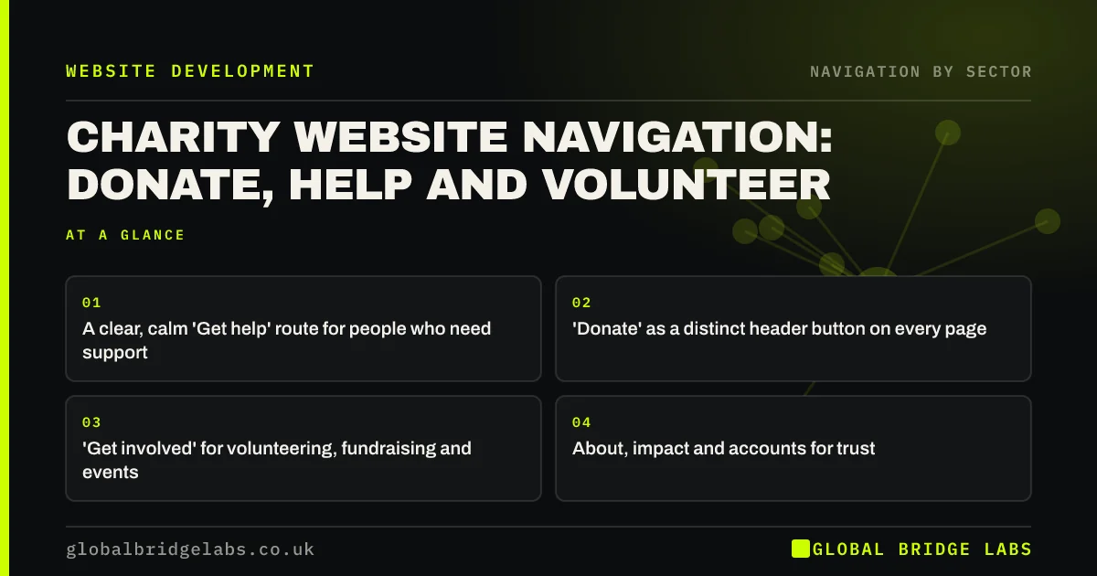
Charity websites serve very different visitors: people seeking help, donors, volunteers, fundraisers and partners. Navigation should give each a clear route, with 'Get help' easy to find and calm in tone, 'Donate' as a visible header button and 'Get involved' gathering volunteering and fundraising. Keep the menu short by grouping, not by hiding the help route.
- A clear, calm 'Get help' route for people who need support.
- 'Donate' as a distinct header button on every page.
- 'Get involved' for volunteering, fundraising and events.
- About, impact and accounts for trust.
Want your charity website navigation reviewed? Message us on WhatsApp.
Chat on WhatsApp →Who visits a charity website?
People seeking help, often stressed or vulnerable; donors deciding whether to give; volunteers and fundraisers looking for ways to take part; and partners, funders or journalists. Each needs something different, and the most vulnerable visitors are least able to search for it.
What should the main menu include?
A typical structure keeps the menu short while giving each group its own route.
- Get help: support, advice and how to contact services.
- What we do: programmes and impact.
- Get involved: volunteer, fundraise, events.
- About: team, accounts, governance.
- Donate: a distinct button.
How should 'Get help' be handled?
Put it first or prominently, in plain, calm language, and make it reachable from every page and on phones. Show urgent contact details, such as helpline numbers, without making people dig. If some visitors may be at risk, consider a quick exit button and guidance on hiding browsing.
Want your help route designed for people under stress? Message us on WhatsApp and we will discuss your requirements.
Chat on WhatsApp →Where should the donate button go?
In the header on every page, styled as a distinct button, and visible on phones without opening the menu. Link it to a short donation page with clear options. Do not let it crowd out 'Get help'; both should be visible.
How does navigation build trust for donors?
Donors look for evidence: what the charity achieves, who runs it and how money is spent. Link impact, the team and annual accounts or reports from the About section. Make the registered charity number visible in the footer.
What does this look like in practice?
A pattern we see: a charity's menu leads with 'News', 'Events' and 'Shop', and support information is three levels down under 'Our work'. Adding 'Get help' as the first menu item and keeping 'Donate' as a header button gives both the people the charity serves and its supporters a clear route.
Charity navigation checklist
- 'Get help' first or prominent, on every page.
- Helpline details easy to reach.
- Donate button in the header.
- Get involved grouping volunteering and fundraising.
- Impact and accounts linked from About.
- Charity number in the footer.
Next step
On a phone, time how long it takes to find your helpline number from your homepage.
Message us on WhatsApp for a charity website review, or book a 30-minute consultation.
Chat on WhatsApp →Sources and further reading
Frequently asked questions
What should be in a charity website's menu?
A clear 'Get help' route, what the charity does and its impact, ways to get involved, about information including accounts, and a distinct 'Donate' button. Keep news, shop and press in secondary positions.
Where should the donate button be on a charity website?
In the header on every page, styled as a button and visible on phones without opening the menu. It should link to a short, simple donation page.
Should charity websites have a quick exit button?
If people at risk, for example from domestic abuse, may use the site, a quick exit button that leaves the site immediately is a widely used safeguard. Pair it with guidance on browsing safely.
Written by

Global Bridge Labs (GBL) is a UK–Sri Lanka partner for social media, websites and BPO. Everything here comes from client delivery, not theory.