Short, practical writing on visibility, conversion and capacity, from the team doing the work for 120+ UK startups, SMEs and enterprises.
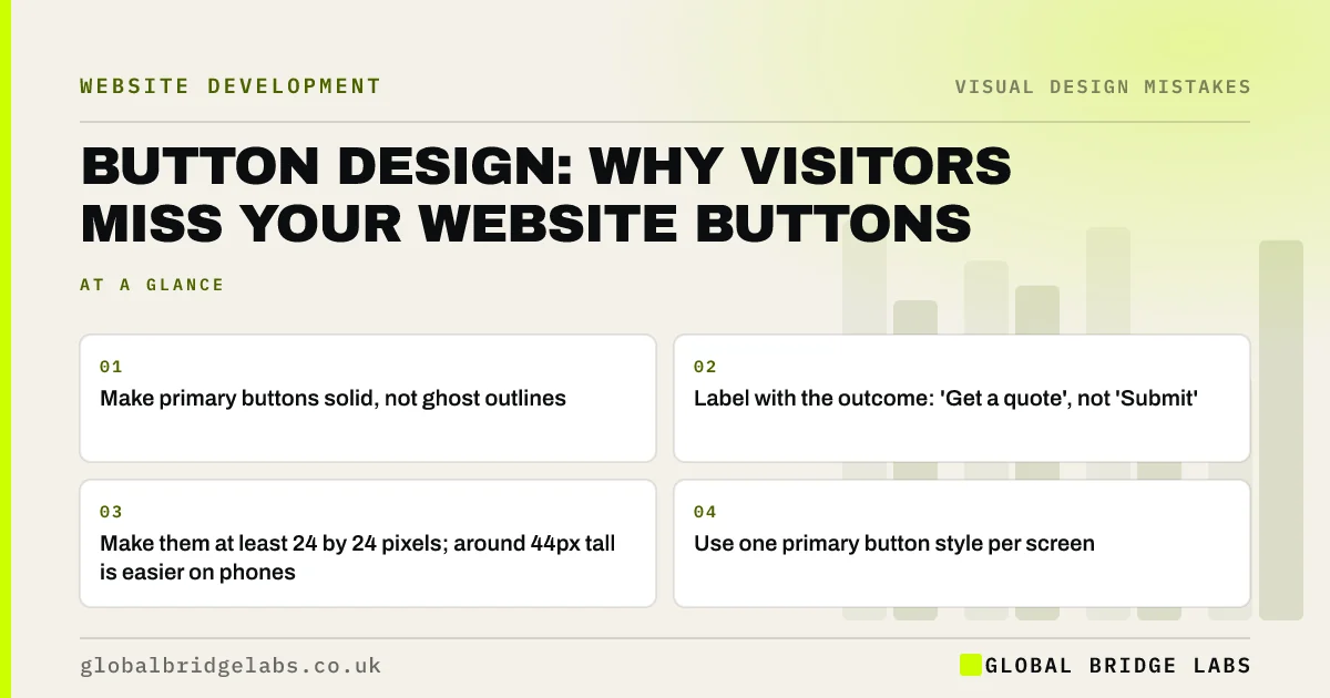
Why visitors miss website buttons: ghost buttons, low contrast, vague labels and links that look like text. How to design buttons people see and click.
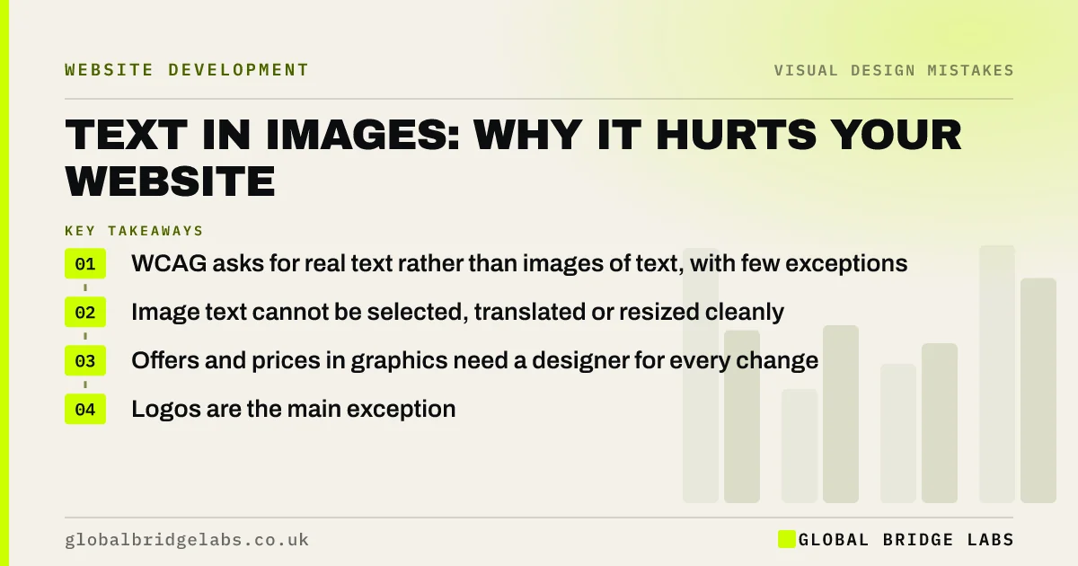
Why putting text in images hurts a business website: search engines and screen readers miss it, it blurs on zoom and mobile, and it is hard to update.
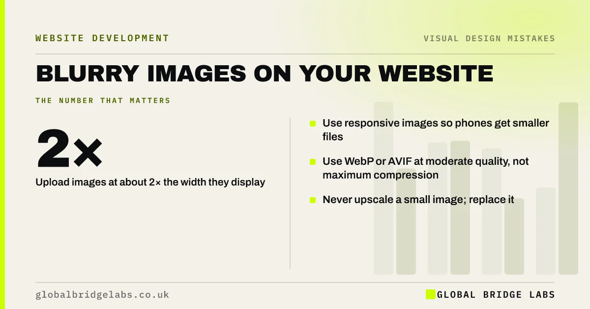
Why images look blurry on your website, from over-compression and upscaling to high-resolution screens, and how to fix them without slowing the page down.
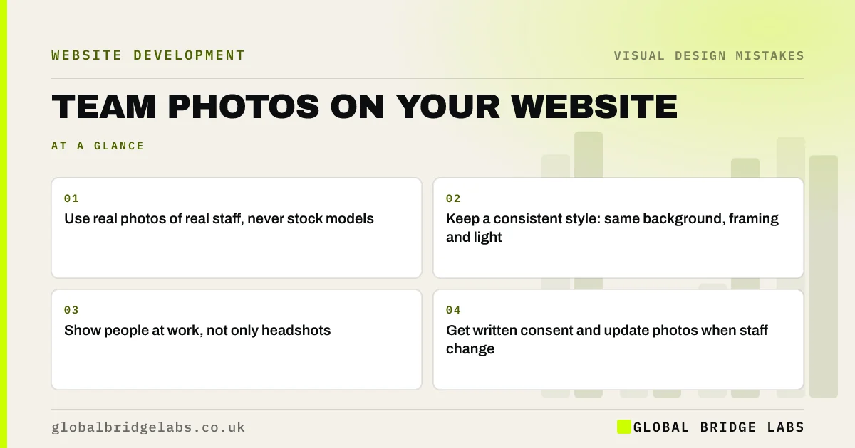
How to use team photos on a business website: why real photos beat stock, what makes a good team shot, where to place them and mistakes to avoid.
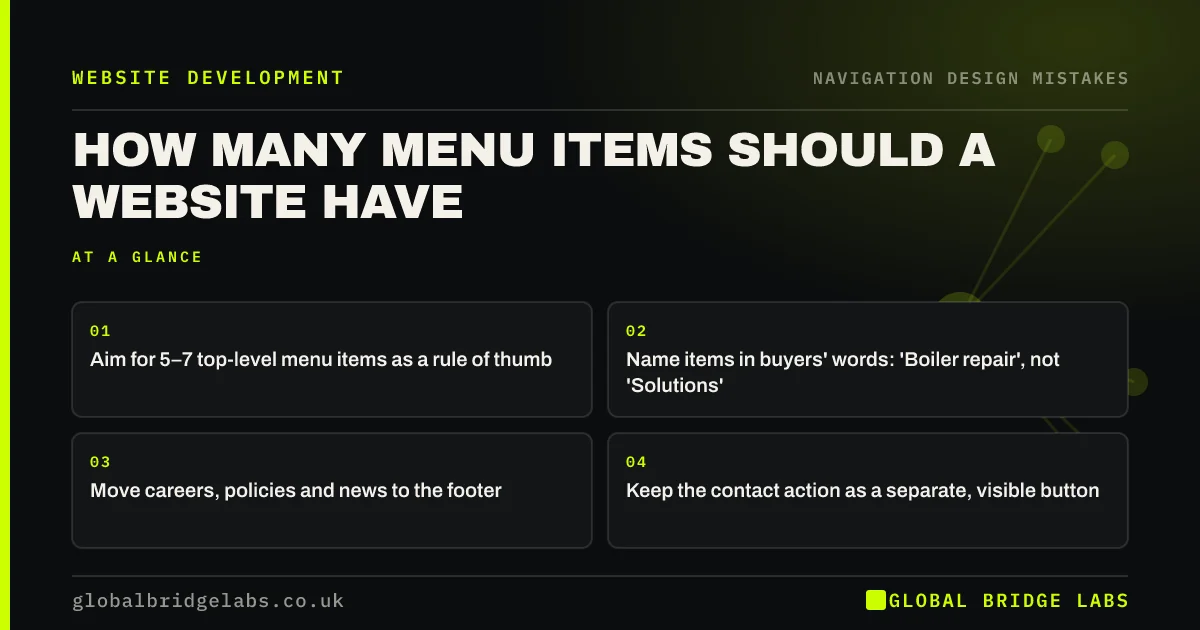
How many menu items a business website should have, why long menus lose visitors, and how to cut yours to five to seven clear labels without hiding pages.
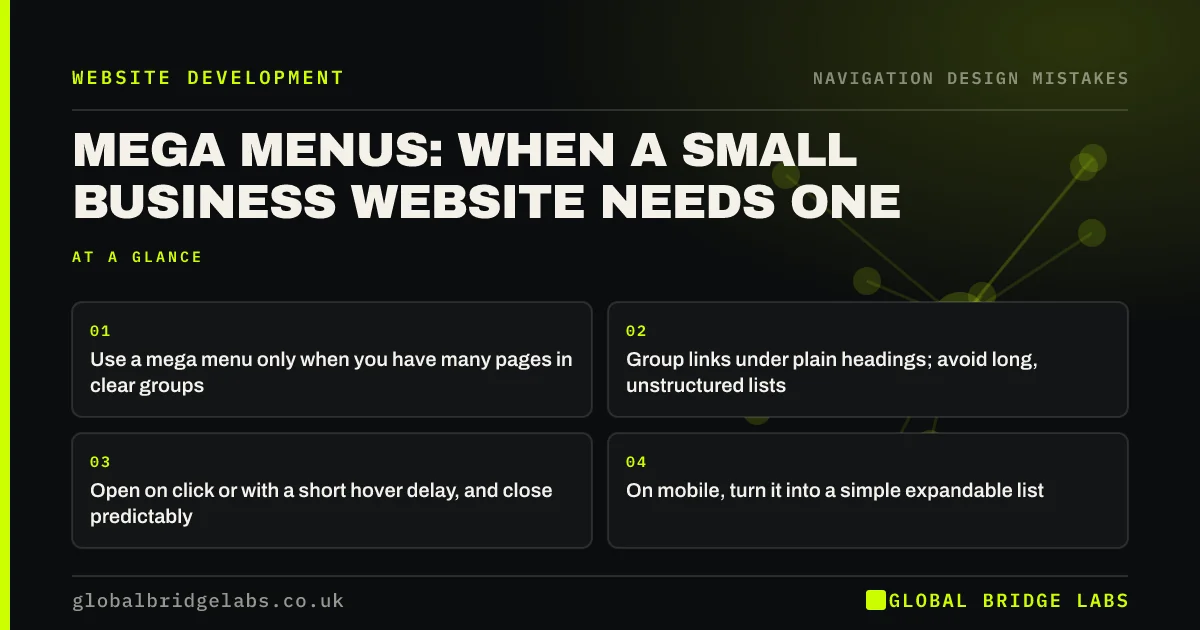
When a mega menu helps a small business website and when it hurts: how many links justify one, how to organise it and the hover mistakes to avoid.
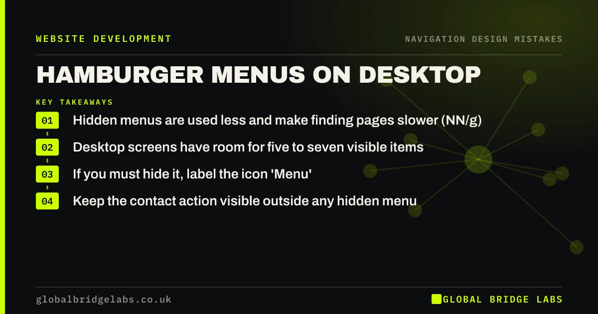
Why a hamburger menu on desktop hides your services and lowers engagement, when it is acceptable, and how to show a visible menu without clutter.
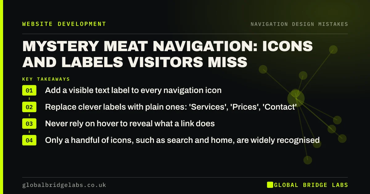
Mystery meat navigation explained: unlabelled icons, clever menu names and hover-only links, why visitors miss them and how to fix your navigation.
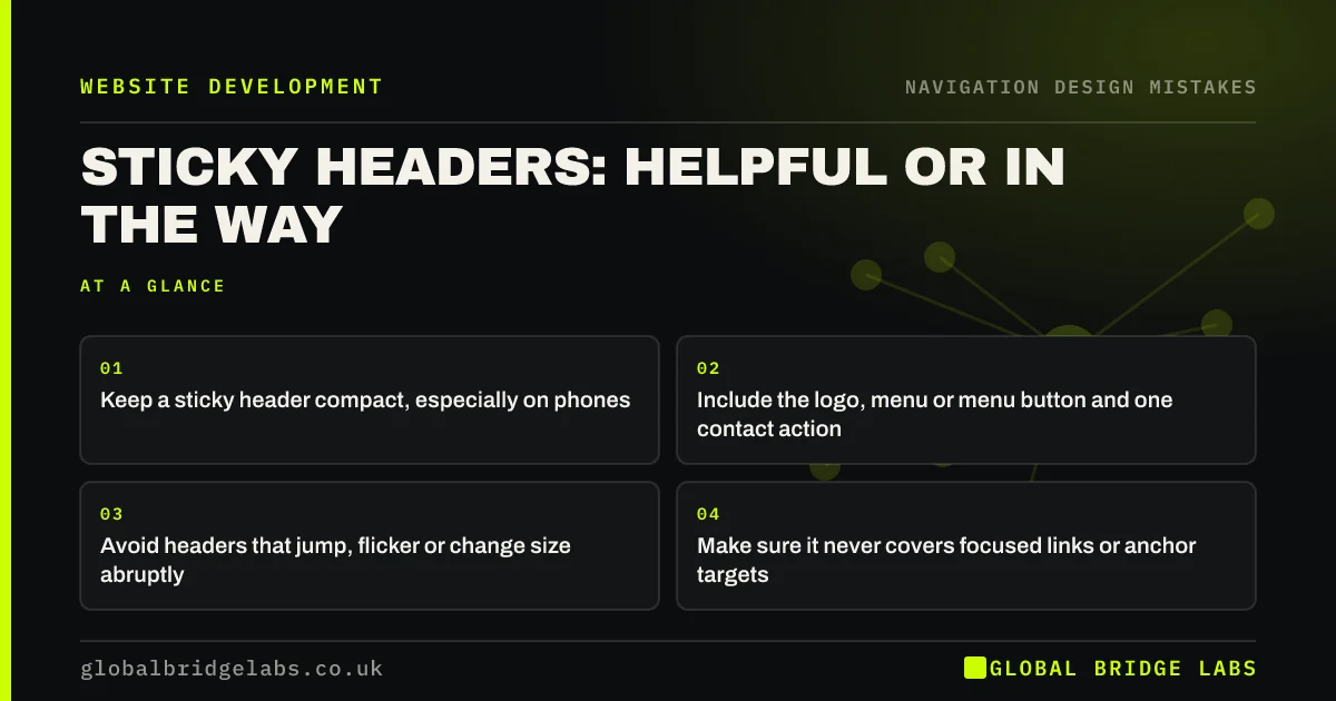
When a sticky header helps visitors and when it gets in the way: how tall it should be, what it should contain and the mobile mistakes to avoid.
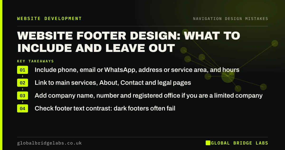
What to include in a business website footer, from contact details and key links to legal information, and the footer design mistakes that waste the space.
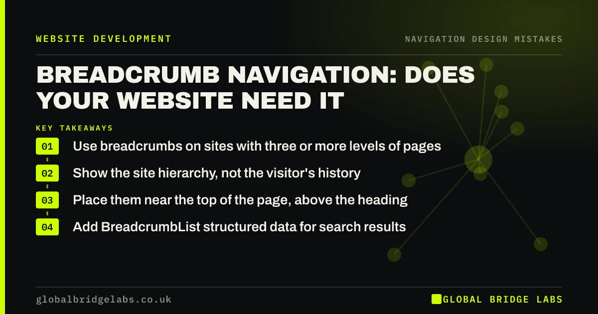
What breadcrumb navigation is, when a business website needs it, how to design breadcrumbs that help visitors and search, and the mistakes to avoid.
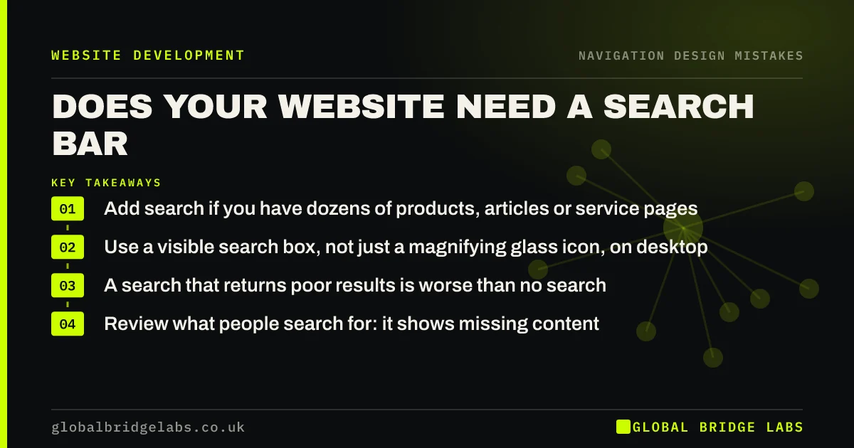
Does a small business website need a search bar? When site search helps, when it is a mistake, how to design it and how searches improve your pages.
30 minutes with our team and you'll know exactly which of the three problems to fix first.