On this page
- 01Key takeaways
- 02Does website design affect conversion?
- 03Where do design and conversion agree?
- 04Where do design and conversion part ways?
- 05How do you brief a site that looks good and converts?
- 06When should design win over conversion tactics?
- 07What does this look like in practice?
- 08Design and conversion review checklist
- 09Next step
- 10Sources and further reading
- 11Frequently asked questions
Key takeaways
Website design and conversion agree on credibility and part ways on priority. Design earns trust in the first seconds, then conversion depends on whether the page answers the buyer's questions and makes the next step easy. When the two conflict, the message should win, because buyers forgive a plain page far more readily than a confusing one.
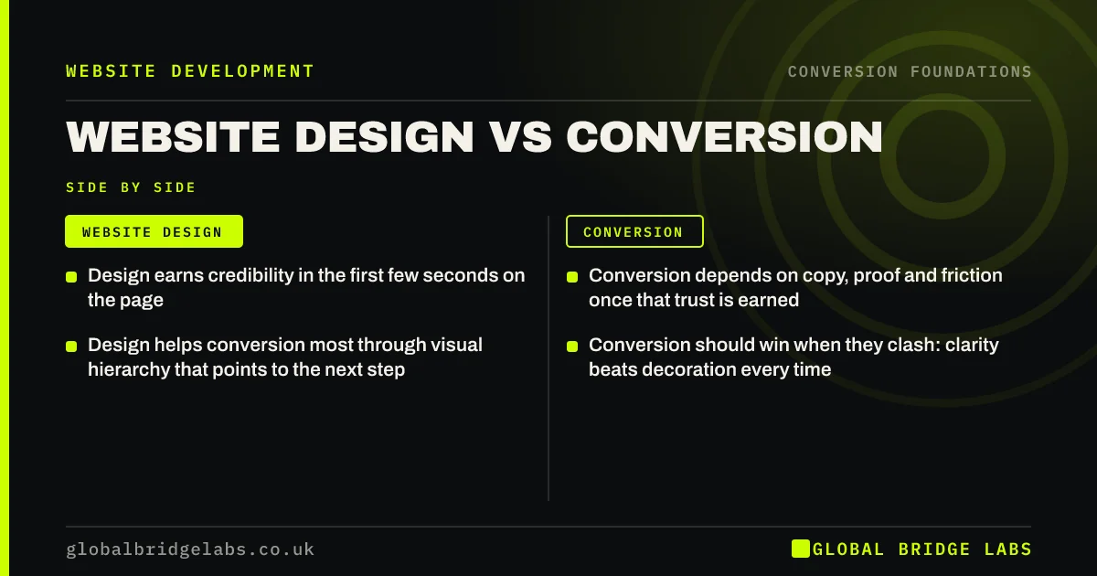
- Design earns credibility in the first few seconds on the page.
- Conversion depends on copy, proof and friction once that trust is earned.
- Design helps conversion most through visual hierarchy that points to the next step.
- Conversion should win when they clash: clarity beats decoration every time.
Want a view on where your design helps and where it hurts? Send us the URL on WhatsApp.
Chat on WhatsApp →Does website design affect conversion?
Yes, but mostly through credibility and clarity rather than style. A dated or broken-looking site makes visitors doubt the business, and poor visual hierarchy hides the offer. Beyond a credible, readable baseline, extra polish adds little. The larger gains come from what the page says and how easy it is to act.
Think of design as the price of entry. It lets you be considered. It does not win the decision on its own.
Where do design and conversion agree?
They agree wherever design makes information easier to take in. Strong contrast, clear type, generous spacing and a consistent layout all help visitors scan and decide faster. Nielsen Norman Group's research on visual hierarchy describes exactly this: size, colour and position tell the eye what matters first.
- Readable type size and contrast (WCAG 2.2 gives measurable minimums).
- One dominant element per screen: the offer, then the action.
- Consistent buttons, so visitors learn what is clickable.
- Real photography of your work, which doubles as proof.
Where do design and conversion part ways?
They part ways when design choices serve the brand's image at the expense of the buyer's questions. The common culprits are full-screen video headers, rotating sliders, abstract slogans, hidden navigation on desktop, minimal text that leaves out prices and process, and animations that delay content on mobile.
Each of these can win design praise. Each also pushes the offer, proof or next step out of the first screen or slows it down.
- Video headers that add seconds to mobile load time.
- Sliders that rotate the key message away before visitors read it.
- Minimalism that removes prices, areas served and process.
- Ghost buttons and low-contrast text that look elegant and get missed.
- Scroll effects that make content appear late or jump.
How do you brief a site that looks good and converts?
Give every key page a job before anyone opens a design tool. For each page, write who arrives, what they need to know, what proof convinces them and what the one next step is. Designers then design to that brief, and reviews ask 'does this help the visitor act?' before 'do we like it?'.
- Page goal: the one action this page exists to produce.
- Visitor: where they came from and what they already know.
- Must-answer questions: price, area, timescale, process.
- Proof: which result, review or project goes where.
- Success measure: the key event you will track.
- A website brief template agencies can quote from
- Web designer or conversion specialist: who do you need?
Want a page-by-page conversion brief for your next project? Ask us on WhatsApp.
Chat on WhatsApp →When should design win over conversion tactics?
Design should win when a conversion tactic would damage trust. Pop-ups on every page, countdown timers, flashing banners and pushy wording can lift short-term clicks while making a professional firm look cheap. For high-value services, restraint is part of the proof.
It should also win on accessibility. A design that meets WCAG 2.2 contrast and target-size rules is easier for everyone to use, and it keeps you on the right side of the Equality Act 2010.
What does this look like in practice?
A UK logistics company commissioned a striking new site with animated route maps and a dark, cinematic look. Enquiries fell by about a third in the first quarter after launch. Mobile pages took several seconds to show any text, and the quote form had moved from the homepage to a separate page.
We kept the colour palette and imagery, removed the heavy animation from mobile, brought a short quote form back to the first screen of the service pages and added delivery-area and lead-time details. Enquiries returned to the old level within two months and then passed it.
Design and conversion review checklist
- Can a first-time visitor read the offer within five seconds on a phone?
- Is there one dominant action per screen?
- Does any animation delay content on mobile?
- Are prices, areas and process visible, not just implied?
- Do buttons look like buttons, with enough contrast?
- Is real proof shown beside the claims?
Next step
You do not have to choose between a site that looks good and one that sells. You do have to decide which one wins when they disagree. We can help you make that call page by page.
Message us on WhatsApp for a design and conversion review, or book a 30-minute consultation.
Chat on WhatsApp →Sources and further reading
- Visual hierarchy in UX: definition · Nielsen Norman Group
- Web Content Accessibility Guidelines (WCAG) 2.2 · W3C
- PageSpeed Insights · Google
Frequently asked questions
Is website design or content more important for conversions?
Content usually matters more once the design is credible and readable. Visitors decide based on whether the page answers their questions about offer, fit, price, proof and next step. Design helps by making those answers easy to find, but it cannot replace them.
Do sliders and video headers hurt conversion?
Often, yes. Sliders rotate the key message away before many visitors read it, and video headers add load time, especially on mobile. If you use them, keep a static headline and call to action in view, and check mobile speed in PageSpeed Insights before and after.
Can I keep my design and still improve conversions?
Usually. Most conversion improvements are changes to words, proof, forms and tracking that sit inside an existing design. Keep colours, type and imagery, and change what the pages say and where the next step appears. Replace the design only if it blocks those changes.
What makes a website look trustworthy?
A clean, current layout, readable text, real photographs of your work and team, consistent branding, clear contact details and specific proof such as reviews and named projects. Broken elements, stock imagery and vague claims undermine trust faster than any colour choice.
Written by

Global Bridge Labs (GBL) is a UK–Sri Lanka partner for social media, websites and BPO. Everything here comes from client delivery, not theory.