On this page
- 01Key takeaways
- 02How can you tell a website is confusing visitors?
- 03What are the most common signs?
- 04What causes the confusion?
- 05How do you fix it without a redesign?
- 06When does confusion point to a redesign?
- 07How do you confirm the fix worked?
- 08How do you write menu labels buyers understand?
- 09What does this look like in practice?
- 10Clarity checklist
- 11Next step
- 12Sources and further reading
- 13Frequently asked questions
Key takeaways
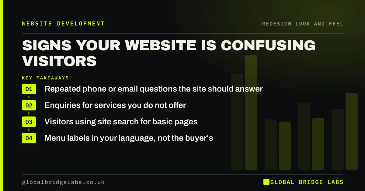
The clearest sign of a confusing website is customers asking questions the site should already answer. Other signs are enquiries for services you do not offer, visitors using search to find basic pages, and people calling to ask how to book. Most confusion comes from vague wording and menu labels, which are fixable in place.
- Repeated phone or email questions the site should answer.
- Enquiries for services you do not offer.
- Visitors using site search for basic pages.
- Menu labels in your language, not the buyer's.
Think your site is confusing people? Tell us what they ask on WhatsApp.
Chat on WhatsApp →How can you tell a website is confusing visitors?
A website is confusing visitors when they cannot quickly work out what you offer, whether it suits them, what it costs or how to get it. The evidence shows up outside analytics: in the questions customers ask, the enquiries you get and the pages people search for.
What are the most common signs?
Ask whoever answers the phone. They usually know the answer already.
- Customers ask about prices, areas covered or process that the site mentions but hides.
- Enquiries arrive for services you stopped offering or never offered.
- People call to ask how to book, even though there is a booking page.
- Site search logs show searches for 'contact', 'prices' or a core service.
- Visitors land on service pages and leave within seconds.
Want to turn your most common customer questions into page fixes? Ask us on WhatsApp.
Chat on WhatsApp →What causes the confusion?
Usually the words, not the design. Internal jargon, clever slogans instead of plain descriptions, menu labels that group services the way you organise them rather than the way buyers think, and key details buried in long paragraphs.
How do you fix it without a redesign?
Turn the top ten customer questions into visible answers on the pages where they arise. Rename menu items in the words buyers use. Put prices, areas and process in short, scannable sections. The GOV.UK style guidance on plain English and short sentences is a useful standard.
When does confusion point to a redesign?
When the structure is the cause: services scattered across pages with no logic, a menu that has grown by addition to 15 items, or a site that serves two very different audiences on the same pages. Rewriting words will not fix a structure that mixes everything together.
How do you confirm the fix worked?
Track the same signals for a month after the changes: the questions customers ask, wrong-service enquiries and the enquiry rate on the changed pages. A quick user test with five people who match your buyers before and after gives a direct comparison.
How do you write menu labels buyers understand?
Use the words buyers type into search, not internal terms. Check Search Console for the queries that bring visitors to each page, and listen to how customers describe what they want on the phone. Labels such as 'Solutions' or 'Capabilities' rarely match either.
Keep labels short, specific and parallel: 'Kitchen fitting', 'Bathroom fitting', 'Extensions' rather than 'Our kitchen expertise'. Test the labels by asking five people where they would click to find a named service. If more than one person hesitates or chooses the wrong item, the label needs changing.
- Take labels from real search queries.
- Keep them short and specific.
- Avoid 'Solutions', 'Capabilities' and similar terms.
- Test with five people and a named task.
What does this look like in practice?
A pattern in UK logistics: the site's menu reads 'Solutions', 'Capabilities' and 'Sectors', and customers keep calling to ask whether the firm does same-day pallet delivery. Renaming the menu to the services buyers search for, with a page each, reduces the repeated calls and increases direct quote requests.
Clarity checklist
Run this over two weeks.
- Log every question customers ask by phone or email.
- Check the site's search terms, if it has site search.
- List enquiries for services you do not offer.
- Rewrite menu labels in buyers' words.
- Answer the top 10 questions on the relevant pages.
- Repeat the log for two weeks and compare.
Next step
If customers keep asking questions your site should answer, we will turn those questions into page changes with you in 30 minutes.
Message us on WhatsApp for a clarity review, or book a 30-minute consultation.
Chat on WhatsApp →Sources and further reading
- Writing to GOV.UK standards: writing guidelines · GOV.UK
- User research · GOV.UK Service Manual
- Creating helpful, reliable, people-first content · Google Search Central
Frequently asked questions
How do I know if my website is confusing?
Listen to customers. If they regularly ask questions the site should answer, enquire about services you do not offer, or call to ask how to book, the site is confusing them. Site search logs and short user tests confirm what is causing it.
What makes a website hard to understand?
Jargon, slogans instead of plain descriptions, menu labels organised around your business rather than buyers' needs, key details buried in long paragraphs, and structures that mix services and audiences together. Most of these are wording problems rather than design problems.
How do I make my website clearer?
Use plain words for what you do and who it is for, name menu items the way buyers search, answer the top customer questions on the pages where they arise, and break long text into short, scannable sections. Test the result with five people who match your buyers.
Should I add a FAQ page to reduce confusion?
An FAQ page helps, but answers work better on the pages where the question arises: prices on service pages, process near the call to action, areas covered on location pages. Use a FAQ page for general questions and link to it from relevant pages.
Written by

Global Bridge Labs (GBL) is a UK–Sri Lanka partner for social media, websites and BPO. Everything here comes from client delivery, not theory.