On this page
- 01Key takeaways
- 02Why do mobile visitors convert less?
- 03How do you measure the mobile gap?
- 04What should you test on a real phone?
- 05What do the speed thresholds say?
- 06When does the mobile gap point to a redesign?
- 07When is the gap not a website problem?
- 08Which mobile fixes are quickest?
- 09What does this look like in practice?
- 10Mobile conversion checklist
- 11Next step
- 12Sources and further reading
- 13Frequently asked questions
Key takeaways
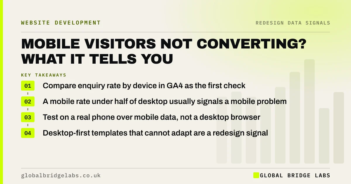
Mobile visitors convert less than desktop on many sites, but a gap of more than about half usually means the mobile experience is failing, not the audience. Check speed, the first screen, tap targets and the form on a real phone. If the site was built desktop-first and cannot be fixed, that is a genuine redesign signal.
- Compare enquiry rate by device in GA4 as the first check.
- A mobile rate under half of desktop usually signals a mobile problem.
- Test on a real phone over mobile data, not a desktop browser.
- Desktop-first templates that cannot adapt are a redesign signal.
Want your mobile experience checked on a real phone? Message us on WhatsApp.
Chat on WhatsApp →Why do mobile visitors convert less?
Mobile visitors convert less when pages load slowly on mobile networks, the main message and call to action sit below the first screen, forms are awkward to complete with a thumb, and phone numbers or WhatsApp links are not tappable. Some gap is natural, because people research on phones and act later, but a large gap usually means friction.
How do you measure the mobile gap?
In GA4, compare the key event rate for your enquiry events by device category over at least three months. Make sure calls and WhatsApp taps are tracked, because mobile visitors use them far more than forms, and leaving them out makes mobile look worse than it is.
What should you test on a real phone?
Use your own phone on mobile data, not office Wi-Fi, and try to make an enquiry from the homepage and your top service page. Note every point where you hesitate.
- Does the first screen say what you do and show a way to contact you?
- Does the page become usable within about 2.5 seconds?
- Can you tap the phone number and WhatsApp link directly?
- Can you complete the form without zooming or fighting the keyboard?
- Do cookie banners or pop-ups hide the content?
Want a mobile walkthrough of your site recorded for you? Ask us on WhatsApp.
Chat on WhatsApp →What do the speed thresholds say?
Google's Core Web Vitals give clear thresholds for a good experience, measured at the 75th percentile of real visits: Largest Contentful Paint within 2.5 seconds, Interaction to Next Paint within 200 milliseconds, and Cumulative Layout Shift below 0.1. Mobile pages that miss them are losing visitors before they read anything.
When does the mobile gap point to a redesign?
When the site was designed for desktop and squeezed onto phones: layouts that stack into very long pages, menus that hide key services, and templates that cannot be changed without rebuilding. If fixing the first screen and form is impossible within the current theme, a mobile-first redesign is justified.
When is the gap not a website problem?
For high-value, considered purchases, many buyers research on a phone and enquire later on a laptop. If desktop enquiries are healthy and many of them are returning visitors, the phone may be doing its job as the research device. Look at the full journey before redesigning for mobile.
Which mobile fixes are quickest?
The quickest mobile fixes change what appears on the first screen and how easy it is to act. They rarely need a new design, and they can often be done in a day or two on most platforms.
Start with a sticky call button or WhatsApp link, a shorter headline that fits on a phone, and compressed images. Then look at the form: fewer fields, the right keyboard for each field, and no dropdowns where a few buttons would do.
- Add a sticky call or WhatsApp button on mobile.
- Shorten the headline to fit the first screen.
- Compress and resize images for phones.
- Cut the form to three or four fields.
- Use tel and email input types so the right keyboard appears.
What does this look like in practice?
A pattern in UK healthcare clinics: most visits come from phones but the booking link sits in a desktop-style header that collapses into a menu on mobile. Adding a fixed 'Book now' and a tappable phone number to the mobile layout typically narrows the gap quickly, without a redesign.
Mobile conversion checklist
Run through these on your own phone.
- Compare enquiry rate by device in GA4 over 3 months.
- Track calls and WhatsApp taps as key events.
- Test the homepage and top service page on mobile data.
- Check Core Web Vitals for mobile in PageSpeed Insights.
- Make the phone number, WhatsApp and form reachable in one tap.
- Remove pop-ups that cover the first screen.
Next step
If mobile visitors are not turning into enquiries, we will walk through your site on a phone with you in 30 minutes and show you where they are dropping off.
Message us on WhatsApp for a mobile conversion check, or book a 30-minute consultation.
Chat on WhatsApp →Sources and further reading
- About key events · Google Analytics Help
- Understanding Core Web Vitals and Google search results · Google Search Central
- Mobile-first indexing best practices · Google Search Central
Frequently asked questions
Why is my mobile conversion rate so low?
Common causes are slow loading on mobile data, the main message and contact options sitting below the first screen, forms that are awkward on a phone, untappable phone numbers, and pop-ups covering content. Also check that calls and WhatsApp taps are tracked, or mobile will look worse than it is.
Is it normal for mobile to convert lower than desktop?
Some gap is normal, especially for considered purchases where buyers research on phones and enquire later on a laptop. A mobile rate below about half of desktop usually means the mobile experience has friction worth fixing. Look at returning visitors to see the full journey.
How do I make my website convert better on mobile?
Put the main message and a contact option on the first screen, make phone and WhatsApp links tappable, shorten the form, remove pop-ups, and fix speed against Core Web Vitals. Test every change on a real phone over mobile data.
Do I need a new website to be mobile friendly?
Not always. Many sites can be improved within their current theme. You need a redesign when the templates were built for desktop and cannot be adapted, so the first screen, navigation and forms stay awkward on phones whatever you change.
Written by

Global Bridge Labs (GBL) is a UK–Sri Lanka partner for social media, websites and BPO. Everything here comes from client delivery, not theory.