On this page
- 01Key takeaways
- 02What is the halo effect?
- 03How does the halo effect shape website credibility?
- 04What triggers the reverse effect?
- 05How do you use the halo effect honestly?
- 06When does the halo effect not help?
- 07What does this look like in practice?
- 08Halo effect checklist
- 09Next step
- 10Sources and further reading
- 11Frequently asked questions
Key takeaways
The halo effect is the tendency for one positive impression to shape how people judge everything else about something. On a website, a strong first screen makes visitors read your services, prices and claims more generously. The reverse, sometimes called the horn effect, means one careless detail makes them doubt the rest.
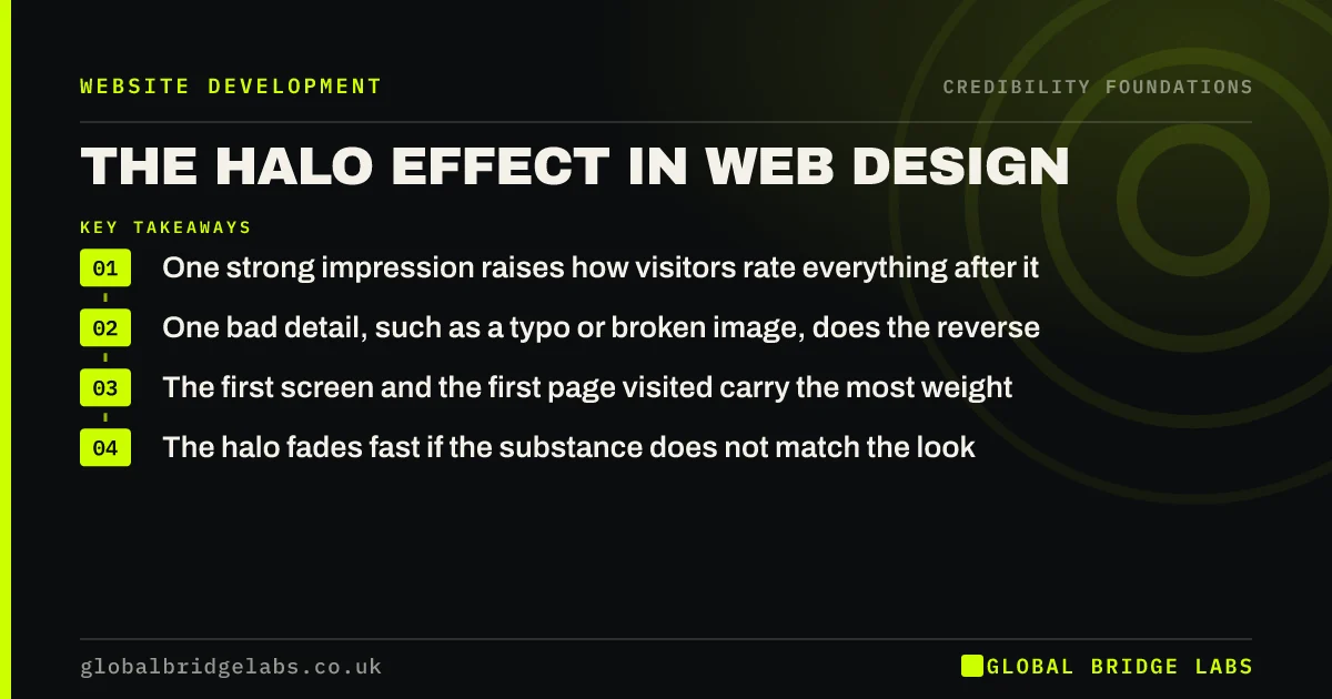
- One strong impression raises how visitors rate everything after it.
- One bad detail, such as a typo or broken image, does the reverse.
- The first screen and the first page visited carry the most weight.
- The halo fades fast if the substance does not match the look.
Want to know what impression your first screen gives? Message us on WhatsApp.
Chat on WhatsApp →What is the halo effect?
The halo effect is a cognitive bias in which a positive impression of one quality influences judgements of unrelated qualities. Psychologist Edward Thorndike named it in 1920, after noticing that officers who rated soldiers well on one trait tended to rate them well on all. Nielsen Norman Group applies the same idea to how users judge websites and products.
How does the halo effect shape website credibility?
Visitors use the first thing they notice as a shortcut for everything they cannot check. A crisp, well-organised first screen suggests the business is organised. Real photos suggest real people. That impression then colours how they read your prices and claims, so the same text seems more believable on a cared-for site than on a careless one.
What triggers the reverse effect?
Small, visible errors trigger the reverse, often called the horn effect. A spelling mistake in a headline, a stretched logo, a 2019 copyright year or a 'Not secure' warning tells visitors the business may be careless elsewhere. Because these details are quick to notice and hard to explain away, they outweigh much longer stretches of good content.
- Typos in headings or buttons.
- Blurry or stretched logos and photos.
- Old dates on news, blogs or the footer.
- Security warnings or broken forms.
- Placeholder text left from a template.
How do you use the halo effect honestly?
Use it by putting your genuine strengths where visitors look first: a clear statement of what you do, real photos of your work, your strongest piece of proof and an easy contact route. Do not use it to create a false impression, such as implying a size or track record you do not have. The halo collapses when the substance does not match.
Want your strongest proof moved to where visitors look first? Message us on WhatsApp and we will discuss your requirements.
Chat on WhatsApp →When does the halo effect not help?
It does not help with buyers who verify carefully, such as procurement teams or clients making large or regulated purchases. They will check company records, reviews and references whatever the design. For them, a good impression earns a closer look, not a decision, so the detail must hold up.
What does this look like in practice?
A pattern we see: a firm's homepage is strong, but most visitors arrive on old blog posts from search, which still show a former logo and a dead sidebar. Their first impression is the weakest page on the site. Updating those templates gives search visitors the same halo as homepage visitors.
Halo effect checklist
- Find the pages most visitors land on first.
- Make each one show what you do, real proof and contact.
- Remove every visible error from those pages.
- Check old templates match the current brand.
- Make sure the substance behind the look holds up.
Next step
List your top five landing pages in analytics and check each one as if it were your homepage.
Message us on WhatsApp for a first-impression review of your landing pages, or book a 30-minute consultation.
Chat on WhatsApp →Sources and further reading
- Halo effect: definition and impact on web user experience · Nielsen Norman Group
- First impressions matter: how designers can support automatic cognitive processing · Nielsen Norman Group
- Attention web designers: you have 50 milliseconds to make a good first impression · Behaviour & Information Technology (Lindgaard et al., 2006)
Frequently asked questions
What is an example of the halo effect on a website?
A visitor lands on a site with clean design and real team photos and assumes the business is professional and reliable, so they read its prices as fair. The same prices on a cluttered, stock-photo site might seem suspicious. The look changed how the content was judged.
What is the opposite of the halo effect?
The opposite is the horn effect, where one negative impression lowers judgements of everything else. On websites, typos, broken links, old dates and security warnings are common triggers, because they suggest carelessness that visitors assume extends to the business.
Does the halo effect last?
Only while what follows supports it. If visitors find vague content, no proof or broken journeys, the initial positive impression fades and can turn into distrust, because the gap between look and substance feels misleading.
Written by

Global Bridge Labs (GBL) is a UK–Sri Lanka partner for social media, websites and BPO. Everything here comes from client delivery, not theory.