On this page
- 01Key takeaways
- 02What is the aesthetic-usability effect?
- 03How does it affect website credibility?
- 04Where does the effect mislead you?
- 05How should a small business use it?
- 06When does looking good not help?
- 07What does this look like in practice?
- 08Aesthetic-usability checklist
- 09Next step
- 10Sources and further reading
- 11Frequently asked questions
Key takeaways
The aesthetic-usability effect is the tendency for people to perceive attractive designs as easier to use, whether or not they are. On a business website, a well-designed look buys patience and goodwill, which helps credibility. It also hides usability problems in testing, so judge a site by what visitors achieve, not what they say.
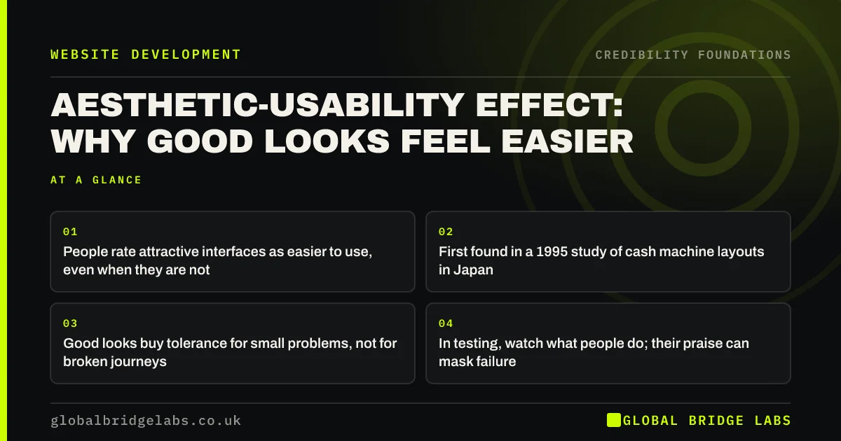
- People rate attractive interfaces as easier to use, even when they are not.
- First found in a 1995 study of cash machine layouts in Japan.
- Good looks buy tolerance for small problems, not for broken journeys.
- In testing, watch what people do; their praise can mask failure.
Want to know if your site's looks are hiding usability problems? Message us on WhatsApp.
Chat on WhatsApp →What is the aesthetic-usability effect?
The aesthetic-usability effect is a cognitive bias where users perceive more attractive designs as more usable. It was first described by Masaaki Kurosu and Kaori Kashimura at Hitachi in 1995, who found that people's ratings of how easy a cash machine layout was to use matched how attractive they found it more closely than how usable it actually was.
How does it affect website credibility?
Attractive design raises credibility because visitors assume a site that looks cared for comes from a business that cares. Nielsen Norman Group notes users are more tolerant of minor issues on attractive sites. For a small business, that tolerance can be the difference between a visitor persisting to the contact page or leaving at the first hiccup.
Where does the effect mislead you?
It misleads when you test a new design. Participants who like how a site looks often say it was easy even when they struggled. They blame themselves rather than the design. That is why usability tests count task success, such as whether the visitor found the price, rather than relying on satisfaction ratings alone.
- Count whether each task was completed, not only how people rated it.
- Note hesitation, backtracking and wrong clicks, even if praised later.
- Compare analytics before and after a redesign, not opinions.
How should a small business use it?
Use the effect as a reason to invest in a cared-for look, but never as a substitute for a working journey. A clean layout, real photography and consistent type create the goodwill; clear navigation, working forms and visible prices convert it. Spend in that order of risk: fix broken journeys first, then polish.
- Website design vs conversion: where the two part ways
- White space in web design: why empty space sells
Want a review of both the look and the journey? Message us on WhatsApp and we will discuss your requirements.
Chat on WhatsApp →When does looking good not help?
Looking good does not help when the problem is substance: no prices, vague services, no proof. It also does not help when visitors hit something broken, such as a form that fails. Goodwill covers small friction; it does not cover a dead end. Research on the effect is about perception, not about whether people buy.
What does this look like in practice?
A pattern we see: an owner's friends praise a new site, yet enquiries fall. Watching five strangers use it shows three cannot find the price list, which moved into a stylish but unclear menu. The design was admired and the journey was worse. Restoring a plain 'Prices' link fixed it.
Aesthetic-usability checklist
- Judge redesigns by task success and enquiries, not compliments.
- Test with strangers, not friends or staff.
- Fix broken journeys before visual polish.
- Keep familiar patterns, such as a visible menu and contact button.
Next step
Watch two strangers try to find your prices and phone number. Note what they do, not what they say.
Message us on WhatsApp for a look-and-journey review, or book a 30-minute consultation.
Chat on WhatsApp →Sources and further reading
- The aesthetic-usability effect · Nielsen Norman Group
- First impressions matter: how designers can support automatic cognitive processing · Nielsen Norman Group
- Why you only need to test with 5 users · Nielsen Norman Group
Frequently asked questions
What is an example of the aesthetic-usability effect?
A visitor finds a stylish website easy to use and says so, even though it took them three attempts to find the contact page. On a plainer site with the same problem, they would more likely call it confusing. The attractive design changed their perception, not the difficulty.
Is the aesthetic-usability effect a good thing?
It is useful but double-edged. It earns tolerance and credibility for attractive sites, which helps businesses. It also hides real problems in testing and feedback, so teams can launch designs that look better and perform worse. Measure behaviour to stay honest.
Who discovered the aesthetic-usability effect?
Masaaki Kurosu and Kaori Kashimura of the Hitachi Design Center described it in 1995, after studying how people rated different layouts for cash machine interfaces. Later research, including work by Noam Tractinsky, found similar results in other settings.
Written by

Global Bridge Labs (GBL) is a UK–Sri Lanka partner for social media, websites and BPO. Everything here comes from client delivery, not theory.