On this page
Key takeaways
A dark website design can look premium and modern, which suits some sectors such as hospitality, creative studios and technology. But light text on a dark background is harder to read in long passages for many people. For credibility, use dark backgrounds for short, visual sections and keep long reading content light, or test carefully.
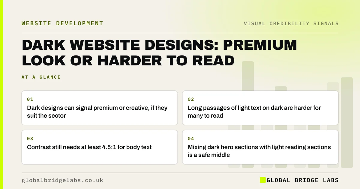
- Dark designs can signal premium or creative, if they suit the sector.
- Long passages of light text on dark are harder for many to read.
- Contrast still needs at least 4.5:1 for body text.
- Mixing dark hero sections with light reading sections is a safe middle.
Want to know whether a dark design suits your buyers? Message us on WhatsApp.
Chat on WhatsApp →Does a dark background look more professional?
A dark background looks more premium in some sectors and more out of place in others. Restaurants, bars, photographers and technology firms often use dark designs well. Accountants, clinics and solicitors usually look more credible on light backgrounds, because buyers associate those sectors with clarity and calm. Fit with buyers' expectations matters more than the background colour itself.
Is dark text harder to read?
For most people, dark text on a light background is easier to read in long passages, and research on positive polarity supports that. Light text on dark backgrounds can cause a halo or glare effect, especially for people with astigmatism. Short headings and captions are fine on dark; long service descriptions and articles are better on light.
How do you use a dark design well?
Use dark backgrounds for the first screen, image-led sections and the footer, and switch to light for reading content. Keep body text large enough, avoid pure white on pure black to reduce glare, and check every text and button colour meets contrast requirements. Make sure photos and logos are designed for a dark background too.
- Dark for hero, gallery and footer; light for reading.
- Off-white text on near-black, not pure white on pure black.
- Body text at least 16px with generous line height.
- Logo and icons in versions made for dark backgrounds.
- Does accessibility affect how credible your brand looks?
- A design system for a small business website
Want a readability check of your dark sections? Message us on WhatsApp and we will discuss your requirements.
Chat on WhatsApp →When should you avoid a dark design?
Avoid a fully dark design if your buyers read a lot before deciding, if many are older, or if your sector expects calm and clarity. Also avoid it if your brand assets were made for light backgrounds; a logo forced onto black often looks improvised. If unsure, test two versions with real buyers.
What does this look like in practice?
A pattern we see: a professional firm chooses an all-black site to look modern. Visitors spend less time on service pages, and older clients say the text is hard to read. Keeping the dark hero and switching service pages to light keeps the modern feel and restores readability.
Dark design checklist
- Check your sector's expectations before going dark.
- Keep long reading content on light backgrounds.
- Check every colour pair for contrast.
- Use logo versions designed for dark backgrounds.
- Test with buyers, including older visitors.
Next step
Read your longest service page on a phone in daylight. If it strains your eyes, your visitors feel it too.
Message us on WhatsApp for a design readability review, or book a 30-minute consultation.
Chat on WhatsApp →Sources and further reading
- Understanding SC 1.4.3: Contrast (Minimum) · W3C
- Using color to enhance your design · Nielsen Norman Group
- The WebAIM Million: accessibility of the top 1,000,000 home pages · WebAIM
Frequently asked questions
Are dark websites bad for business?
Not necessarily. Dark designs suit visual and premium sectors such as hospitality and creative studios. They are a poorer fit for sectors where buyers read a lot or expect calm, such as healthcare and accountancy. Readability and fit matter more than the background colour.
Is white text on a black background bad?
For short headings it is fine. For long passages, many people find light text on dark harder to read, and some see a glare effect. Use off-white on near-black, larger text and generous spacing, or keep long content on a light background.
Should I offer a dark mode on my website?
Most small business sites do not need one. Dark mode is mainly valued in apps and tools people use for long periods. A well-designed light site with good contrast serves most visitors. Add dark mode only if your audience asks for it.
Written by

Global Bridge Labs (GBL) is a UK–Sri Lanka partner for social media, websites and BPO. Everything here comes from client delivery, not theory.