On this page
- 01Key takeaways
- 02Do certain colours build trust?
- 03What colour choices do affect credibility?
- 04How should you choose website colours?
- 05When is changing colours a waste of money?
- 06What does this look like in practice?
- 07Colour credibility checklist
- 08Next step
- 09Sources and further reading
- 10Frequently asked questions
Key takeaways
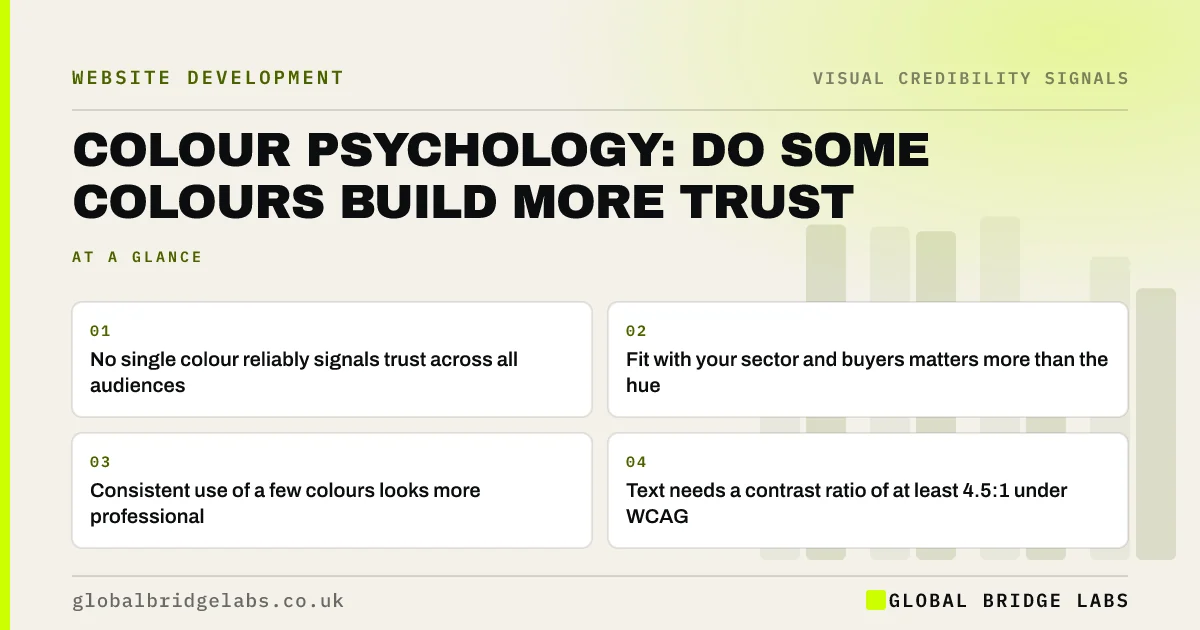
No colour makes a website trustworthy on its own. Popular claims, such as 'blue means trust', have weak evidence. What does affect credibility is whether colours suit the sector, are used consistently, give readable contrast and match the rest of your brand. A muddled or unreadable palette costs credibility; the specific hue matters far less.
- No single colour reliably signals trust across all audiences.
- Fit with your sector and buyers matters more than the hue.
- Consistent use of a few colours looks more professional.
- Text needs a contrast ratio of at least 4.5:1 under WCAG.
Want your colours checked for contrast and consistency? Message us on WhatsApp.
Chat on WhatsApp →Do certain colours build trust?
The evidence that particular colours build trust is weak and inconsistent. Blue is common in finance and technology, so it can feel familiar there, but familiarity is the mechanism, not the colour. Colour meanings vary by culture, sector and personal experience. Nielsen Norman Group advises using colour for meaning and emphasis, not as a psychological shortcut.
What colour choices do affect credibility?
Colour affects credibility through readability, consistency and fit. Low-contrast text looks careless and is hard to read. Too many colours look improvised. A palette that clashes with your sector, such as neon for a solicitor, sets the wrong expectation. These are measurable problems, unlike the supposed emotional effects of a particular hue.
- Readability: body text at a contrast ratio of 4.5:1 or more.
- Consistency: one primary colour, neutrals and one accent for actions.
- Fit: a palette in the range buyers expect for your sector.
- Meaning: use colour the same way everywhere, such as one colour for buttons.
How should you choose website colours?
Start with your existing brand colours and check them for contrast. Use the strongest colour sparingly, for the main action, so it stands out. Keep backgrounds neutral to let photos and content carry the page. Then document the rules, so every new page uses colour the same way.
- Brand guidelines for your website: what to include
- Does accessibility affect how credible your brand looks?
Want a colour and contrast review of your key pages? Message us on WhatsApp and we will discuss your requirements.
Chat on WhatsApp →When is changing colours a waste of money?
Changing colours is a waste when the real problem is content, proof or layout. Owners sometimes rebrand in a new colour hoping for a fresh start, while the same vague service pages remain. If buyers already recognise your colours, changing them also costs recognition. Fix readability, keep the hue.
What does this look like in practice?
A pattern we see: a firm uses its pale brand green for body text and buttons, giving low contrast and buttons that do not stand out. Keeping the green for accents, using near-black text and a darker shade for buttons keeps the brand and makes the site look sharper.
Colour credibility checklist
- Check text contrast is at least 4.5:1.
- Limit the palette to a primary, neutrals and one accent.
- Use one colour for all main buttons.
- Check the palette fits your sector's expectations.
- Document the rules so they stay consistent.
Next step
Run your main text and button colours through a contrast checker. Any failure is a quick, visible fix.
Message us on WhatsApp for a colour review, or book a 30-minute consultation.
Chat on WhatsApp →Sources and further reading
- Using color to enhance your design · Nielsen Norman Group
- Understanding SC 1.4.3: Contrast (Minimum) · W3C
- Trustworthiness in web design: 4 credibility factors · Nielsen Norman Group
Frequently asked questions
What is the most trustworthy colour for a website?
There is no single trustworthy colour. Blue is common in finance and technology, which makes it feel familiar there, but evidence that blue itself builds trust is weak. Readable contrast, consistency and a palette that fits your sector matter more.
Is colour psychology real?
Colours do carry associations, but they vary by culture, sector and person, and research on specific effects is inconsistent. Treat popular colour psychology claims with caution and focus on what you can measure: contrast, consistency and whether buyers find the site easy to read.
How many colours should a business website use?
Most business sites work well with one primary brand colour, a set of neutrals for text and backgrounds, and one accent colour reserved for actions such as buttons. More than that usually makes the site look improvised.
Written by

Global Bridge Labs (GBL) is a UK–Sri Lanka partner for social media, websites and BPO. Everything here comes from client delivery, not theory.