On this page
- 01Key takeaways
- 02How much text is too much on a website?
- 03What are the signs of too much text?
- 04What should you cut first?
- 05How should the remaining text be structured?
- 06Does cutting text hurt SEO?
- 07When does too much text point to a redesign?
- 08What should a service page include, at minimum?
- 09What does this look like in practice?
- 10Text editing checklist
- 11Next step
- 12Sources and further reading
- 13Frequently asked questions
Key takeaways
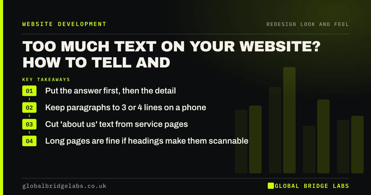
A website has too much text when key answers are buried, not when a page is long. Visitors scan headings and the first line of paragraphs, so put the answer first, keep paragraphs to three or four lines, and cut anything that is about you rather than about the buyer. Detailed pages can rank and convert well if they are structured.
- Put the answer first, then the detail.
- Keep paragraphs to 3 or 4 lines on a phone.
- Cut 'about us' text from service pages.
- Long pages are fine if headings make them scannable.
Want your key pages edited down? Send us a link on WhatsApp.
Chat on WhatsApp →How much text is too much on a website?
Text is too much when it hides what the visitor came for. A 1,500-word service page with clear headings, short paragraphs and prices near the top can outperform a 200-word page with no detail. A 300-word homepage that is one dense block can fail. Structure matters more than word count.
What are the signs of too much text?
Look at your pages on a phone. The signs are obvious at that size.
- Paragraphs longer than a phone screen.
- Headings that are vague, such as 'Welcome' or 'Our approach'.
- The price, area or process buried halfway down the page.
- Several paragraphs about the company's history on a service page.
- Scroll maps showing few visitors reach the call to action.
Want to see how far visitors actually read? Ask us on WhatsApp.
Chat on WhatsApp →What should you cut first?
Cut text that is about you rather than the buyer, repeated statements of quality, and introductions that delay the point. The GOV.UK guidance on writing for the web recommends front-loading the most important information and using plain, short sentences, which is a good standard for any business site.
- 'We are passionate about...' and similar openings.
- History and values on service pages: move them to About.
- Repeated claims of quality without proof.
- Paragraphs that restate the heading.
How should the remaining text be structured?
Use question-style headings, put a direct answer in the first sentence under each, and follow with detail. Use bullets for lists, tables for comparisons, and keep one idea per section. This helps readers and search engines, including AI answers that lift self-contained passages.
Does cutting text hurt SEO?
Cutting padding rarely does. Cutting useful detail can. Keep content that answers buyer questions, such as prices, process, areas and proof, and remove content that exists only to add words. Google's guidance on helpful content favours pages written for people, not word counts.
When does too much text point to a redesign?
When the templates force it: a design that only supports long text blocks, with no way to add headings, lists, tables or visual breaks. Then editing helps only so far, and the templates need redesigning to present content in scannable forms.
What should a service page include, at minimum?
A service page needs enough text to answer a buyer's main questions, and no more. For most small business services that means a clear headline, who it is for, what is included, a price range or starting point, how the process works, proof and a way to enquire.
Put each in its own short section with a descriptive heading, so a buyer scanning the page can jump to the part they care about. Detail beyond that, such as technical specifications or long histories, can sit lower on the page or on a separate page linked from it.
- Headline: what, for whom, where.
- What is included and what is not.
- Price range or 'from' price.
- Process in three to five steps.
- Proof and a call to action.
What does this look like in practice?
A pattern in UK professional services: a service page opens with four paragraphs about the firm's founding and philosophy, and the actual services and fees appear near the bottom. Moving the history to the About page and opening with services, fees and who they suit shortens the page and puts the answer first.
Text editing checklist
Apply this to your top five pages.
- Read each page on a phone.
- Rewrite vague headings as questions or claims.
- Put the answer in the first sentence under each heading.
- Keep paragraphs to 3 or 4 lines.
- Move company history to the About page.
- Use bullets and tables where there are lists or comparisons.
Next step
If your pages feel heavy, we will edit one key page with you in 30 minutes so you can see the approach, then apply it to the rest.
Message us on WhatsApp for a copy edit session, or book a 30-minute consultation.
Chat on WhatsApp →Sources and further reading
- Writing to GOV.UK standards: writing guidelines · GOV.UK
- Creating helpful, reliable, people-first content · Google Search Central
- About Microsoft Clarity (heatmaps and session recordings) · Microsoft
Frequently asked questions
How many words should a website page have?
As many as it takes to answer the buyer's questions, and no more. Service pages often work well at 600 to 1,500 words when structured with clear headings. Homepages usually need less. Structure and relevance matter far more than any word count.
Do people read website text?
Most people scan. They read headings, the first line of paragraphs, bullets and anything near a call to action, then read in detail only where it matters to them. Write for scanning: answer first, short paragraphs, clear headings. Design pages so scanners still get the answer.
Is long content better for SEO?
Not by length alone. Content that fully answers searchers' questions tends to perform well, and that is sometimes long. Padding does not help. Google's guidance favours helpful content written for people rather than for word counts. Structure long content with clear headings.
How do I make my website easier to read?
Use plain words, short sentences and paragraphs of three or four lines. Put the most important information first, use descriptive headings, and break lists into bullets. Check every page on a phone, where readability problems are most obvious. Read pages aloud to spot sentences that are too long.
Written by

Global Bridge Labs (GBL) is a UK–Sri Lanka partner for social media, websites and BPO. Everything here comes from client delivery, not theory.