On this page
- 01Key takeaways
- 02What is a carousel post?
- 03Why do carousels pre-qualify buyers?
- 04What structure should a carousel follow?
- 05How should the slides be designed?
- 06What topics suit a carousel?
- 07When is a carousel the wrong choice?
- 08What does this look like in practice?
- 09Carousel checklist
- 10Next step
- 11Sources and further reading
- 12Frequently asked questions
Key takeaways
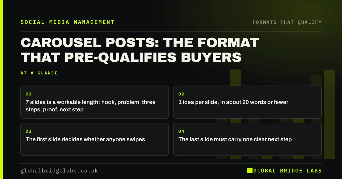
Carousel posts are multi-slide posts a reader swipes through. They suit businesses because they carry enough detail for a buyer to judge fit: the problem, the fix, the proof and the price signal, one slide each. A reader who reaches the last slide has qualified themselves.
- 7 slides is a workable length: hook, problem, three steps, proof, next step.
- 1 idea per slide, in about 20 words or fewer.
- The first slide decides whether anyone swipes.
- The last slide must carry one clear next step.
Want a carousel built from one of your jobs? Message us on WhatsApp.
Chat on WhatsApp →What is a carousel post?
A carousel post is a single social media post containing several images or slides that the viewer swipes through in order. Instagram, LinkedIn, Facebook and TikTok all support a version. It works like a short slide deck inside the feed.
Why do carousels pre-qualify buyers?
Carousels pre-qualify buyers because swiping is a choice. Someone who swipes through seven slides about replacing a conservatory roof is very probably thinking about a conservatory roof. The format also has room for the scope and price signals that a single image cannot carry.
What structure should a carousel follow?
Use seven slides. Slide one is the hook naming the buyer's problem. Slide two explains why it happens. Slides three to five show the fix in three steps. Slide six gives proof and scale. Slide seven gives the next step. Adjust the middle, but keep the first and last.
- 1: hook, in the buyer's words.
- 2: why the problem happens.
- 3 to 5: the fix, one step per slide.
- 6: a real example with scope or price range.
- 7: one next step.
Send us a topic on WhatsApp and we will outline the seven slides. Let us discuss your requirements.
Chat on WhatsApp →How should the slides be designed?
Design for a phone held at arm's length. Use large text, strong contrast and one idea per slide. Keep the same layout throughout so the reader's eye knows where to look. Real photos of your work are better than stock images. Include the text in the caption or alt text for accessibility.
- About 20 words per slide at most.
- Large type with strong contrast.
- The same template on every slide.
- Your own photos where possible.
What topics suit a carousel?
Topics with steps or comparisons suit a carousel: how a job is done, how to choose between options, what a budget buys, mistakes to avoid, and a case study told in stages. If the point can be made in one image and one line, use a single post.
When is a carousel the wrong choice?
A carousel is the wrong choice when the content is a single striking result, when movement explains it better, or when you do not have time to do it properly. A rushed carousel with tiny text performs worse than a clear photo. They also take longer to make, so plan them.
What does this look like in practice?
A pattern we see with UK service firms: the one carousel explaining 'what a typical project costs and involves' is saved and shared far more than anything else on the account, and new enquiries refer to it months later. It is worth pinning.
Carousel checklist
Check before publishing.
- Slide one names the buyer's problem.
- One idea per slide.
- Text is readable on a phone.
- A real example with scope is included.
- The last slide has one next step.
- The caption repeats the key points.
Next step
Pick the question you answer most often in quotes and turn it into seven slides this week.
Message us on WhatsApp for the seven-slide template, or book a 30-minute consultation.
Chat on WhatsApp →Sources and further reading
- Meta Business Help Centre · Meta
- LinkedIn Pages best practices · LinkedIn
- WCAG 2 overview · W3C Web Accessibility Initiative
Frequently asked questions
What is a carousel post?
A carousel post is one social media post made of several images or slides that the viewer swipes through. It is available on Instagram, LinkedIn, Facebook and TikTok, and works like a short slide deck in the feed. Use it when a topic needs more than one image to explain.
How many slides should a carousel have?
Around seven suits most business topics: a hook, the cause of the problem, three steps, a proof slide and a next step. Use fewer if the point is simple. Each slide should carry one idea. Stop adding slides once the point is made, because readers leave when a deck drags.
Do carousels perform better than single images?
They often hold attention for longer, because each swipe is another interaction. Their real advantage for a business is room for detail, which helps buyers judge fit. A weak carousel still loses to a strong single image. Choose the format that fits the content, not the one said to perform best.
What should the last slide of a carousel say?
It should give one next step, such as 'Message us your postcode for availability', and say what the reader will get. Do not end on a logo alone. The reader has just shown interest by swiping to the end. Tell them what to send and what they will get back.
Written by

Global Bridge Labs (GBL) is a UK–Sri Lanka partner for social media, websites and BPO. Everything here comes from client delivery, not theory.