On this page
- 01Key takeaways
- 02Why does visual consistency matter?
- 03Which six elements should you fix?
- 04How do templates help?
- 05How do you stay consistent without being boring?
- 06When should you change your visual style?
- 07What does this look like in practice?
- 08What does a simple visual guide contain?
- 09How do you keep visuals consistent across a team?
- 10Next step
- 11Sources and further reading
- 12Frequently asked questions
Key takeaways
Consistent visual branding on social media means a follower can recognise your post before reading your name. Fix six elements: colours, fonts, layouts, photo style, logo placement and video openings. Build templates for each recurring format so consistency happens automatically rather than by effort.
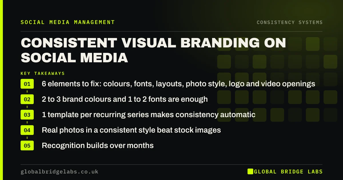
- 6 elements to fix: colours, fonts, layouts, photo style, logo and video openings.
- 2 to 3 brand colours and 1 to 2 fonts are enough.
- 1 template per recurring series makes consistency automatic.
- Real photos in a consistent style beat stock images.
- Recognition builds over months. Do not redesign every quarter.
Want templates built for your posts? Message us on WhatsApp.
Chat on WhatsApp →Why does visual consistency matter?
Visual consistency matters because recognition is how repeated exposure turns into familiarity. If every post looks different, followers cannot tell at a glance that it is yours, and each post starts from zero. If posts share a recognisable look, every one reinforces the last.
Which six elements should you fix?
- Colours: two or three brand colours used for backgrounds, text and accents.
- Fonts: one or two fonts, used the same way for headings and body.
- Layouts: a fixed layout for each recurring series.
- Photo style: consistent lighting, angles and editing.
- Logo placement: same corner, same size, or none at all.
- Video openings: the same first-second visual or text style.
Want a one-page visual guide for your posts? Message us on WhatsApp.
Chat on WhatsApp →How do templates help?
Templates build consistency into the tool. Whoever makes the post starts from the same layout, colours and fonts, so the result looks consistent even when different people make it. Most design tools support shared templates at little or no cost.
How do you stay consistent without being boring?
Keep the frame fixed and vary what is inside it. The layout, colours and fonts stay the same; the photo, job, person and message change. Alternate between two or three layouts rather than using just one, so the grid has rhythm without losing recognition.
When should you change your visual style?
Change it rarely and deliberately, for example after a rebrand, not because the team is bored. Recognition takes months to build and seconds to lose. If you do change, change everything at once and announce it, rather than drifting gradually.
What does this look like in practice?
A UK kitchen fitter had posts in dozens of styles, depending on which staff member made them. We built three templates, one each for finished kitchens, tips and team posts, with fixed colours and a consistent photo style. Within three months, customers began commenting that they recognised the posts in their feed, and the account's saves rose steadily.
What does a simple visual guide contain?
- Colour codes for backgrounds, text and accents.
- Font names and sizes for headings and body text.
- Three layout templates with examples.
- Photo rules: lighting, angles, backgrounds and editing style.
- Logo placement rule, or a note that posts carry no logo.
- Two examples of posts that follow the guide and one that does not.
How do you keep visuals consistent across a team?
Use shared templates that lock colours and fonts, give every location or contributor the one-page guide, and review a sample of posts monthly. Where staff take photos, give them a short shot list so images look similar in angle and framing.
Next step
Put your last nine posts side by side. If they do not look like one business, choose your six elements and build a template for each recurring series.
Message us on WhatsApp and we will design your template set.
Chat on WhatsApp →Sources and further reading
- Meta Business Help Centre · Meta
- LinkedIn Pages best practices · LinkedIn
- Writing to GOV.UK standards: writing guidelines · GOV.UK
Frequently asked questions
How do I keep my social media branding consistent?
Fix your colours, fonts, layouts, photo style, logo placement and video openings, then build templates for each recurring series so everyone starts from the same design. Review a sample of posts monthly to catch drift.
Should every social media post look the same?
Posts should look like they come from the same business, not identical. Keep the frame fixed, such as colours, fonts and layouts, and vary the content inside. Two or three alternating layouts give variety while keeping recognition.
Do I need a logo on every post?
Not necessarily. Consistent colours, layouts and photo style often identify you better than a logo. If you use a logo, keep it small and in the same place every time.
How often should I update my social media design?
Rarely. Refresh templates when the brand changes or every couple of years if they look dated. Frequent redesigns reset recognition and waste the familiarity you have built.
Do I need a professional designer for social media templates?
Not necessarily. Many small businesses build good templates in free or low-cost design tools. A designer can help if you are rebranding or want a distinctive look, but the key is using whatever templates you have consistently.
Written by

Global Bridge Labs (GBL) is a UK–Sri Lanka partner for social media, websites and BPO. Everything here comes from client delivery, not theory.