On this page
- 01Key takeaways
- 02Why sketch a homepage before using any software?
- 03What should you draw first?
- 04Why draw the phone layout first?
- 05How do you test a sketch?
- 06When is sketching a waste of time?
- 07What does this look like in practice?
- 08Homepage sketch checklist
- 09Next step
- 10Sources and further reading
- 11Frequently asked questions
Key takeaways
To sketch a homepage layout, draw a tall phone-shaped column on paper and add one box per section, in the order buyers ask their questions. It takes about 30 minutes, costs nothing and shows whether your plan makes sense before you open a tool or pay for design time.
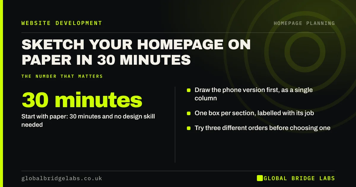
- Start with paper: 30 minutes and no design skill needed.
- Draw the phone version first, as a single column.
- One box per section, labelled with its job.
- Try three different orders before choosing one.
Want a second opinion on your sketch? Message us on WhatsApp.
Chat on WhatsApp →Why sketch a homepage before using any software?
Sketching is fast and easy to throw away, which is the point. People defend polished work but happily scribble over a paper sketch. It keeps attention on what appears and in what order, rather than on fonts and colours, and it lets non-designers join in without feeling they need any skill.
What should you draw first?
Draw the top section first, because it carries the most attention. Add a box for the headline, one for the subheadline, one for the button and one for the image. Then ask what a visitor's next question would be, and draw the box that answers it. Repeat until no question is left.
Why draw the phone layout first?
Drawing in one column forces you to decide what comes first. On a desktop, you can place things side by side and avoid the choice. On a phone, everything is stacked, and many SME sites get most of their visits from phones. A sequence that works there will usually adapt to desktop easily.
How do you test a sketch?
Show it to someone outside the business and ask them to talk through what they expect each box to say and do. If they cannot predict the next step, the order has a gap. This takes minutes, and it catches sequence problems before anyone has spent money on the page.
When is sketching a waste of time?
Skip it when you are using a template whose section order you already plan to keep, or when your changes are small. It also fails if you have no draft words, because boxes labelled 'text here' hide the real questions. Rough headline wording in each box makes the sketch far more useful.
What does this look like in practice?
A pattern worth trying: give three people the same section list and ask each to sketch the order alone. Where the sketches agree, you have your structure. Where they differ, you have found the disagreement that would otherwise surface during design rounds.
Homepage sketch checklist
- Use a pen so you cannot fuss over details.
- Draw one narrow column for a phone.
- Label each box with its job.
- Add rough words, not 'text here'.
- Try at least three orders.
- Ask an outsider to talk it through.
Next step
Set a 30-minute timer, draw your homepage and photograph the result. That photo is a better design brief than a list of websites you like.
Send us the photo on WhatsApp and we will give you honest feedback, with no pitch.
Chat on WhatsApp →Sources and further reading
- Visual hierarchy in UX: definition · Nielsen Norman Group
- Minimize cognitive load to maximize usability · Nielsen Norman Group
- Mobile-first indexing best practices · Google Search Central
Frequently asked questions
How do I sketch a website layout?
Draw a tall narrow column, then add a labelled box for each section, top to bottom, in the order a visitor asks their questions. Use a pen and rough wording. You are planning the sequence, so you need no drawing skill and no software.
What is the difference between a sketch and a wireframe?
A sketch is a quick, disposable paper drawing used to explore options. A wireframe is a tidier grey digital layout that records the chosen structure, with real or draft words in place, and is usually what a designer or developer works from.
Should I design for mobile or desktop first?
Plan the phone layout first for most SME sites, because a single column forces clear priorities and phones usually bring a large share of visits. Check your own analytics to confirm, especially if you sell to office-based B2B buyers.
Written by

Global Bridge Labs (GBL) is a UK–Sri Lanka partner for social media, websites and BPO. Everything here comes from client delivery, not theory.