On this page
- 01Key takeaways
- 02What is a homepage hero section?
- 03What goes in a hero section?
- 04What are the most common hero section faults?
- 05How tall should a hero section be?
- 06When should a hero section break these rules?
- 07What does this look like in practice?
- 08Hero section checklist
- 09Next step
- 10Sources and further reading
- 11Frequently asked questions
Key takeaways
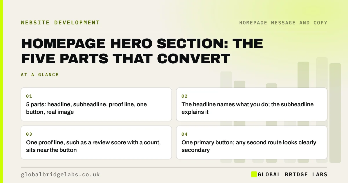
A homepage hero section that converts has five parts: a headline that says what you do, a subheadline that says who it is for and the result, a one-line proof point, one primary button and an image of real work or people. If any part is missing or replaced by a slogan, a slider or a second equal button, the hero stops doing its job.
- 5 parts: headline, subheadline, proof line, one button, real image.
- The headline names what you do; the subheadline explains it.
- One proof line, such as a review score with a count, sits near the button.
- One primary button; any second route looks clearly secondary.
Want your hero section rewritten around these five parts? Message us on WhatsApp.
Chat on WhatsApp →What is a homepage hero section?
A homepage hero section is the first block a visitor sees, usually a headline, supporting text, a button and an image across the top of the page. It carries most of the homepage's work, because Nielsen Norman Group found 57% of page-viewing time is spent above the fold. If the hero fails, few visitors see the rest.
What goes in a hero section?
Five parts, each with one job. Leave none out, and add nothing that competes with them.
- Headline: what you do, in the words buyers use.
- Subheadline: who it is for, where, and the result they get.
- Proof line: a review score with a count, a key accreditation or a client type.
- Primary button: a verb and an outcome, such as 'Get a fixed quote'.
- Image: real work, premises or people, not stock.
What are the most common hero section faults?
The most common faults are a slogan instead of a description, a slider rotating three messages, a full-screen image with text too small to read, two equal buttons and a hero so tall on mobile that the button sits below the first screen. Each one delays the answer to 'am I in the right place?'.
How tall should a hero section be?
Tall enough to hold the five parts and no taller. On a phone, the headline, subheadline and button should all appear before the first scroll; the image can sit behind or below them. A hero that fills the whole screen with a picture pushes the message out of view and can create a false floor, where visitors think the page has ended.
When should a hero section break these rules?
Break them for a strong brand with very high recognition, or for an online shop where the hero is a current product or offer and the navigation does the routing. Even then, the visitor should know within seconds what to click next.
What does this look like in practice?
A pattern we see: a hero with a drone video of the office and the words 'Building the future together'. Replacing it with a headline naming the service, a subheadline naming the area and client type, a review line and one button usually lifts clicks to the next page within weeks.
Hero section checklist
- Headline names what you do in buyers' words.
- Subheadline says who for, where and the result.
- One proof line sits near the button.
- One primary button with a verb and outcome.
- Image shows real work or people.
- Headline, subheadline and button fit in the first phone screen.
Next step
Write your hero's five parts on one page, then check each against the list. Rewrite the weakest part first; it is usually the headline.
Message us on WhatsApp and we will review your hero section, or book a 30-minute consultation.
Chat on WhatsApp →Sources and further reading
- Scrolling and attention · Nielsen Norman Group
- Carousel usability: designing an effective UI · Nielsen Norman Group
- Optimise Largest Contentful Paint · web.dev (Google)
Frequently asked questions
What should a homepage hero section include?
A clear headline saying what you do, a subheadline saying who it is for and the result, a short proof line such as a review score, one primary call to action button and a real image. On a phone, the text and button should appear before the first scroll.
Should my hero section have a video?
Only if the video shows something buyers need to see and does not slow the page or replace the message. Background videos often cost loading time and push the headline aside. A strong still image with clear text usually converts better for small businesses.
How many buttons should a hero section have?
One primary button, and at most one clearly secondary link for visitors who are not ready to act. Two buttons of equal weight make people hesitate, because they must decide between them before they have decided to act.
Written by

Global Bridge Labs (GBL) is a UK–Sri Lanka partner for social media, websites and BPO. Everything here comes from client delivery, not theory.