On this page
- 01Key takeaways
- 02How does a B2C homepage differ from B2B?
- 03What should consumers see first?
- 04Should prices appear on a consumer homepage?
- 05How do you reduce effort for consumers?
- 06What should you avoid on a B2C page?
- 07What does this look like in practice?
- 08B2C homepage checklist
- 09Next step
- 10Sources and further reading
- 11Frequently asked questions
Key takeaways
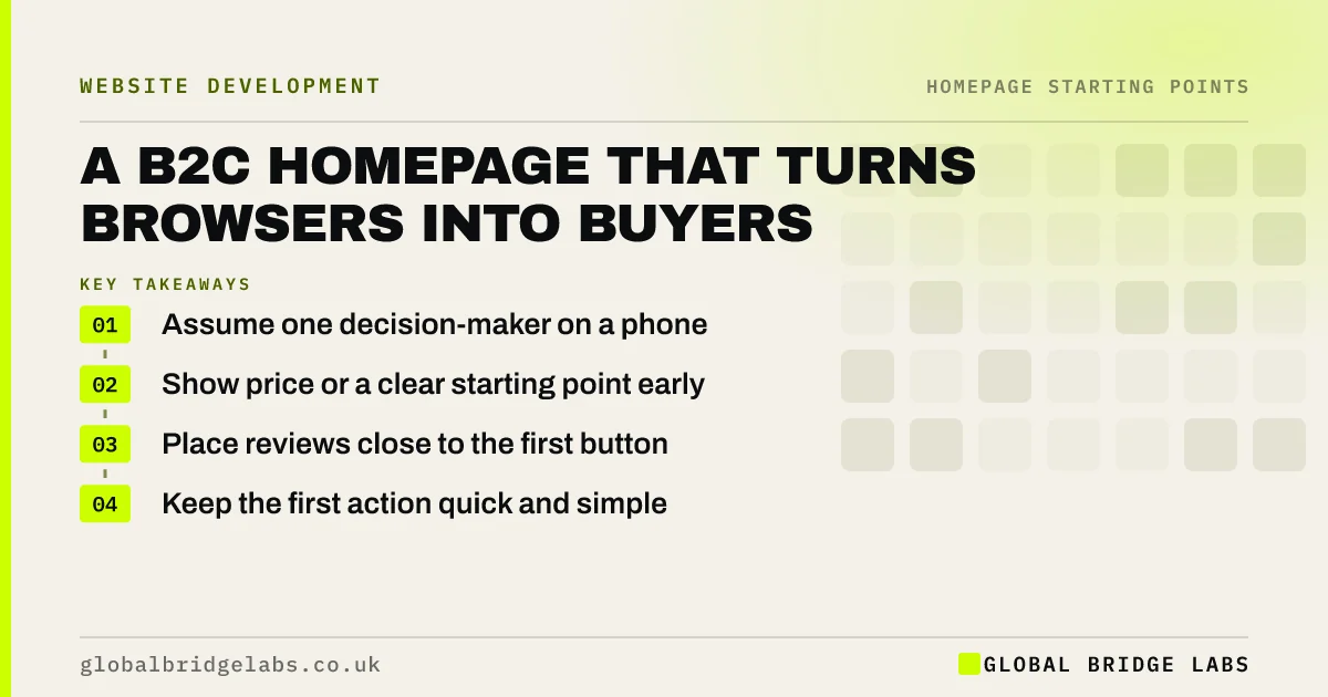
A B2C homepage helps one person decide quickly, usually on a phone. It should make the offer clear at once, reassure with reviews and honest pricing, and offer a next step that takes seconds. Consumers rarely study a homepage, so remove anything that slows the path from interest to action.
- Assume one decision-maker on a phone.
- Show price or a clear starting point early.
- Place reviews close to the first button.
- Keep the first action quick and simple.
Selling to consumers? Message us on WhatsApp for a homepage review.
Chat on WhatsApp →How does a B2C homepage differ from B2B?
A B2C homepage usually faces one decision-maker with less patience and more alternatives. Purchases are smaller, more emotional and often made on a phone. That means a shorter path, less explanation and more reassurance at the point of action. Consumer law also applies, which shapes pricing and claims.
What should consumers see first?
They should see what you offer, who it suits and the reason to trust it, followed by a button. A review score or a short proof line near the top helps. Use photos of the product or service itself, because consumers decide partly on how things look and feel.
Should prices appear on a consumer homepage?
Usually yes, at least as a starting point. Consumers expect to see a price, and hiding one reads as expensive or evasive. UK rules also bar drip pricing, where mandatory fees appear only later, so any figure you show should include unavoidable charges. Be clear what is included.
How do you reduce effort for consumers?
Offer quick routes such as tap-to-call, WhatsApp, online booking or express checkout. Keep forms to a few fields, and make buttons easy to reach with a thumb. Every extra step loses some people. Baymard's research puts documented cart abandonment at roughly 70%, with extra costs the top reason given.
What should you avoid on a B2C page?
Avoid false urgency, such as countdown timers that reset, and pre-ticked extras. The CMA treats some pressure selling as misleading, and buyers quickly lose trust in it. Honest scarcity is fine if it is true, such as limited appointment slots. A calm, clear page usually lasts longer than a pushy one.
What does this look like in practice?
A pattern worth watching in consumer businesses: a homepage asks people to request a quote for something they could book at once. Adding a visible starting price and a booking button tends to shift enquiries from questions about cost to questions about dates.
B2C homepage checklist
- State the offer clearly in the first screen.
- Show a real review score near the button.
- Show a price that includes mandatory fees.
- Offer a quick route on mobile.
- Remove false urgency.
- Test the page one-handed on a phone.
Next step
Time yourself going from your homepage to a completed enquiry on a phone. Every step you can remove from that journey is worth more than a new design.
Message us on WhatsApp for a mobile journey review, with no pitch.
Chat on WhatsApp →Sources and further reading
- Cart abandonment rate statistics · Baymard Institute
- Digital Markets, Competition and Consumers Act 2024 · legislation.gov.uk
- Unfair commercial practices guidance (CMA207) · Competition and Markets Authority
- Consumer Contracts (Information, Cancellation and Additional Charges) Regulations 2013 · legislation.gov.uk
Frequently asked questions
What should be on a B2C homepage?
A clear offer, reviews or other proof, real product or service images, a price or starting point and one easy next step. Keep it short, and make sure that it works properly on a phone, where most consumers will see it.
Should B2C websites show prices?
In most cases, yes. Consumers compare options quickly, and a hidden price can send them elsewhere. Any price you do show should include mandatory charges, because UK rules on drip pricing require the total to be clear.
How can I make my consumer homepage convert better?
Show the offer and proof sooner, remove unnecessary steps, add an instant contact or booking route and make sure it loads fast on a phone. Then check where visitors stop, using your analytics, before changing anything else.
Written by

Global Bridge Labs (GBL) is a UK–Sri Lanka partner for social media, websites and BPO. Everything here comes from client delivery, not theory.