On this page
- 01Short answer
- 02What is the job of a homepage?
- 03Why do homepages become cluttered?
- 04What are the eight homepage sections, in order?
- 05How long should a homepage be?
- 06What should stay off the homepage?
- 07When should a homepage break this structure?
- 08What does this look like in practice?
- 09Homepage structure checklist
- 10Next step
- 11Sources and further reading
- 12Frequently asked questions
Short answer
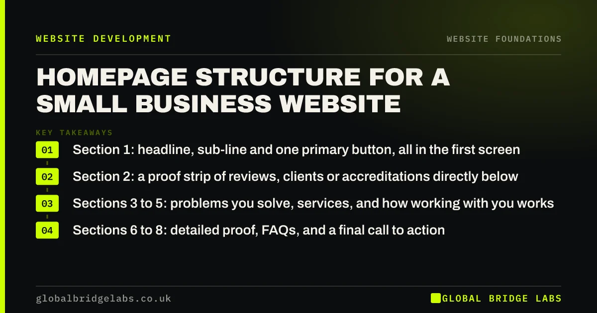
The homepage structure that works for most UK small businesses has eight sections in a fixed order: headline and action, proof strip, the problems you solve, services, how it works, detailed proof, FAQs and a final call to action. Each section answers the next question a buyer has.
- Section 1: headline, sub-line and one primary button, all in the first screen.
- Section 2: a proof strip of reviews, clients or accreditations directly below.
- Sections 3 to 5: problems you solve, services, and how working with you works.
- Sections 6 to 8: detailed proof, FAQs, and a final call to action.
Want your homepage mapped to this structure? Send us the URL on WhatsApp and we will mark up what to move.
Chat on WhatsApp →What is the job of a homepage?
A homepage is a routing page: its job is to confirm a visitor is in the right place, earn enough trust to keep them reading, and send them to the page or action that matches what they need.
It is rarely where the decision gets made. Many visitors land on service pages, location pages or blog posts from search. The homepage matters most for people who already know your name, such as referrals and repeat visitors, and for those it needs to be quick and reassuring rather than clever.
Why do homepages become cluttered?
Homepages become cluttered because everyone in the business wants their thing on it. Over a few years the page collects news items, a slideshow, a welcome paragraph, social feeds and three different calls to action, and the visitor is left to work out the priority.
A fixed structure solves this politically as well as practically. When every section has a defined job, adding something new means replacing something, which forces the right conversation.
- Rotating sliders that hide four of the five messages.
- Embedded social feeds that slow the page and show old posts.
- News sections last updated two years ago.
- Multiple competing buttons in the first screen.
What are the eight homepage sections, in order?
This order follows the questions a buyer asks: am I in the right place, can I trust them, do they solve my problem, what exactly do they do, what happens next, is there more proof, what about my specific concern, and how do I start.
- 1. Hero: outcome headline, audience and area sub-line, one primary button, phone or WhatsApp on mobile.
- 2. Proof strip: star rating with review count, recognisable client or accreditation logos.
- 3. Problems: the three problems buyers arrive with, in their language.
- 4. Services: one card per service, each linking to its own page.
- 5. How it works: three or four steps from first contact to result.
- 6. Detailed proof: two or three reviews with names and specifics, or short case summaries.
- 7. FAQs: five to six questions buyers ask before enquiring, answered plainly.
- 8. Final call to action: repeat the primary action with a reason to act now.
How long should a homepage be?
A homepage should be as long as it takes to answer the eight questions above, which is typically six to ten screens on a phone. Length is not the problem visitors complain about. Irrelevance is.
What matters is that the primary action is visible at the top, repeated after the proof and services, and again at the end. A visitor who is convinced after section two should never have to scroll to the bottom to find out how to contact you.
What should stay off the homepage?
Remove anything that does not help a visitor decide or act. Slideshows, auto-playing video with sound, embedded social feeds, lengthy company history and newsletter pop-ups on arrival all compete with the primary action.
Company history belongs on the About page. News belongs in a blog or not at all. Social feeds can be replaced by a single link to your most active channel. Each removal also makes the page lighter, which helps it pass Core Web Vitals on mobile.
Not sure what to cut? Send us a screenshot of your homepage on WhatsApp and we will mark it up.
Chat on WhatsApp →When should a homepage break this structure?
Break the structure when the business model is different. An e-commerce homepage should lead with categories and bestsellers, because visitors come to browse. A restaurant homepage should put the booking button, opening times and menu first, because those are the three things almost every visitor wants.
A single-service business with most traffic from paid ads may not need a traditional homepage at all, only a strong landing page. The principle stays the same: answer the visitor's next question in the order they ask it.
What does this look like in practice?
A pattern in professional services firms: a homepage that opens with a large photograph of the office building, followed by a welcome letter from the founder, a news section and a list of partner names. Services appear only in the navigation.
Restructuring it into the eight sections, with the services moved into cards near the top and a short FAQ answering fee and process questions, typically increases the number of visitors who reach a service page. The founder's letter moves to the About page, where people who want it still find it.
Homepage structure checklist
Work down the page and tick each section.
- Keep the headline, sub-line and one button inside the first screen on mobile.
- Place a proof strip directly under the hero.
- Describe three problems in the buyer's words.
- Link every service card to its own service page.
- Show a three or four-step process.
- Include two or three specific, named reviews.
- Answer five or six real pre-enquiry questions.
- End with the primary action repeated.
Next step
If your homepage has grown by addition rather than design, we will map it to the eight sections with you in 30 minutes and show you what to move, cut and rewrite.
Message us on WhatsApp for a homepage restructure plan, or book a 30-minute consultation.
Chat on WhatsApp →Sources and further reading
- SEO Starter Guide · Google Search Central
- Understanding Core Web Vitals and Google search results · Google Search Central
- Writing to GOV.UK standards: writing guidelines · GOV.UK
Frequently asked questions
What should be on a small business homepage?
A clear headline and primary action, a proof strip of reviews or accreditations, the problems you solve, your services with links, how the process works, detailed reviews, answers to common questions, and a final call to action. Everything else, including company history and news, belongs elsewhere.
Should I use a slider on my homepage?
Usually not. Sliders hide most of their messages because few visitors wait for the next slide, and they often add heavy images that slow the page. One strong static headline with a single primary button communicates more and loads faster on a phone.
How many calls to action should a homepage have?
One primary action, repeated at the top, middle and end of the page, plus at most one secondary option such as a phone number or WhatsApp on mobile. Offering several different actions of equal weight makes visitors hesitate and reduces the number who take any of them.
Is a long homepage bad for conversions?
No, provided every section answers a real buyer question and the primary action is visible at the top and repeated further down. Visitors scroll when the content is relevant. They leave when it is irrelevant or when they cannot find how to take the next step.
Written by

Global Bridge Labs (GBL) is a UK–Sri Lanka partner for social media, websites and BPO. Everything here comes from client delivery, not theory.