On this page
- 01Key takeaways
- 02What is the three-click rule?
- 03Is the three-click rule true?
- 04Why does the rule persist?
- 05What should you measure instead?
- 06How shallow should key pages be?
- 07What does this look like in practice?
- 08Click-depth checklist
- 09Next step
- 10Sources and further reading
- 11Frequently asked questions
Key takeaways
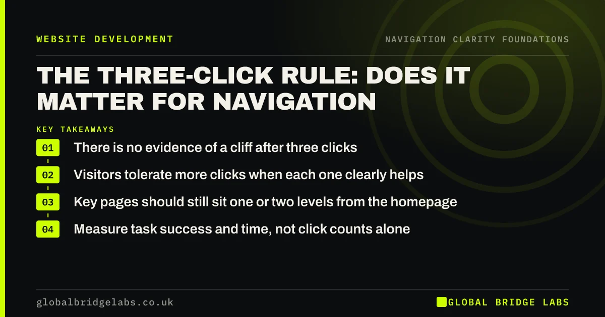
The three-click rule says visitors give up if they cannot find something within three clicks. Research does not support it as a hard limit: visitors keep clicking as long as each click feels like progress. What matters is that every step is obvious. Keep key pages shallow, but judge navigation by how confident each click feels, not by the count.
- There is no evidence of a cliff after three clicks.
- Visitors tolerate more clicks when each one clearly helps.
- Key pages should still sit one or two levels from the homepage.
- Measure task success and time, not click counts alone.
Want to know where your visitors lose confidence? Message us on WhatsApp.
Chat on WhatsApp →What is the three-click rule?
The three-click rule is an informal web design guideline claiming that users should be able to reach any page within three clicks, or they will become frustrated and leave. It spread in the late 1990s and is still repeated in briefs. It was never based on a published study.
Is the three-click rule true?
Not as a hard rule. A 2003 study by Joshua Porter at User Interface Engineering found users were no more likely to give up after three clicks than after twelve, and their satisfaction did not drop sharply at three. Nielsen Norman Group has also described the rule as a myth. Clicks that feel like progress are tolerated; confusing ones are not.
Why does the rule persist?
It persists because it points at something real: deep, unclear structures do lose visitors. The rule is a crude way to say 'keep important things close and obvious'. The problem is that following it literally leads to cramming dozens of links into menus to keep everything within three clicks, which makes each click harder.
What should you measure instead?
Measure whether visitors complete the task and how confident each step feels. Task success rate, time on task and first-click accuracy are better guides than click counts. Information scent, how strongly each label signals the goal, explains why some long routes feel easy and some short ones fail.
How shallow should key pages be?
Shallow is still sensible for the pages buyers rely on. Services, prices, proof and contact should be reachable from the main menu or one level below it, from every page. Deeper content, such as individual articles or product variants, can sit further down if the route is clear.
What does this look like in practice?
A pattern we see: a brief asks for 'everything within three clicks', so the menu grows to 40 links. Visitors now face a wall of options at the first click. Cutting to six groups with clear sub-menus adds a click for some pages but makes every click easier.
Click-depth checklist
- Key pages one or two levels from any page.
- Each label clearly signals what is behind it.
- No click lands on a page that only lists more links without context.
- Test task success, not click counts.
- Remove links that exist only to shorten routes.
Next step
Test one task with three people and note where they hesitate, not how many clicks they take.
Message us on WhatsApp for a navigation review, or book a 30-minute consultation.
Chat on WhatsApp →Sources and further reading
- The 3-click rule for navigation is false · Nielsen Norman Group
- Information scent: how users decide where to go next · Nielsen Norman Group
- SEO Starter Guide · Google Search Central
Frequently asked questions
Is the three-click rule a myth?
Yes, as a hard limit. Studies have found visitors do not abandon tasks at three clicks, and satisfaction depends more on whether each click feels like progress. Keeping important pages shallow is still good practice, but the number three has no special meaning.
How many clicks is too many?
There is no fixed number. Too many is when visitors stop feeling confident they are heading the right way. Key pages should be within one or two clicks of anywhere, and every step should clearly signal what comes next.
Does the three-click rule apply to mobile?
The same logic applies to taps. On phones, each tap that opens a menu or sub-menu counts, so keep the most common action visible outside the menu and keep sub-menus to one level where possible.
Written by

Global Bridge Labs (GBL) is a UK–Sri Lanka partner for social media, websites and BPO. Everything here comes from client delivery, not theory.