On this page
- 01Key takeaways
- 02Why do professional services sites make these mistakes?
- 03Mistake 1: generic corporate imagery
- 04Mistake 2: menus by practice area
- 05Mistake 3: hiding the people
- 06Mistake 4: no fee information
- 07Mistake 5: no clear first step
- 08Mistake 6: regulatory detail that crowds the page
- 09What does this look like in practice?
- 10Professional services checklist
- 11Next step
- 12Sources and further reading
- 13Frequently asked questions
Key takeaways
Professional services websites for accountants, solicitors, consultants and advisers often look polished and still lose clients. The common design mistakes are stock images of handshakes and skylines, menus organised by internal practice areas, hidden people, no indication of fees and a generic 'Contact us' with no clear first step. Clients buy people and clarity.
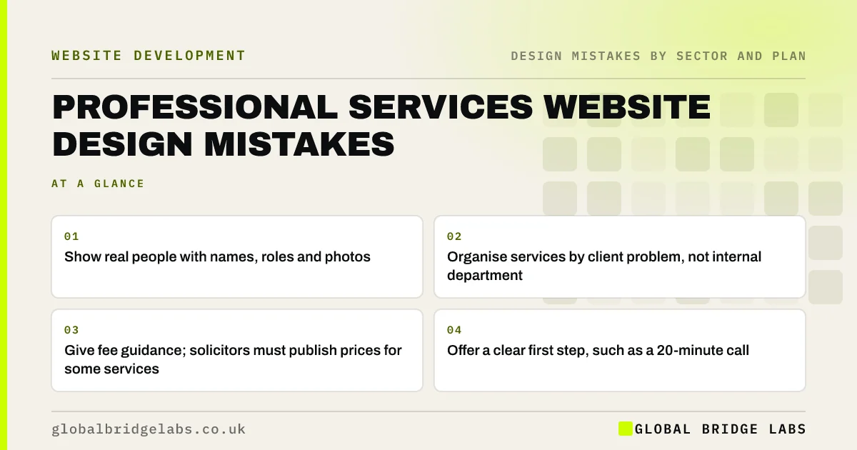
- Show real people with names, roles and photos.
- Organise services by client problem, not internal department.
- Give fee guidance; solicitors must publish prices for some services.
- Offer a clear first step, such as a 20-minute call.
Want your firm's website reviewed? Message us on WhatsApp.
Chat on WhatsApp →Why do professional services sites make these mistakes?
Professional firms often design websites to look established and serious, which leads to generic imagery, formal language and structures that mirror the firm's departments. Clients, meanwhile, arrive with a problem: a tax bill, a dispute, a business sale. The design should start from that problem.
Mistake 1: generic corporate imagery
Handshakes, city skylines and gavels say nothing about your firm and are used by hundreds of competitors. Real photos of your team and office, with names, build far more trust for a service where clients are choosing who to work with.
Mistake 2: menus by practice area
A menu listing 'Corporate', 'Private Client' and 'Advisory' makes sense internally but not to someone selling their business or dealing with a will. Organise services by client situation, or by client type then situation, using plain language.
Mistake 3: hiding the people
Clients want to know who they will deal with. Put relevant people on each service page with their photo, qualifications and a short, human summary, not only on a team page buried in the menu.
Mistake 4: no fee information
Silence on fees makes clients assume the worst. The Solicitors Regulation Authority requires firms to publish price and service information for certain services, such as residential conveyancing and probate. Other firms can give fixed fees for common work or typical ranges and explain what affects the cost.
Want fee information presented clearly? Message us on WhatsApp and we will discuss your requirements.
Chat on WhatsApp →Mistake 5: no clear first step
'Contact us' leaves clients unsure what happens next or what it will cost. Offer a specific first step, such as 'Book a free 20-minute call' or 'Send us your question', and say how quickly you reply.
Mistake 6: regulatory detail that crowds the page
Regulated firms must show certain information, such as regulator details and complaints procedures. Put it in the footer and on a dedicated page rather than crowding the main message, but make sure it is complete. Financial firms must also ensure financial promotions are fair, clear and not misleading.
What does this look like in practice?
A pattern we see: an accountancy site leads with a skyline photo and a menu of internal service lines, and the partners appear only on a team page. Leading with client situations and putting the right partner on each service page makes it obvious who can help with what.
Professional services checklist
- Replace stock imagery with real team photos.
- Organise services by client situation.
- Put relevant people on each service page.
- Give fixed fees or ranges where you can.
- Offer a specific first step and reply time.
- Keep regulatory information complete but out of the way.
Next step
Read your homepage as a client with a specific problem. Can you see who would help and what happens next?
Message us on WhatsApp for a professional services website review, or book a 30-minute consultation.
Chat on WhatsApp →Sources and further reading
- Transparency rules · Solicitors Regulation Authority
- Financial promotions and adverts · Financial Conduct Authority
- Photos as web content · Nielsen Norman Group
Frequently asked questions
What makes a good accountant or solicitor website?
Services organised by client situation, real people with photos and qualifications on service pages, clear fee guidance, plain language, reviews and a specific first step such as a short call, with regulatory information complete in the footer.
Do solicitors have to show prices on their website?
The SRA requires firms to publish price and service information for certain services, including residential conveyancing, probate and some employment and immigration work. Check the SRA's transparency rules for your services.
Should professional firms use stock photos?
Sparingly, if at all. Generic corporate stock images are common across competitors and add little trust. Real photos of your team and office help clients choose who to work with.
Written by

Global Bridge Labs (GBL) is a UK–Sri Lanka partner for social media, websites and BPO. Everything here comes from client delivery, not theory.