On this page
- 01Key takeaways
- 02Why do e-commerce design mistakes cost so much?
- 03Mistake 1: weak product images
- 04Mistake 2: hidden delivery costs
- 05Mistake 3: filters and search that do not help
- 06Mistake 4: forced account creation
- 07Mistake 5: long, fiddly checkouts on mobile
- 08Mistake 6: missing reassurance
- 09What does this look like in practice?
- 10E-commerce design checklist
- 11Next step
- 12Sources and further reading
- 13Frequently asked questions
Key takeaways
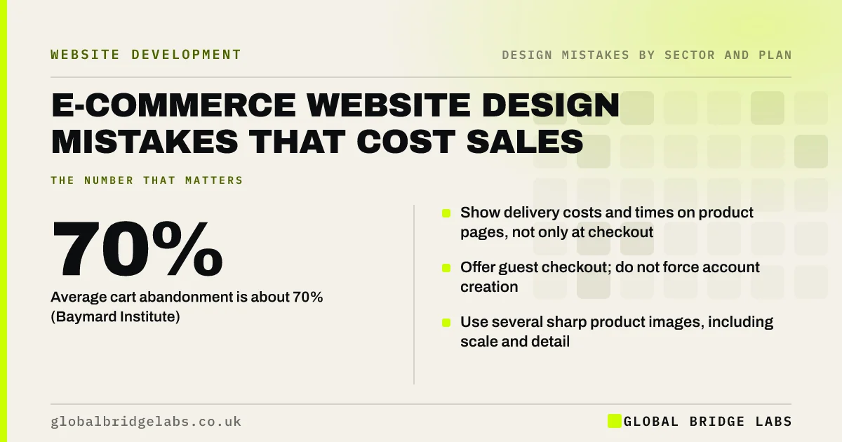
E-commerce design mistakes cost sales at every step: poor product photos, delivery costs revealed only at checkout, filters that do not help, small add-to-basket buttons on mobile and long checkouts with forced account creation. Baymard Institute puts average online cart abandonment at about 70%, and extra costs and complicated checkouts are among the most common reasons.
- Average cart abandonment is about 70% (Baymard Institute).
- Show delivery costs and times on product pages, not only at checkout.
- Offer guest checkout; do not force account creation.
- Use several sharp product images, including scale and detail.
Want your online shop reviewed? Message us on WhatsApp.
Chat on WhatsApp →Why do e-commerce design mistakes cost so much?
Online shoppers cannot touch the product or ask a sales assistant, so the design has to answer every question and remove every doubt. A small fault, such as an unclear size guide or a surprise delivery charge, applied to every visitor adds up to a large share of lost orders.
Mistake 1: weak product images
One small photo on a white background does not show scale, texture or detail. Show several sharp images, including the product in use, close-ups and something that shows size. Let shoppers zoom on mobile.
Mistake 2: hidden delivery costs
Delivery charges that appear only at checkout are a leading cause of abandonment in Baymard's research. Show delivery costs, free delivery thresholds and delivery times on product pages and in the basket. Under UK law, unavoidable charges should not be hidden until late in the purchase.
Mistake 3: filters and search that do not help
Filters that use internal terms, cannot be combined or reset the page each time make large catalogues hard to browse. Offer filters shoppers care about (size, price, colour, availability), show counts and keep their place when they return from a product.
Want your product pages and checkout checked? Message us on WhatsApp and we will discuss your requirements.
Chat on WhatsApp →Mistake 4: forced account creation
Requiring an account before purchase is another common abandonment reason in Baymard's research. Offer guest checkout and invite shoppers to save their details after the order.
Mistake 5: long, fiddly checkouts on mobile
Checkouts with many fields, tiny inputs, no address lookup and no digital wallets are hard work on a phone. Cut fields, use autofill, offer Apple Pay or Google Pay, and show clear error messages.
Mistake 6: missing reassurance
Returns policy, delivery promises, secure payment and reviews should be visible near the add-to-basket button and in checkout. Consumers buying online have a 14-day cancellation right under the Consumer Contracts Regulations; explaining your returns process clearly reassures shoppers.
What does this look like in practice?
A pattern we see: a shop shows delivery charges only after shoppers enter their address, and requires an account. Showing delivery costs on product pages and adding guest checkout removes two common reasons people leave at the final step.
E-commerce design checklist
- Several sharp images per product, with zoom.
- Delivery costs and times on product pages.
- Useful, combinable filters.
- Guest checkout.
- Short mobile checkout with wallets and autofill.
- Returns, security and reviews near the button.
Next step
Buy one of your own products on a phone as a guest and note every moment of doubt or delay.
Message us on WhatsApp for an e-commerce review, or book a 30-minute consultation.
Chat on WhatsApp →Sources and further reading
- Cart abandonment rate statistics · Baymard Institute
- E-commerce checkout usability: research and benchmark · Baymard Institute
- Consumer Contracts (Information, Cancellation and Additional Charges) Regulations 2013 · legislation.gov.uk
- Digital Markets, Competition and Consumers Act 2024 · legislation.gov.uk
Frequently asked questions
What are the most common e-commerce website mistakes?
Weak product images, delivery costs revealed only at checkout, forced account creation, unhelpful filters, long mobile checkouts and missing reassurance about returns and security. Baymard's research links several of these to cart abandonment.
What is a normal cart abandonment rate?
Baymard Institute's average of many studies is about 70%. Some abandonment is unavoidable because people browse and compare, but surprise costs, forced accounts and complicated checkouts are fixable causes.
Should my online shop require an account?
No. Offer guest checkout and invite shoppers to create an account after ordering. Forced account creation is a common reason for abandoning a purchase.
Written by

Global Bridge Labs (GBL) is a UK–Sri Lanka partner for social media, websites and BPO. Everything here comes from client delivery, not theory.