On this page
- 01Key takeaways
- 02What is Jakob's law?
- 03Why does Jakob's law matter for navigation?
- 04Which navigation conventions should you keep?
- 05When is it worth breaking a convention?
- 06Does following conventions make a site look generic?
- 07What does this look like in practice?
- 08Conventions checklist
- 09Next step
- 10Sources and further reading
- 11Frequently asked questions
Key takeaways
Jakob's law says users spend most of their time on other websites, so they expect yours to work the same way. For navigation, that means a logo top left that links home, a menu across the top or behind a familiar icon on phones, contact details in the header and footer, and links that look like links. Breaking conventions costs visitors effort.
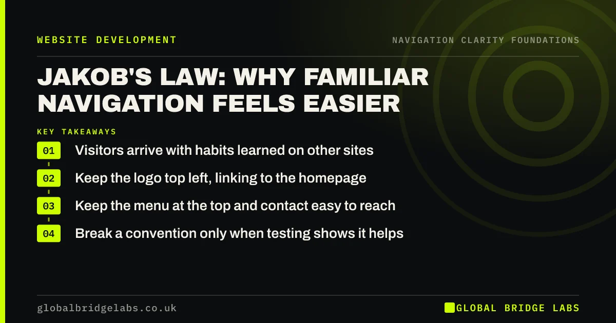
- Visitors arrive with habits learned on other sites.
- Keep the logo top left, linking to the homepage.
- Keep the menu at the top and contact easy to reach.
- Break a convention only when testing shows it helps.
Want to check your site against common conventions? Message us on WhatsApp.
Chat on WhatsApp →What is Jakob's law?
Jakob's law is a principle of web usability, named after Jakob Nielsen, stating that users prefer a site to work the same way as the sites they already know, because that is where they spend most of their time. Nielsen Norman Group presents it as a reason to follow established design patterns instead of inventing new ones.
Why does Jakob's law matter for navigation?
Navigation is where visitors rely on habit most. They look top left for the logo, top right for contact or basket, and the footer for policies and contact details. Nielsen Norman Group's research on logo placement found visitors are much more likely to return to the homepage with a left-placed logo than a centred one. Familiar placement means no learning.
Which navigation conventions should you keep?
Keep the conventions visitors rely on to orient themselves. Most business sites should not experiment with these, because the gain from novelty rarely outweighs the cost of confusion.
- Logo top left, linking to the homepage.
- Main menu across the top on desktop.
- A recognisable menu icon with the word 'Menu' on phones.
- Contact or primary action at the top right.
- Underlined or clearly styled text links.
- Contact details, policies and secondary links in the footer.
When is it worth breaking a convention?
Break a convention when your visitors have a different habit, or when testing shows a better alternative. A booking-heavy site may put a 'Book' button where others put 'Contact'. Bottom navigation on phones has become familiar from apps. Test the change with real users before rolling it out.
Does following conventions make a site look generic?
Not necessarily. Conventions apply to placement and behaviour, not to brand. Colour, type, imagery, tone of voice and content are where a business stands out. A distinctive site with a conventional menu is easier to use than a conventional-looking site with an unusual menu.
What does this look like in practice?
A pattern we see: a design-led site centres its logo, hides the menu in a corner icon on desktop and styles links as plain text. It looks striking, but visitors hunt for the menu. Restoring a visible top menu and underlined links keeps the look and removes the hunt.
Conventions checklist
- Logo top left, linking home.
- Visible menu across the top on desktop.
- Menu icon labelled 'Menu' on phones.
- Primary action top right.
- Links that look clickable.
- Footer with contact details and policies.
Next step
Compare your header with three competitors' sites and note any place yours behaves differently.
Message us on WhatsApp for a navigation review, or book a 30-minute consultation.
Chat on WhatsApp →Sources and further reading
- Jakob's law of internet user experience · Nielsen Norman Group
- Website logo placement for maximum brand recall · Nielsen Norman Group
- 10 usability heuristics for user interface design · Nielsen Norman Group
Frequently asked questions
What is Jakob's law in UX?
Jakob's law states that users spend most of their time on other websites, so they prefer yours to work the same way. It is a reason to follow established patterns for navigation, forms and layout, so visitors can use your site without learning anything new.
Does Jakob's law mean all websites should look the same?
No. It applies to how things work and where they sit, not to visual style. You can use your own colours, type, photography and voice while keeping a familiar menu, logo position and link styling. Brand lives in the content and look, not in unusual navigation.
Who is Jakob Nielsen?
Jakob Nielsen is a Danish usability researcher who co-founded Nielsen Norman Group with Don Norman. He is known for the 10 usability heuristics, research on how people read on the web and discount usability methods such as testing with small numbers of users.
Written by

Global Bridge Labs (GBL) is a UK–Sri Lanka partner for social media, websites and BPO. Everything here comes from client delivery, not theory.