On this page
- 01Short answer
- 02Why do most social media reports fail?
- 03What belongs on the first page?
- 04What belongs underneath?
- 05How do you keep definitions stable?
- 06How often should you report?
- 07What does this look like in practice?
- 08How do you present a report that gets a decision?
- 09How do you report when the numbers are bad?
- 10Next step
- 11Sources and further reading
- 12Frequently asked questions
Short answer
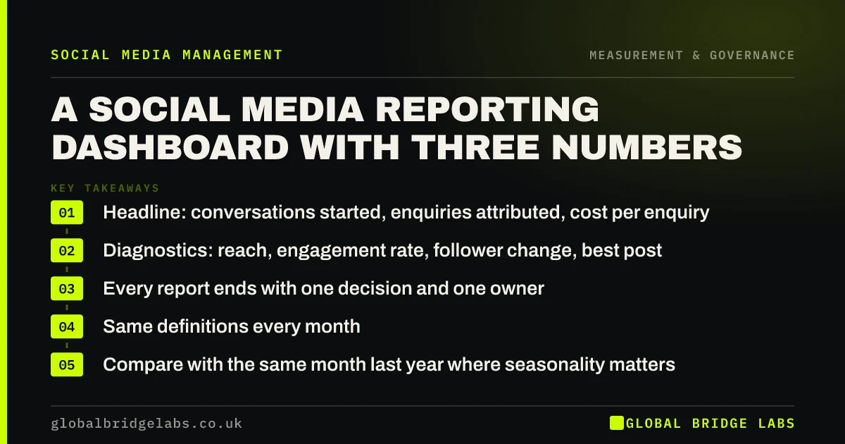
A social media report should fit on one page and answer three questions: did it produce conversations, what did each one cost, and what are we changing. Everything else is a diagnostic that belongs underneath, available if asked but not presented by default.
- Headline: conversations started, enquiries attributed, cost per enquiry.
- Diagnostics: reach, engagement rate, follower change, best post.
- Every report ends with one decision and one owner.
- Same definitions every month. Changing them destroys the trend.
- Compare with the same month last year where seasonality matters.
Want a one-page reporting template for your business? Message us on WhatsApp.
Chat on WhatsApp →Why do most social media reports fail?
Because they are built to demonstrate effort rather than to support a decision. A fourteen-page monthly report with platform screenshots proves that work happened. It does not tell an owner whether to spend more, less or differently.
The test for every number in a report: if this went up or down by 30%, would we do anything differently? If not, it is a diagnostic, and it belongs in an appendix.
What belongs on the first page?
Three numbers with a comparison and a direction, plus a single sentence of interpretation for each.
- Conversations started: genuine two-way exchanges with non-customers.
- Enquiries attributed: by whatever combination of methods you use, stated consistently.
- Cost per enquiry: total cost including internal time, divided by enquiries.
- One sentence per number saying what changed and why you think it changed.
- One decision for next month, with a named owner.
What belongs underneath?
The diagnostics that explain the headline numbers when they move unexpectedly.
Reach tells you whether distribution changed. Engagement rate tells you whether relevance changed. Follower change tells you whether the audience is still growing in the right places. Best and worst posts tell you what to make more and less of. None of them are the point, but all of them answer a why.
How do you keep definitions stable?
Write a one-page definitions sheet and attach it to the first report. Engagement rate calculated against reach, an enquiry defined as a request for a quote or a booking, a conversation defined as a two-way exchange.
Then do not change them mid-year. If a definition must change, restate the previous twelve months on the new basis, or the trend line becomes fiction at exactly the point you need to trust it.
We report on three numbers for UK clients monthly. Message us on WhatsApp to see the format.
Chat on WhatsApp →How often should you report?
Monthly for the record, quarterly for decisions. Monthly numbers in small businesses are noisy: one good job, one seasonal week or one viral post will swing them enough to produce bad decisions.
Read monthly reports for anomalies. Make strategic decisions at the quarter, against the goal in your strategy document.
What does this look like in practice?
A pattern worth testing on your own reporting: ask what decision the last monthly report led to. In a great many businesses, nobody can name one.
Cutting it to one page with three numbers and a decision line changes that immediately. The first decision is often to stop producing a content format that has generated no conversations in months, which is evidence the longer report contained all along and nobody could find.
How do you present a report that gets a decision?
Lead with the decision you are asking for, not with the data. A report that opens with we recommend holding budget and moving two hours a week from Instagram to community response gets discussed; a report that opens with reach was up 12% gets skimmed.
Put the three numbers underneath as the evidence for that recommendation, and the diagnostics underneath those. This is the reverse of how most marketing reports are built, and it is the reason most of them are read once.
Keep the meeting to fifteen minutes. If a report needs longer than that to explain, the problem is the report rather than the complexity of the channel.
- Open with the recommendation, not the data.
- Three numbers as evidence, diagnostics below.
- Fifteen-minute meeting. Longer means the report is wrong.
- One named owner against each decision.
How do you report when the numbers are bad?
Plainly, early, and with a diagnosis. A report that buries a decline under favourable diagnostics costs more credibility than the decline itself, and it delays the decision by a month.
The structure that works: state what fell and by how much, say what you believe caused it, distinguish clearly between what you know and what you are inferring, and state what you are changing and when you will know whether it worked.
Be specific about cause. Reach fell because we published six posts instead of eleven while two people were on holiday is a useful sentence. The algorithm changed is not, and it is almost never the real explanation in a small account.
- State the decline first, with the number.
- Separate what you know from what you are inferring.
- Name a specific cause. Cadence explains most declines.
- Say what changes and when it will be reviewed.
Next step
A report that does not end in a decision is a status update. Reports should be short, stable and consequential.
Message us on WhatsApp for a one-page social media reporting template built around your goals.
Chat on WhatsApp →Sources and further reading
- URL builders: collect campaign data with custom URLs · Google Analytics Help
- Meta Business Help Centre · Meta
Frequently asked questions
What should a social media report include?
Three headline numbers: conversations started, enquiries attributed and cost per enquiry, each with a comparison and one sentence of interpretation. Diagnostics such as reach and engagement belong underneath, available when a headline number moves unexpectedly.
How often should we review social media performance?
Read monthly for anomalies, decide quarterly. Monthly figures in small businesses are noisy enough that acting on them produces poor decisions, since a single seasonal week or one unusual post can swing every number.
Should reports include screenshots from each platform?
No. Screenshots demonstrate effort rather than support decisions. If a number would not change what you do when it moves by thirty percent, it is a diagnostic and belongs in an appendix rather than on the first page.
How do I compare this month to last month fairly?
Keep definitions identical and compare with the same month last year wherever seasonality matters. If a definition has to change, restate the previous twelve months on the new basis so the trend line remains meaningful.
Written by

Global Bridge Labs (GBL) is a UK–Sri Lanka partner for social media, websites and BPO. Everything here comes from client delivery, not theory.